
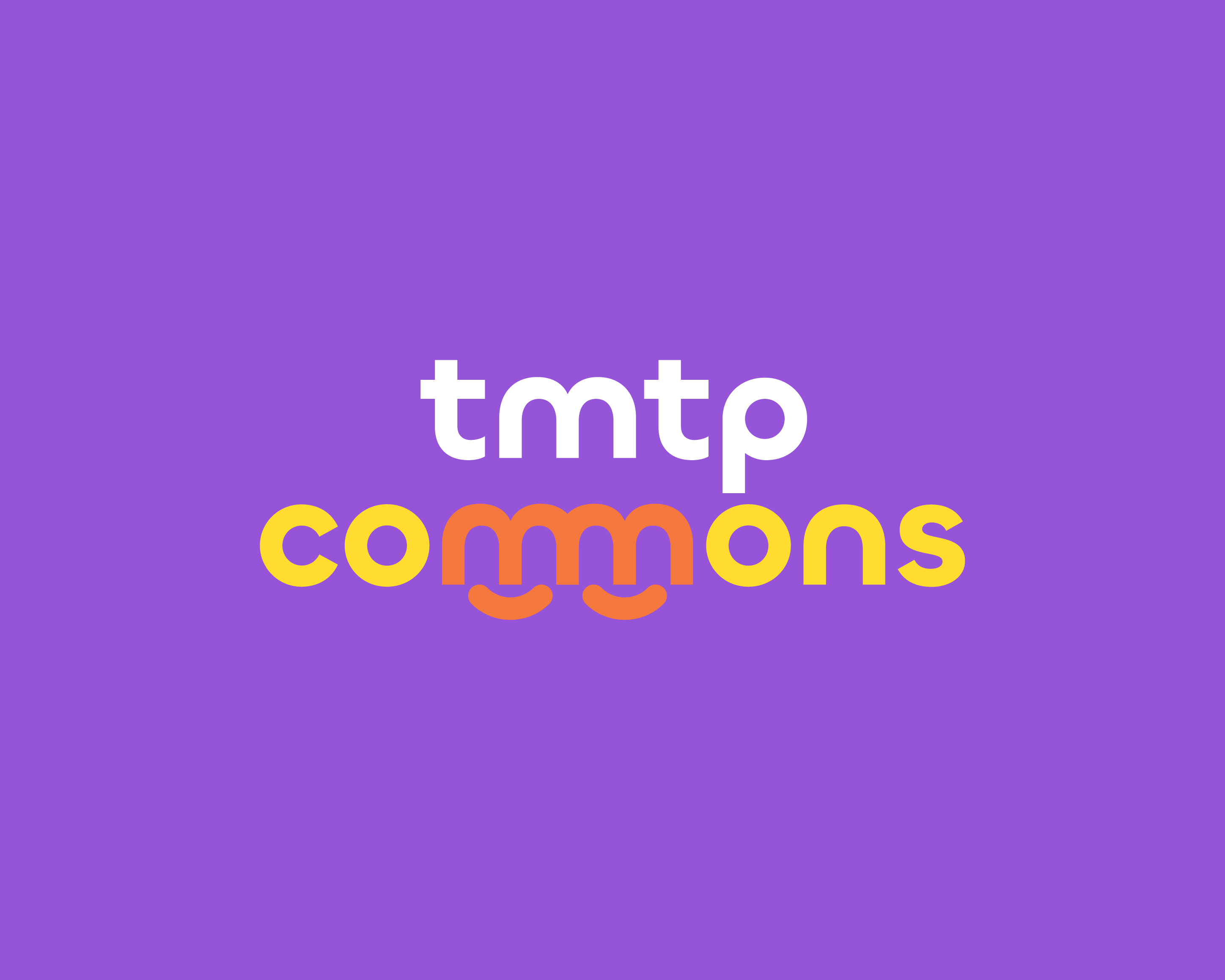
tmtp commons. An identity built around connection.
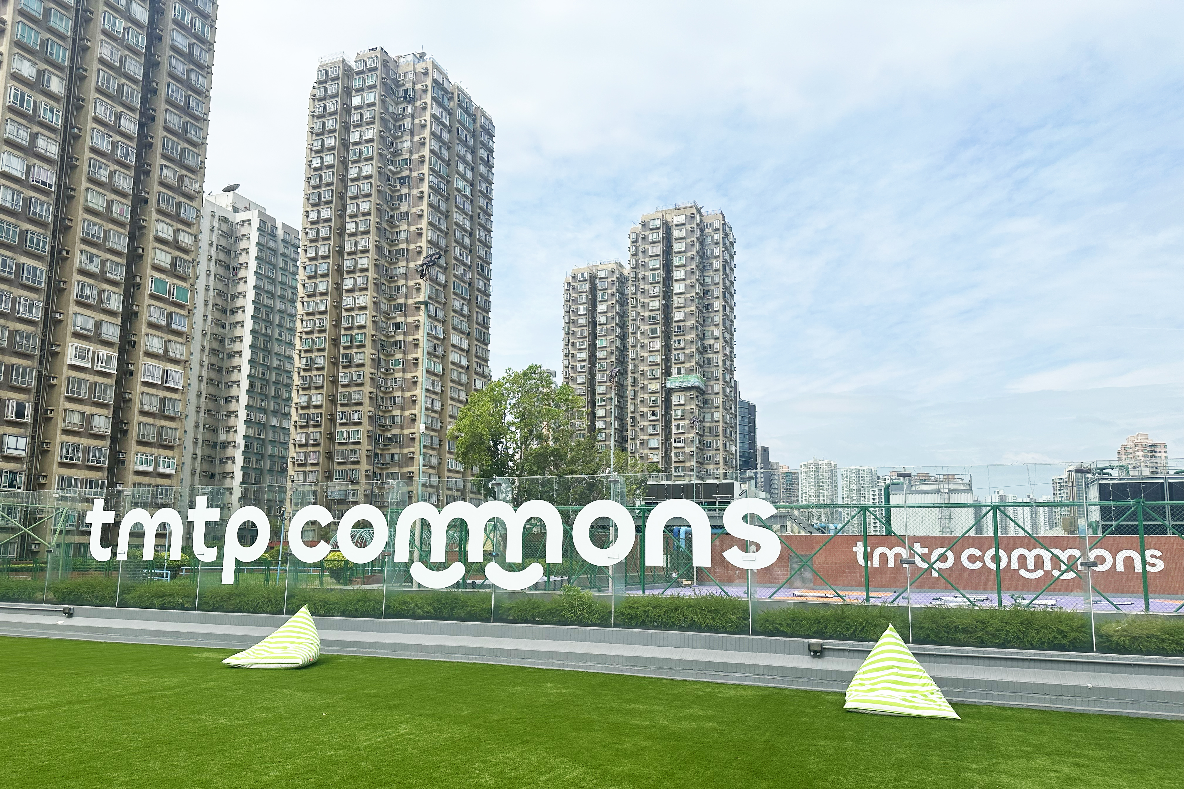
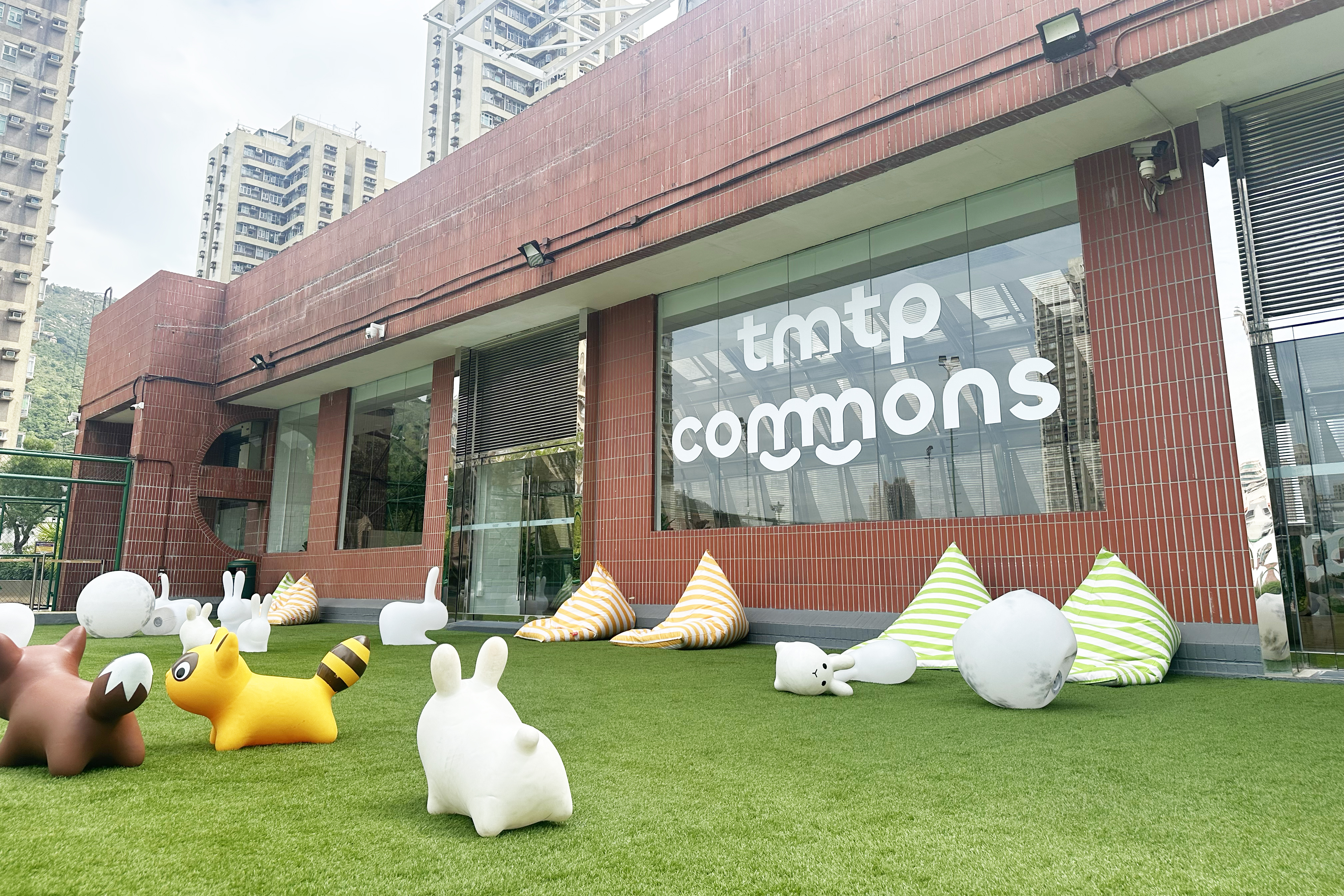
Tuen Mun Town Plaza set out to transform an existing fourth-floor platform into tmtp commons, an open-air shared space for the community. Its programme spans wellness, sustainable living, creative workshops, learning and community services. We were asked to create an identity that could hold this diversity together: one that feels open and welcoming, carries a clear sense of optimism, and actively draws people through the mall to a new destination.
Service
CONCEPT
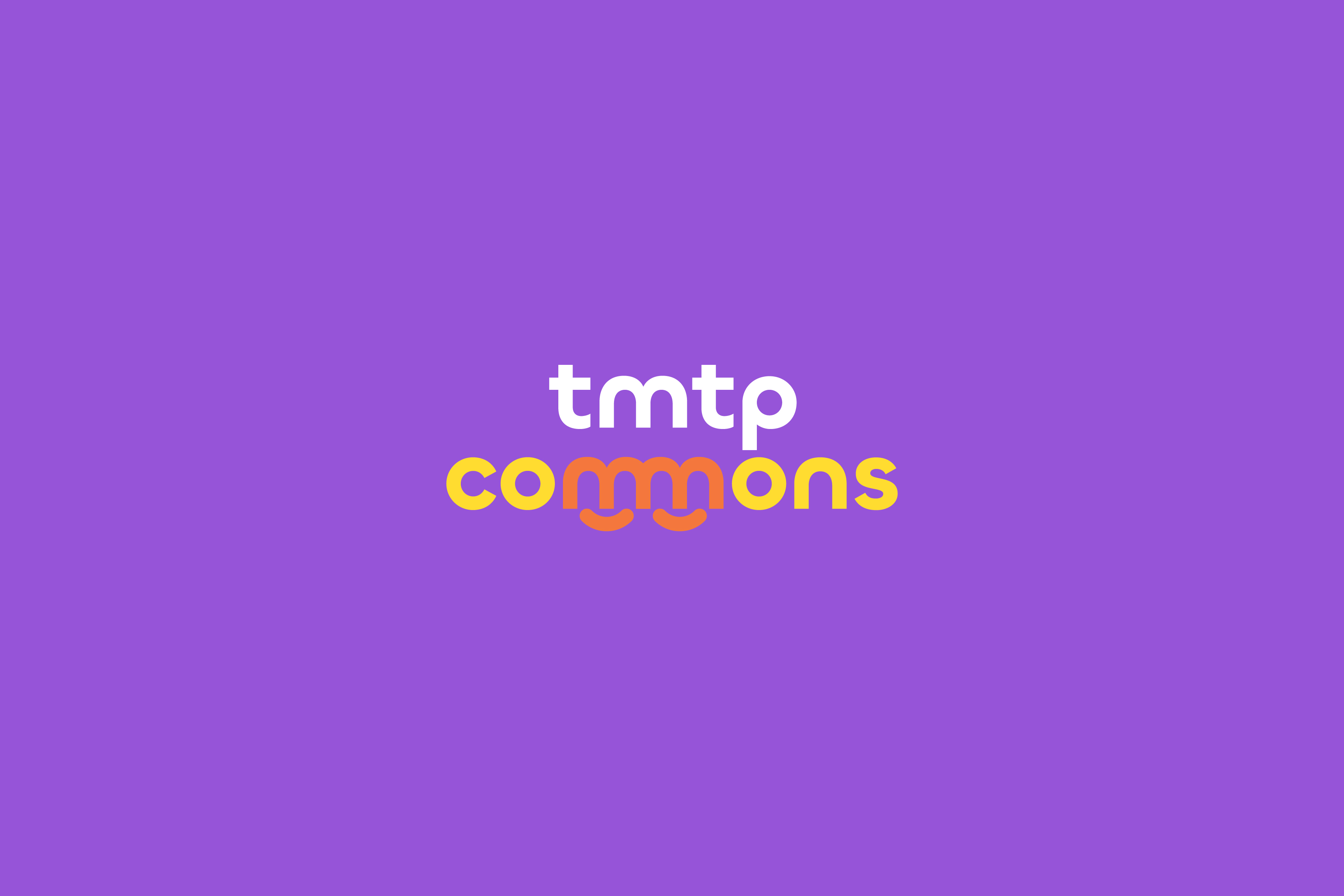
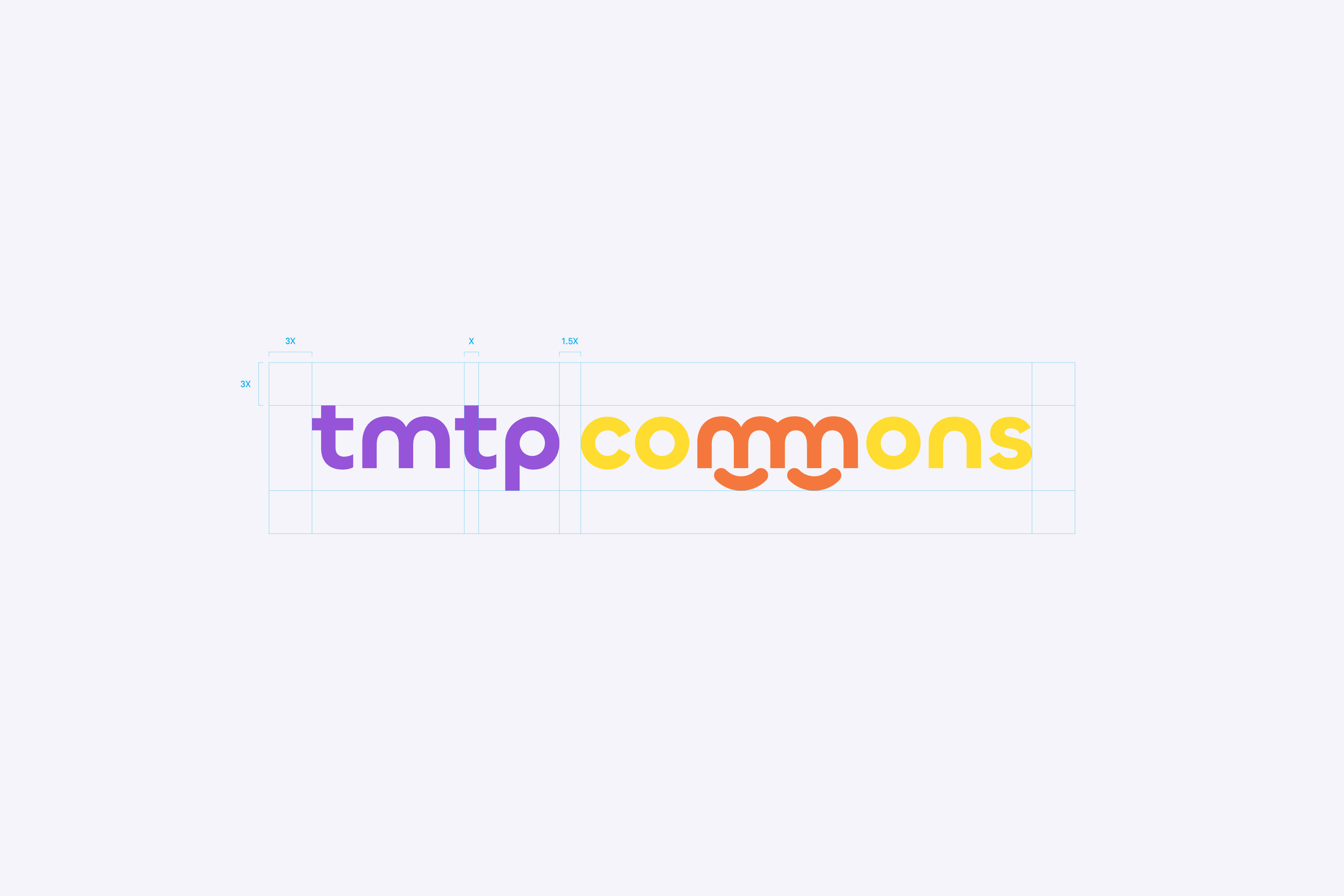
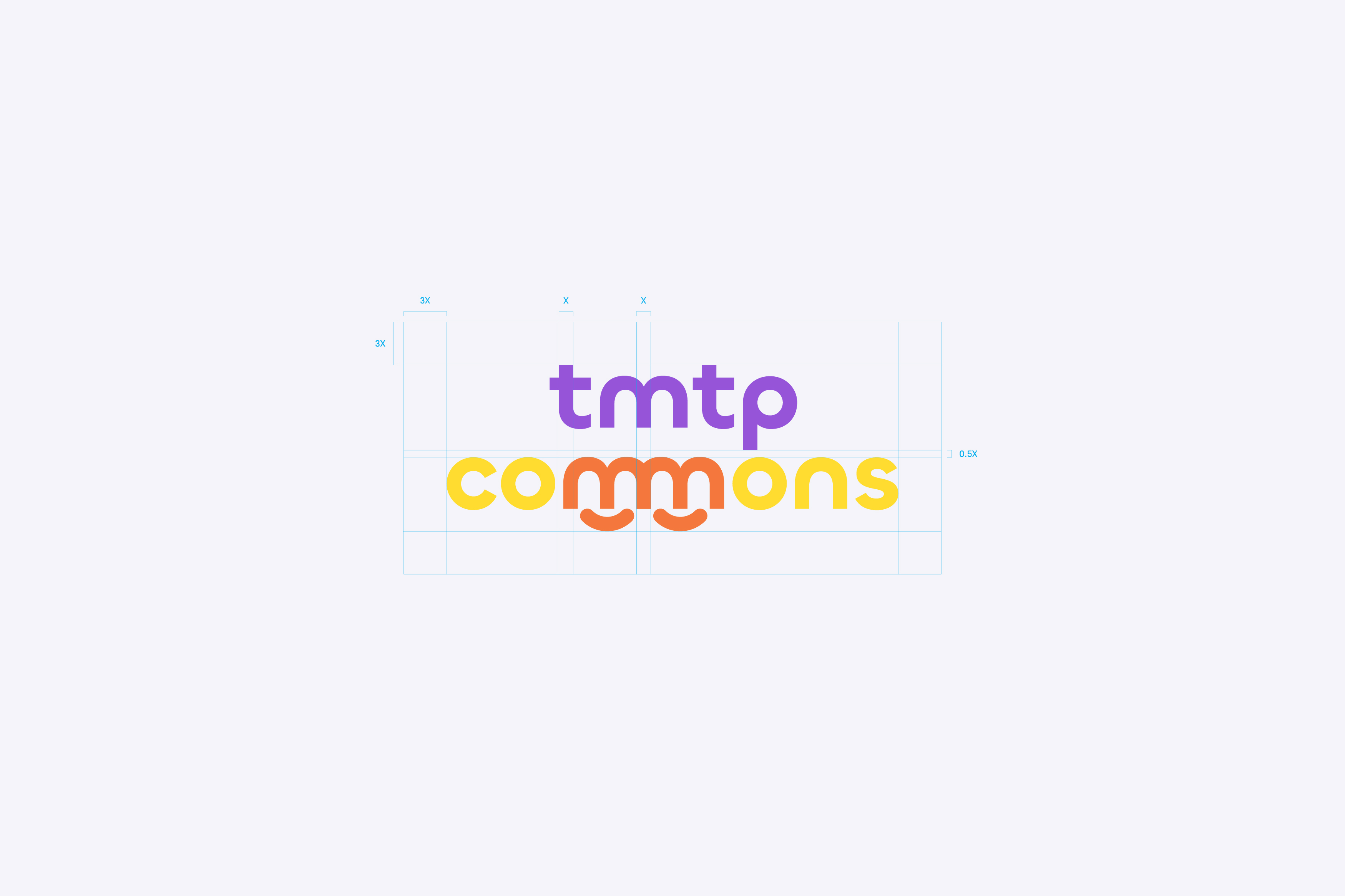
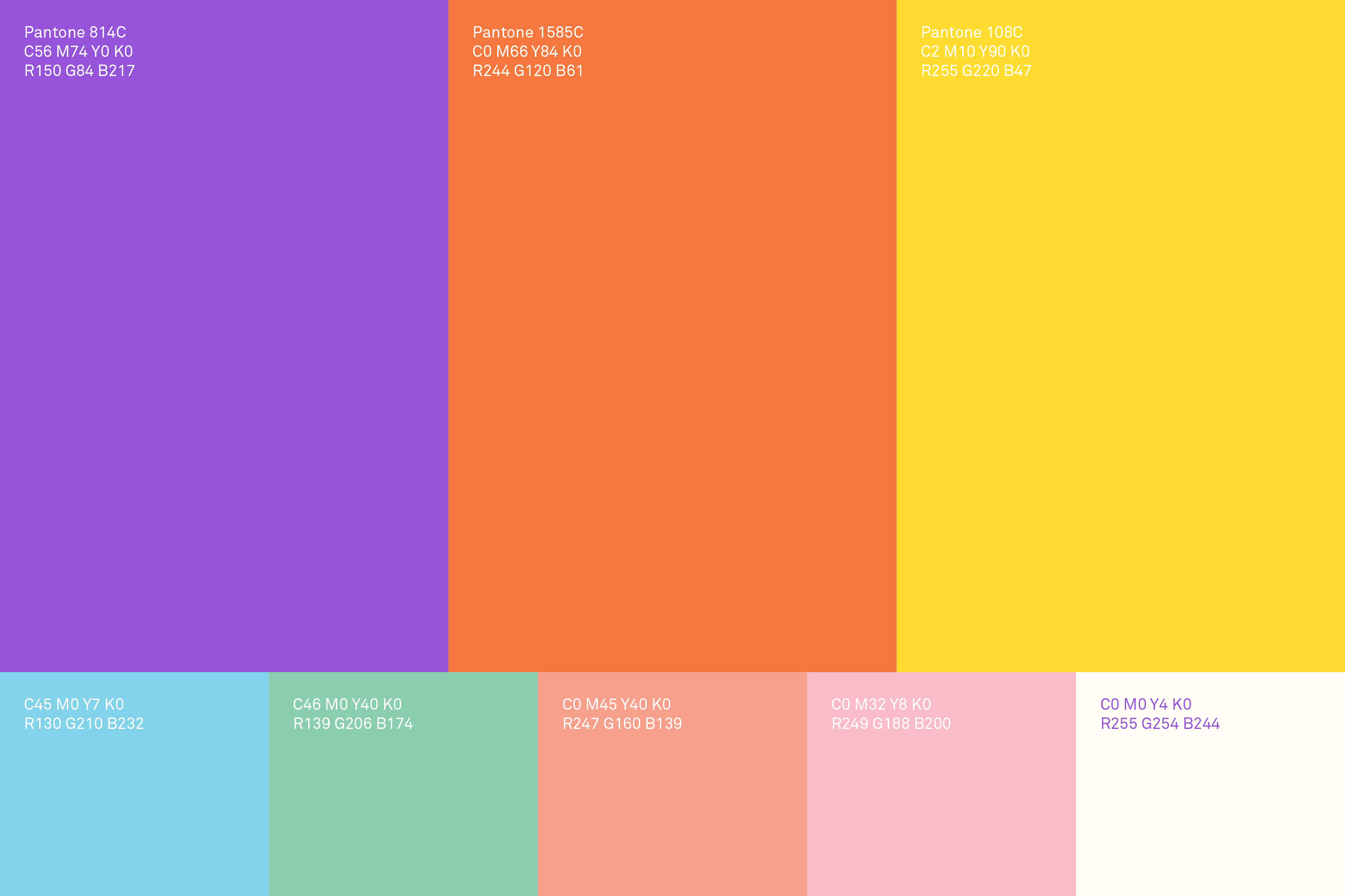
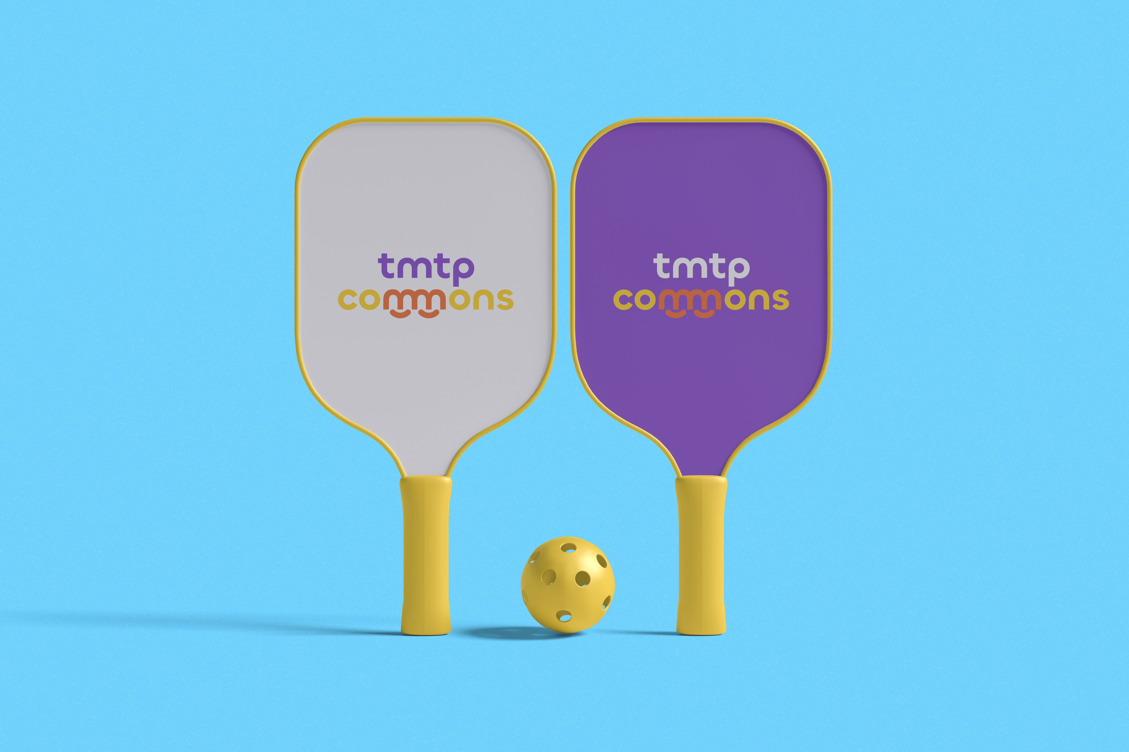
The core concept for the tmtp commons identity is deeply rooted in the principles of connectedness, movement, and emotional warmth, accurately reflecting the space’s role as a nexus for community activity. The logotype itself is the central conceptual pillar, featuring a unique, playful treatment of the double “m” in “commons.” By intentionally linking these letters, we established a powerful symbolic representation of Continuity, suggesting a seamless flow of ideas and collective process; Movement, with the rhythmic, wave-like pattern embodying the energy and dynamic spirit of a lively community hub; and Connectedness, where the interconnected curves symbolize collaboration, support, and the harmony of diverse elements working together. Crucially, this linked “m” formation abstractly forms two smiles. This universally recognized symbol of happiness and positivity establishes an immediate, emotional connection, communicating warmth, care, and a welcoming atmosphere. This is further supported by a bright, high-contrast color palette of vibrant purples, yellows and oranges which was deliberately chosen to express a joyful and energetic vibe that synchronizes with the brand’s holistic value and optimistic tone.
THE MODULAR KEY VISUAL
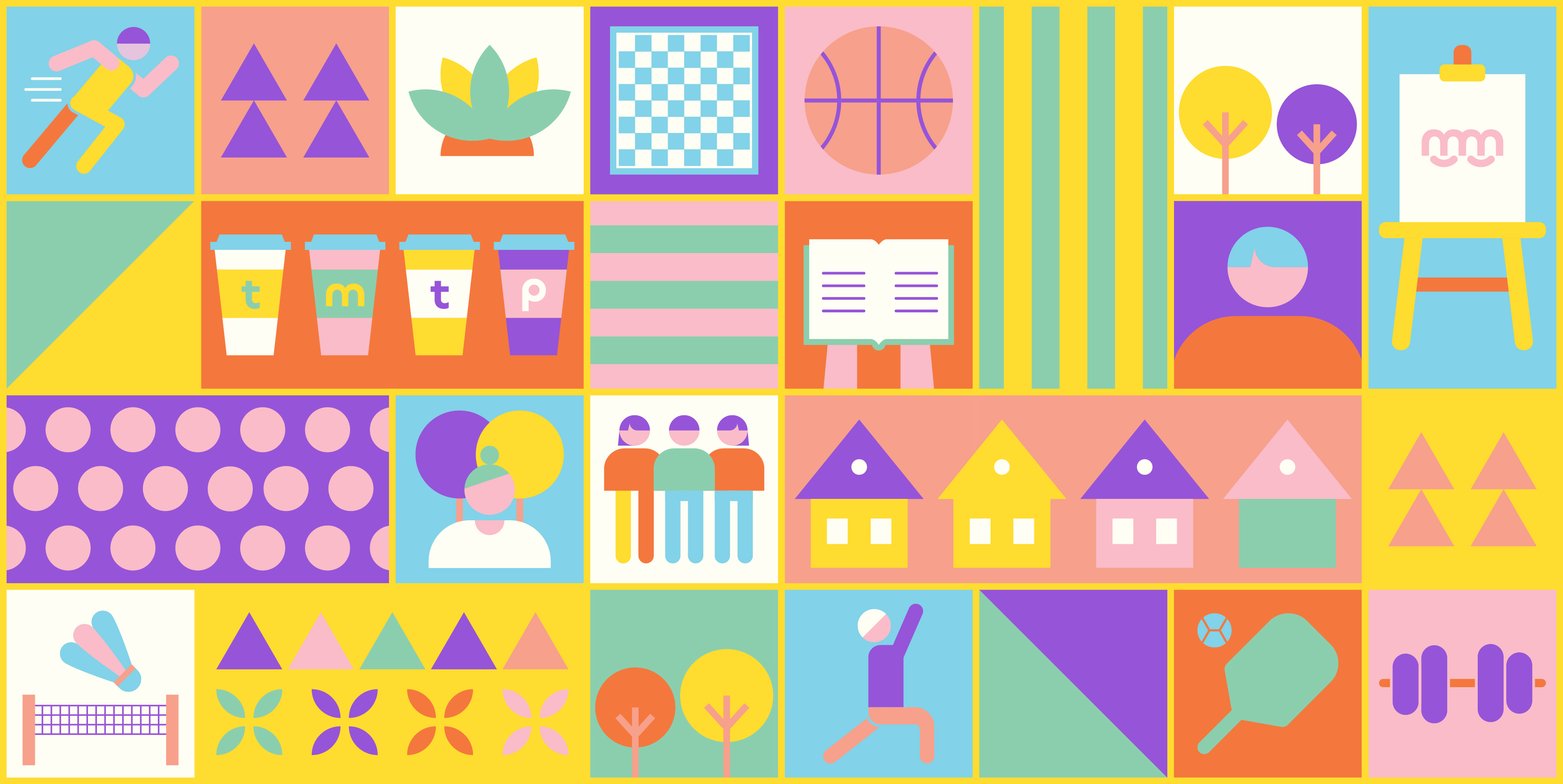
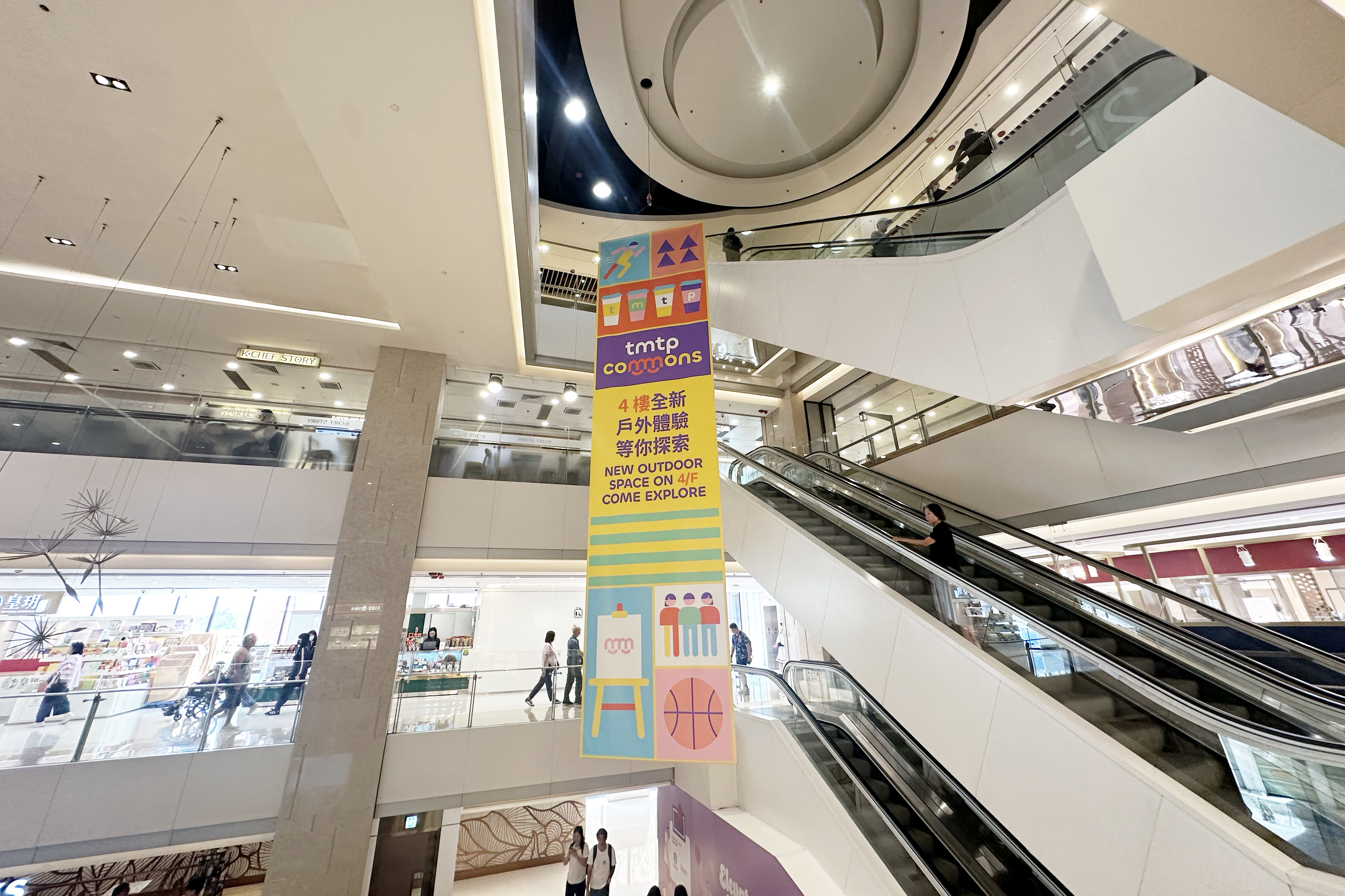
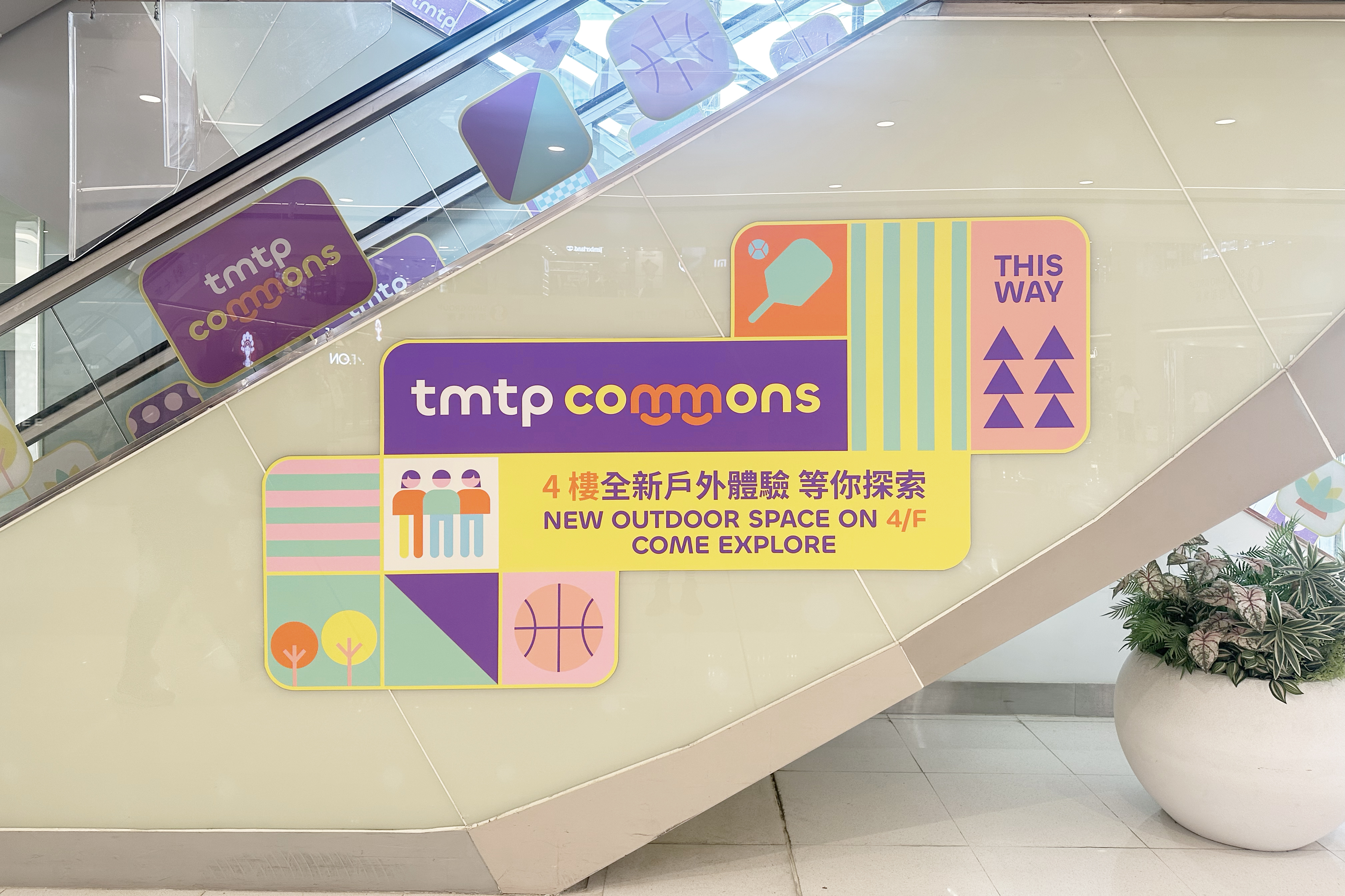
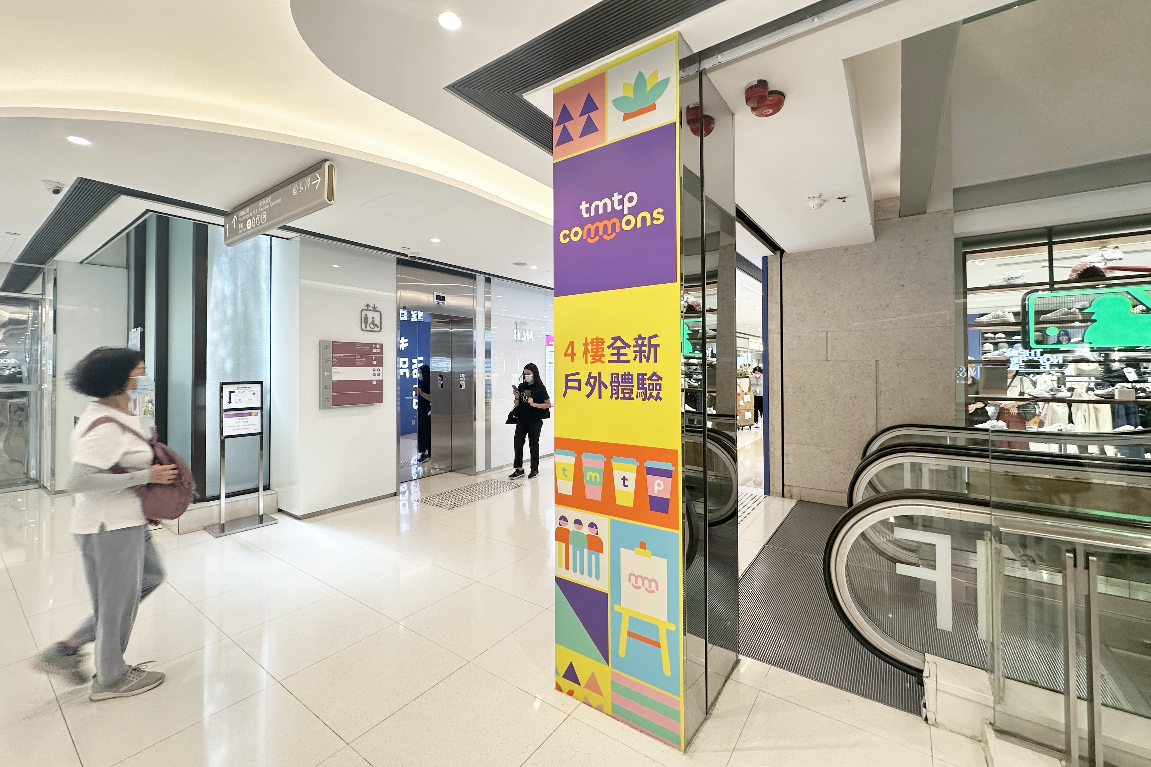
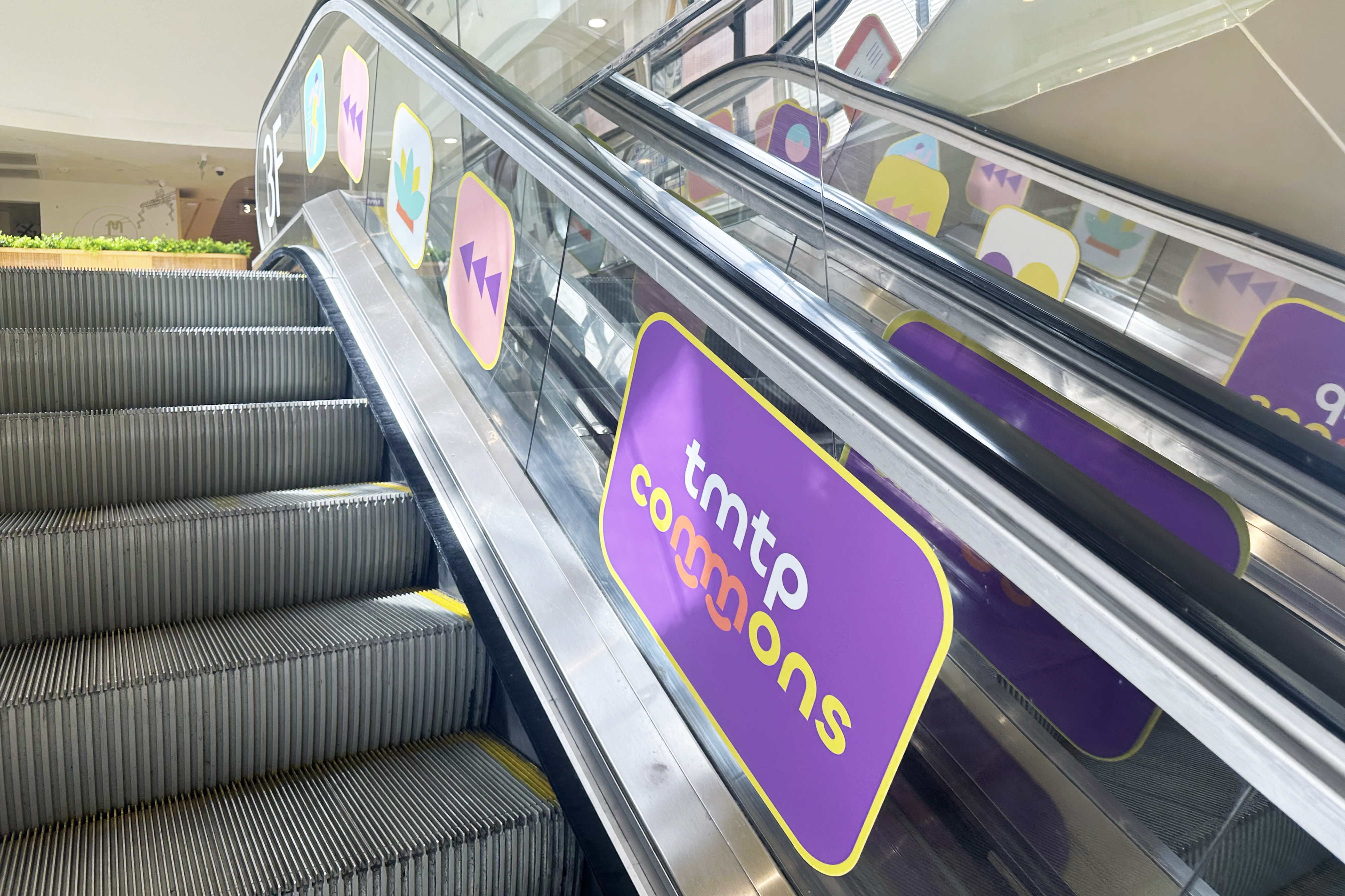
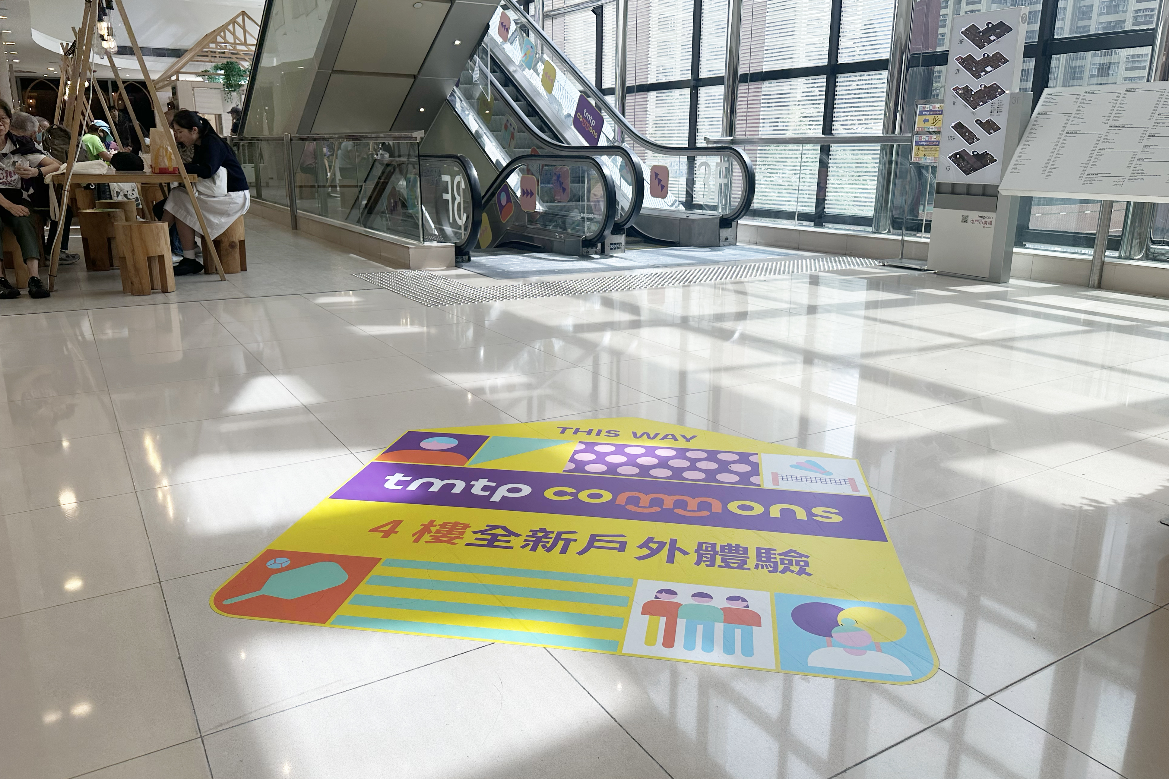
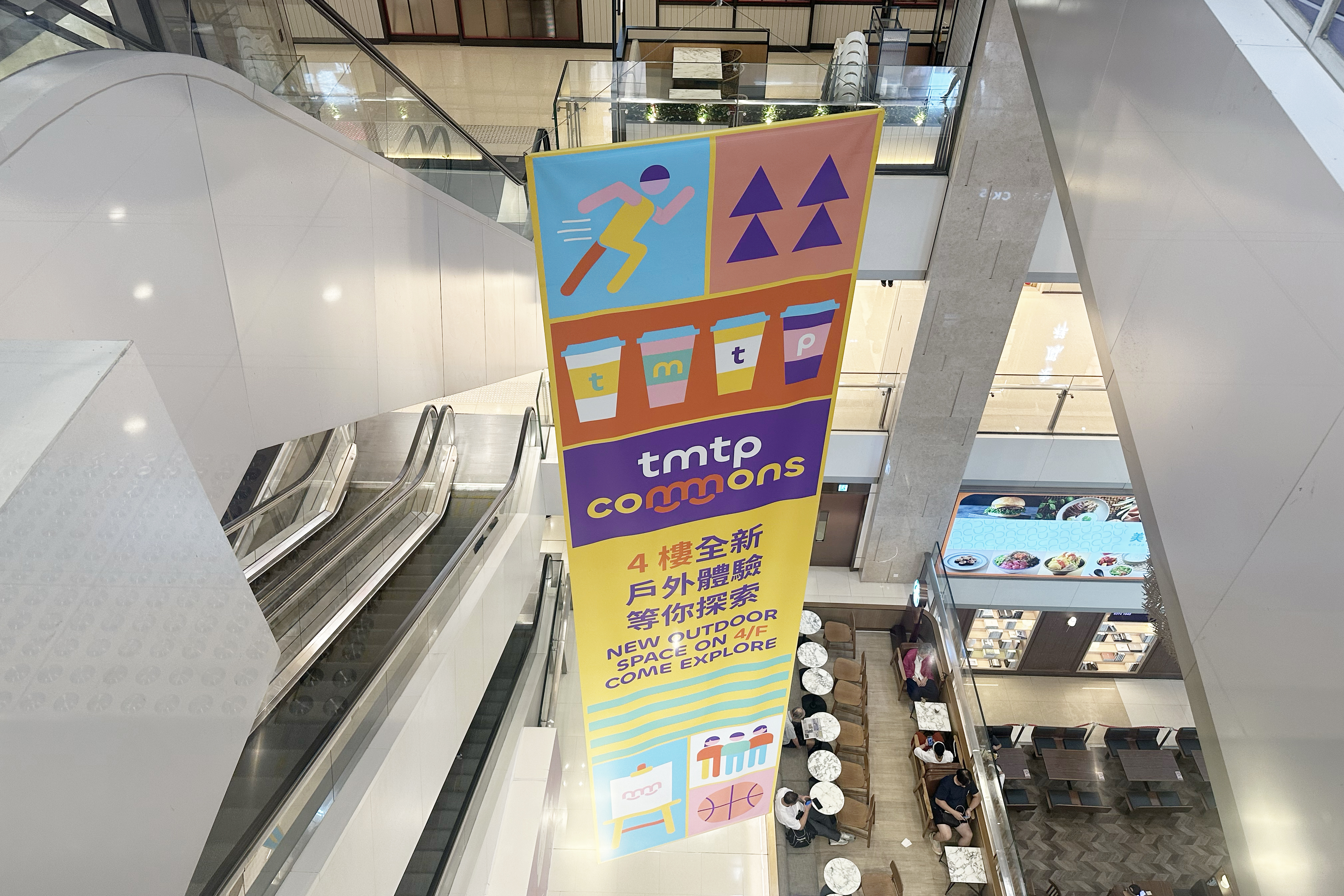
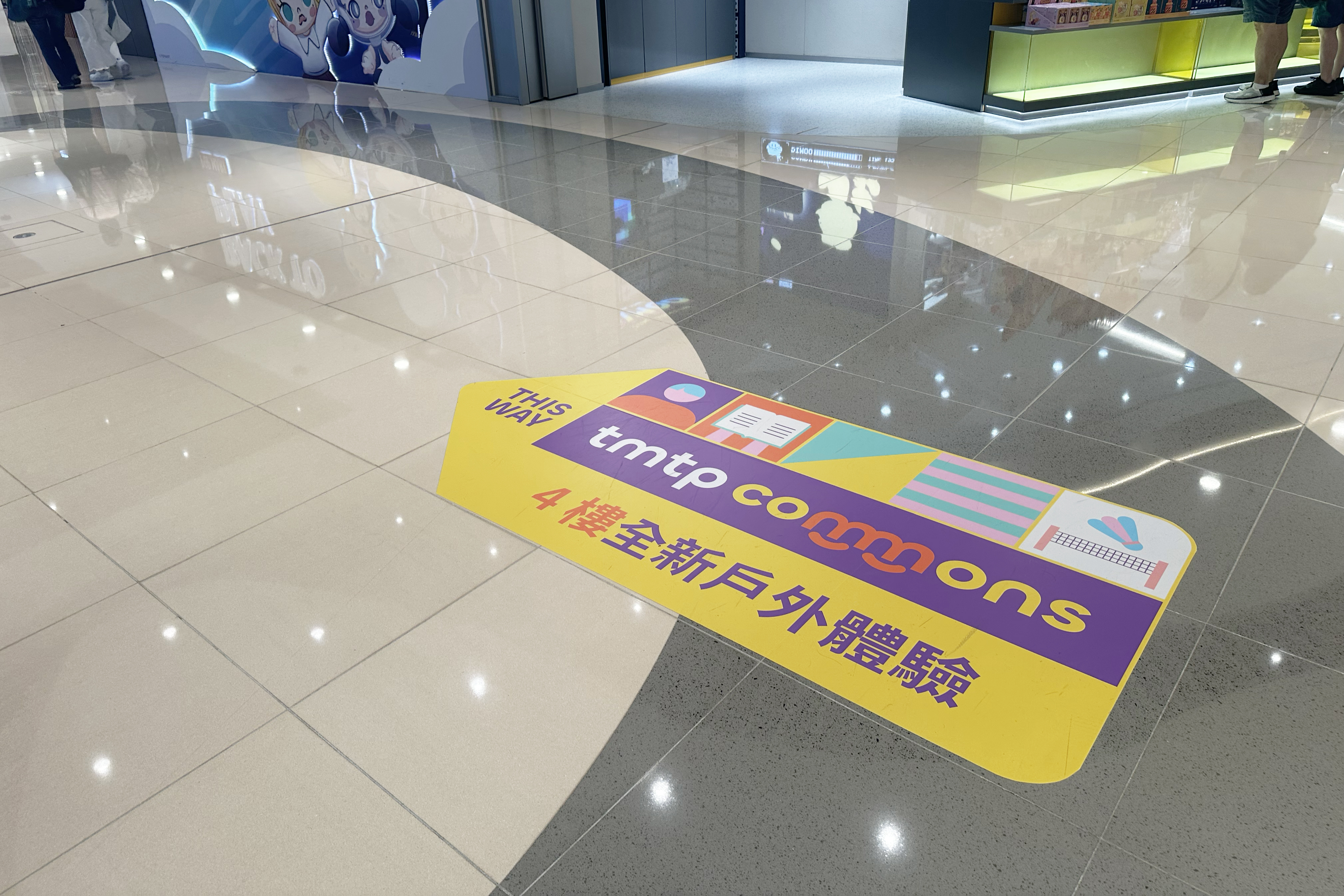
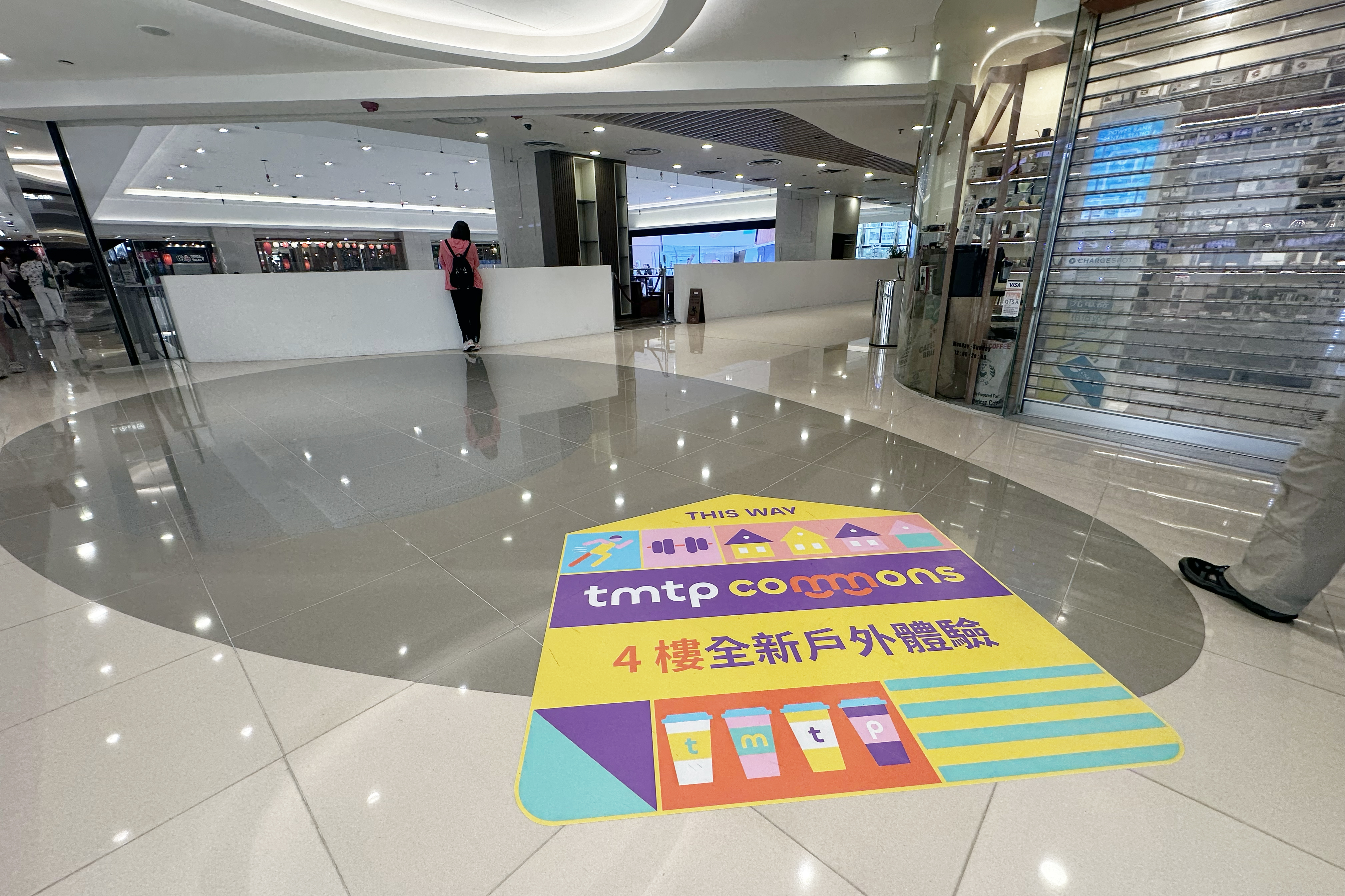
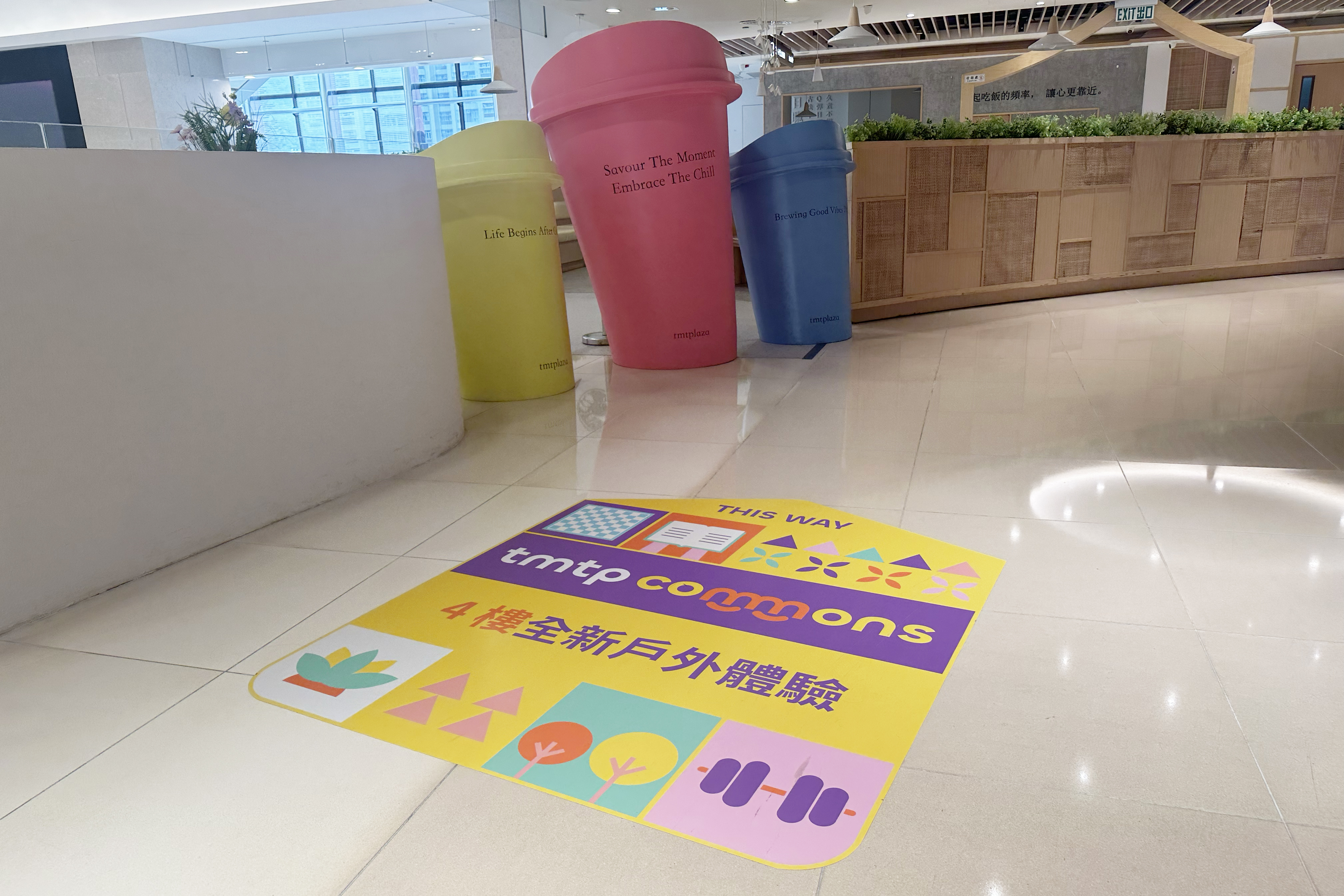
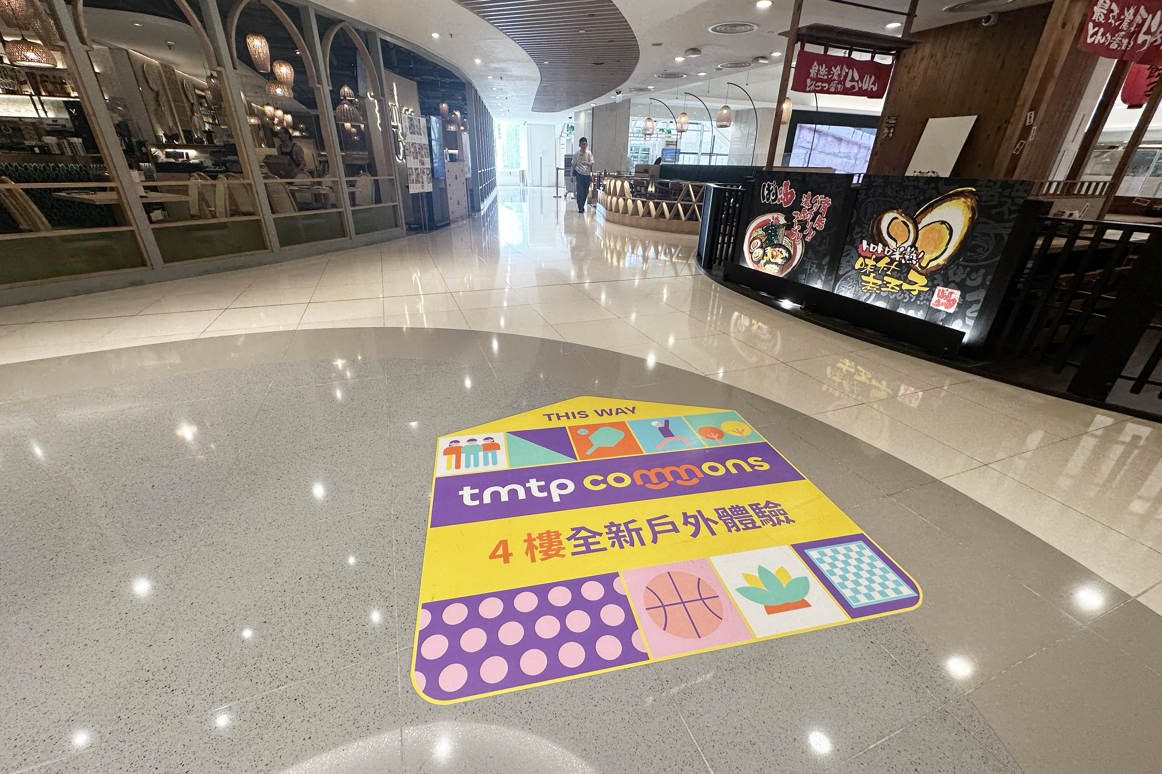
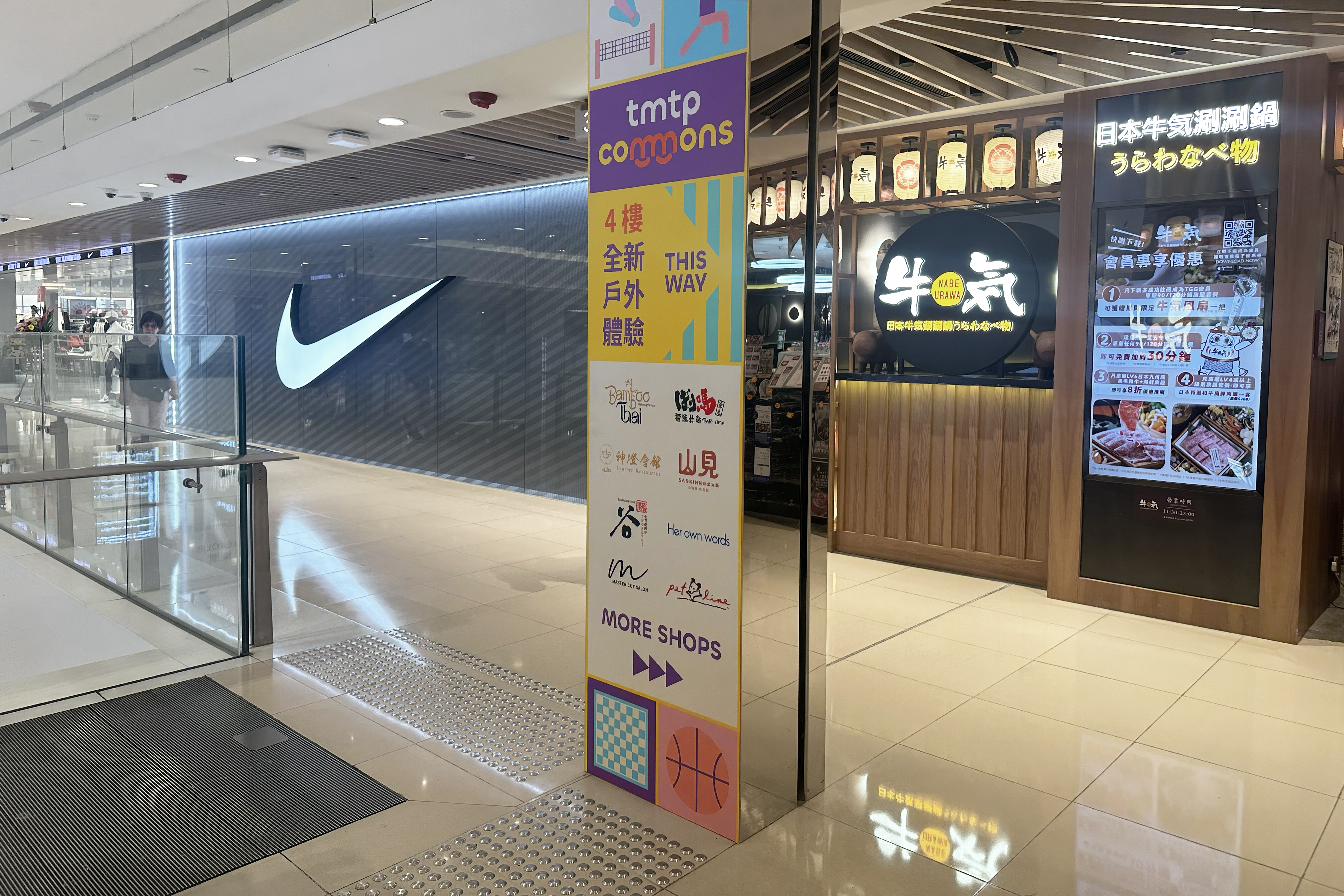
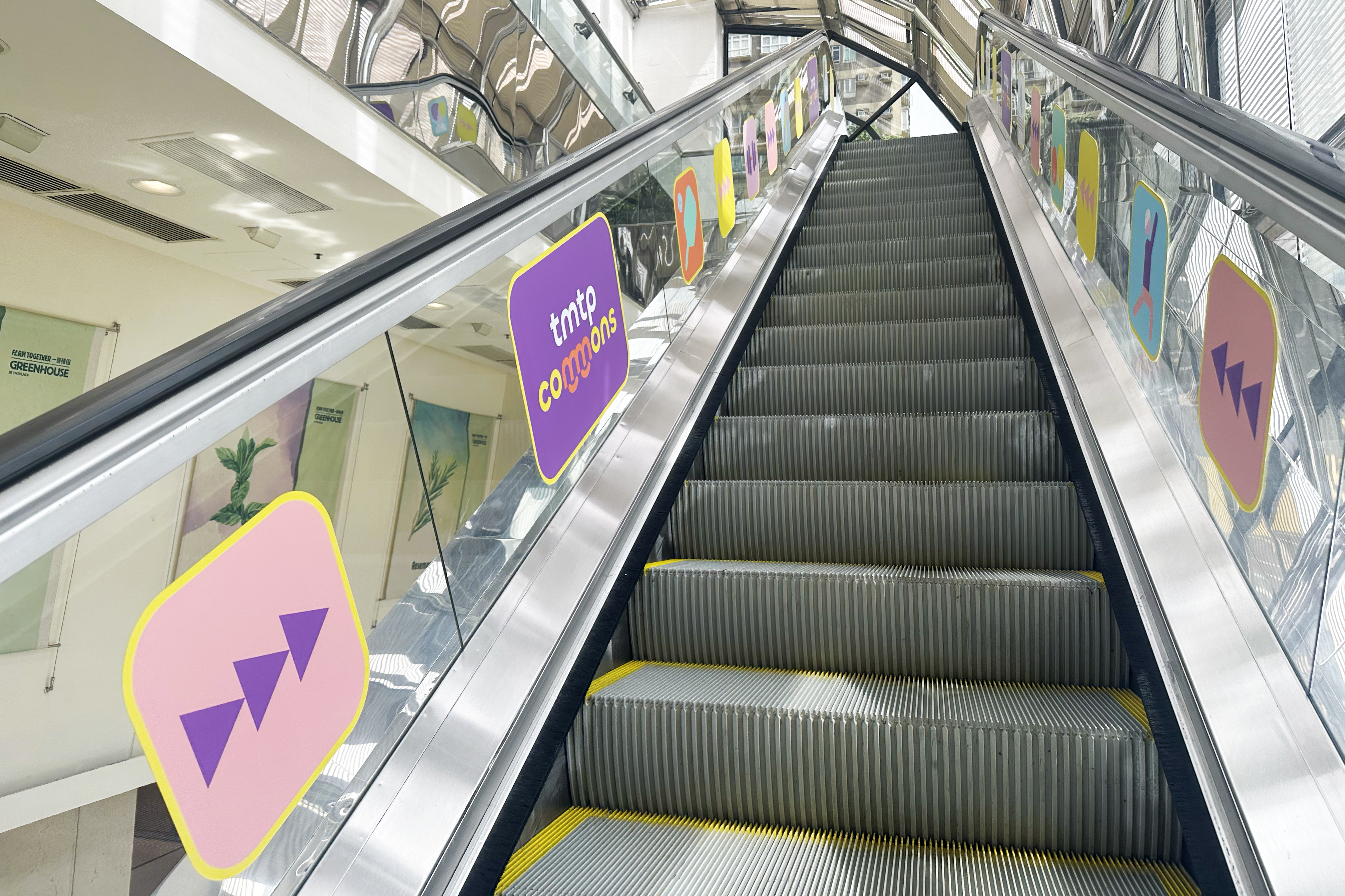
The Key Visual (KV) was executed as a simple, highly graphical, and modular pattern, designed to serve simultaneously as the brand’s primary visual support and a key navigational aid. The KV is structured as a grid-based mosaic of abstract icons, each concisely representing a core activity offered at the tmtp commons, such as wellness, sports, creative arts, and community engagement. This instantly and clearly communicates the variety and inclusivity of the space. The geometric, flat design ensures the visual remains modern, friendly, and highly legible across all applications . The modular nature of the grid is paramount for the identity’s practical use, allowing the pattern to be scaled, cropped, and rearranged seamlessly without losing brand integrity or recognition. This robust system is ideally suited for adaptation across all marketing touchpoints: from full, impactful patterns on large indoor banners to individual elements and smaller segments utilized on floor and escalator stickers. This ensures a visually consistent “bread crumb” trail that effectively guides visitors to the 4th-floor platform while simultaneously reinforcing the unique brand experience.
More case


Designing Purposeful Brand Identities for DFI
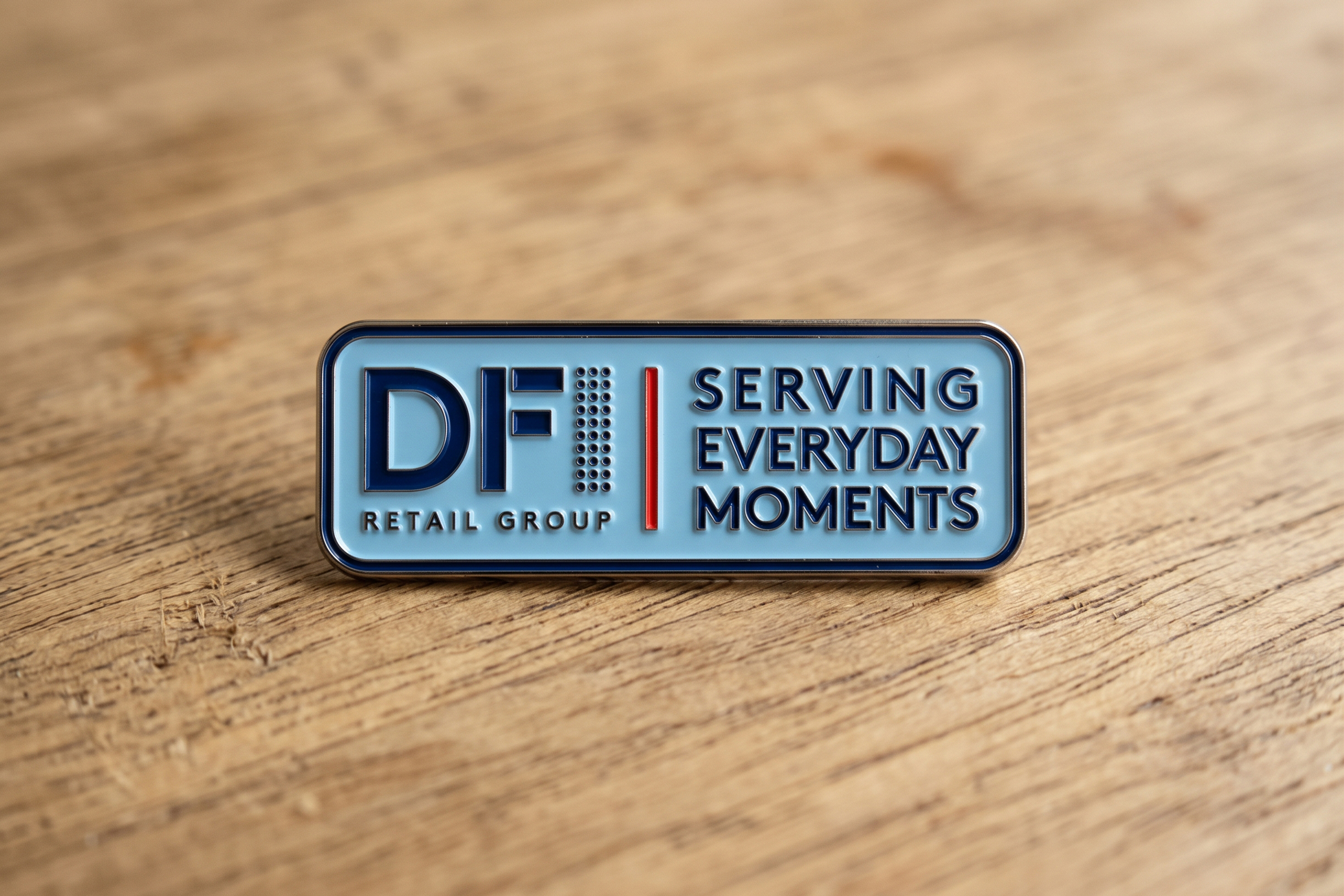
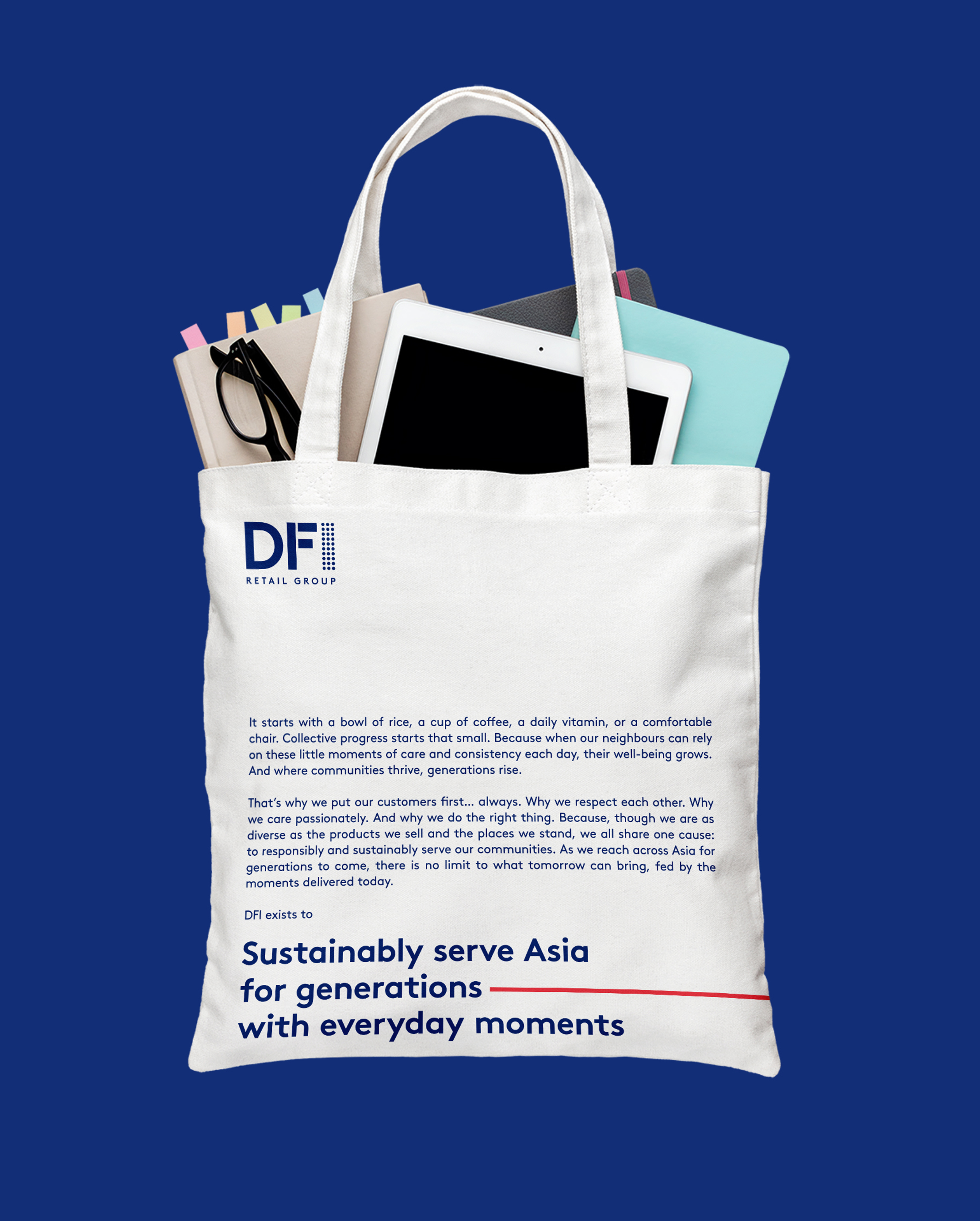
DFI Retail Group stands out in the Asian retail landscape, known for delivering quality, value, and exceptional service to its clientele through renowned brands and immersive retail experiences. Double Eleven had the privilege of leading a pivotal project – the identity design for DFI’s new brand purpose collateral development. Our team meticulously developed a versatile design system that seamlessly integrates the brand’s slogan, statement, and narrative with its established corporate image.

CONCEPT
At the core of our design concept is the deliberate use of a dash to accentuate the brand purpose as a memorable quote. This dynamic red line, vibrant and captivating, encapsulates the energy, passion, and proactive dedication of DFI towards enhancing the daily experiences of its customers. Emerging from the left, where the brand purpose slogan and statement reside, the dash signifies the dawn of a new day. It extends fluidly to the right, surpassing the boundaries of the canvas, symbolizing an enduring journey of customer service and sustainable adaptation to their evolving needs.


More case


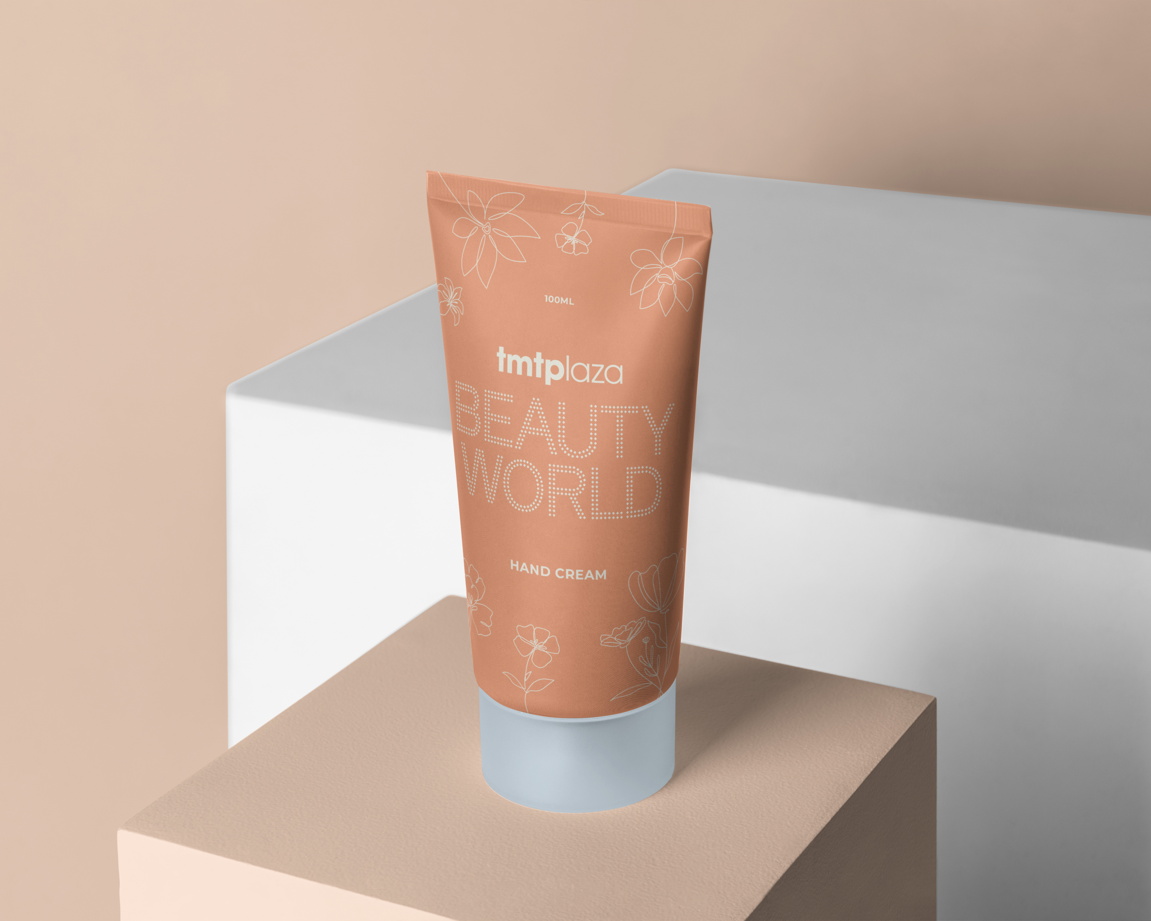


tmtplaza Beauty World Campaign
The tmtplaza Beauty World campaign is a seasonal promotional initiative comprising a lucky draw, stamp rewards scheme, and exclusive offers on select beauty and skincare products from a diverse array of brands. Our assignment entailed the comprehensive redesign of the campaign’s key visual, which encompassed the identity system, color palettes, and supplementary graphics. Our proposal advocates for the incorporation of a nude color palette throughout the campaign to underscore a refined and feminine aesthetic that aligns seamlessly with the overarching theme. Additionally, we recommended the subtle integration of floral line drawings to embellish all marketing materials cohesively.


More case


Urban Bee Keeping at Sino Group
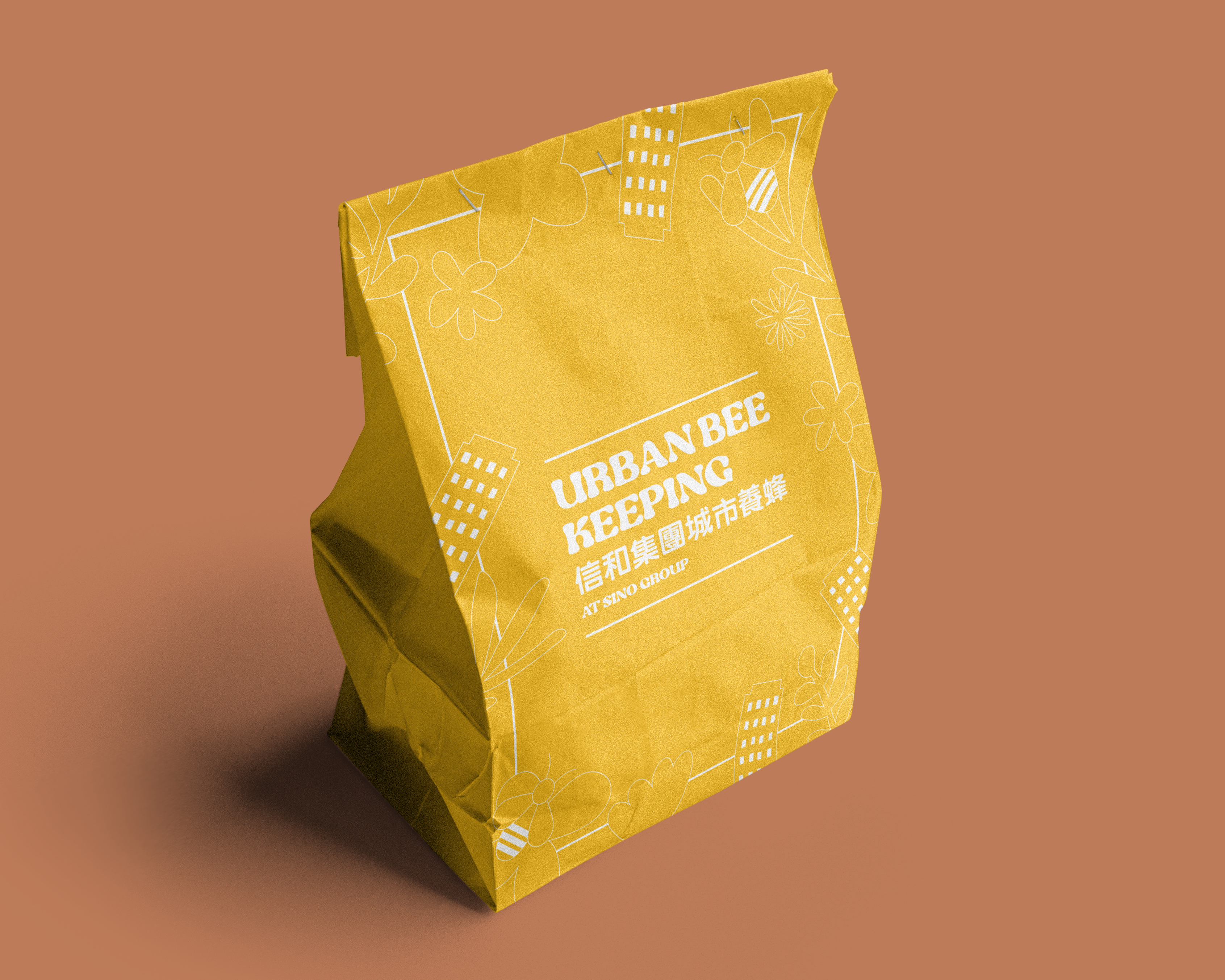
Sino Group and tmtplaza, in collaboration with local beekeeping and environmental conservation group “Eco Pioneer,” initiated the Urban Bee Keeping Program to contribute to bee conservation efforts. They utilize the harvested “Tuen Mun Honey” from the Tuen Mun beehives to create a range of exclusive products, showcasing the unique honey from Tuen Mun. Double Eleven was responsible for designing the entire campaign’s main visual, including the campaign logo and supporting graphics for various promotional materials. The campaign logo features a font that resembles flowing honey, evoking the theme of the campaign. The main visual primarily uses the color of honey as the background, with simple and abstract lines depicting bees, city buildings, and plant shapes, creating a cohesive promotional concept and image for the campaign.
Service


More case
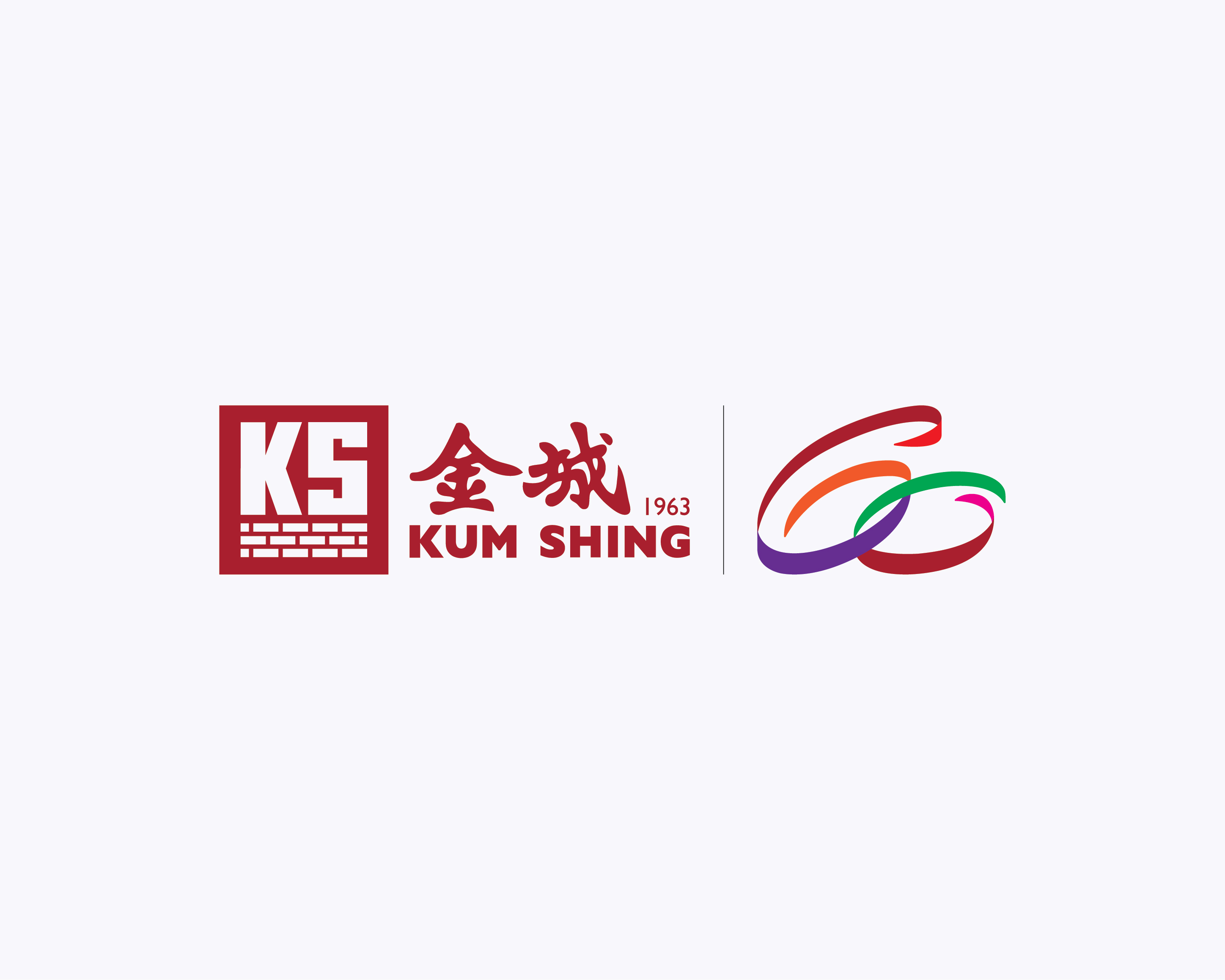
Kum Shing 60th Anniversary Logo
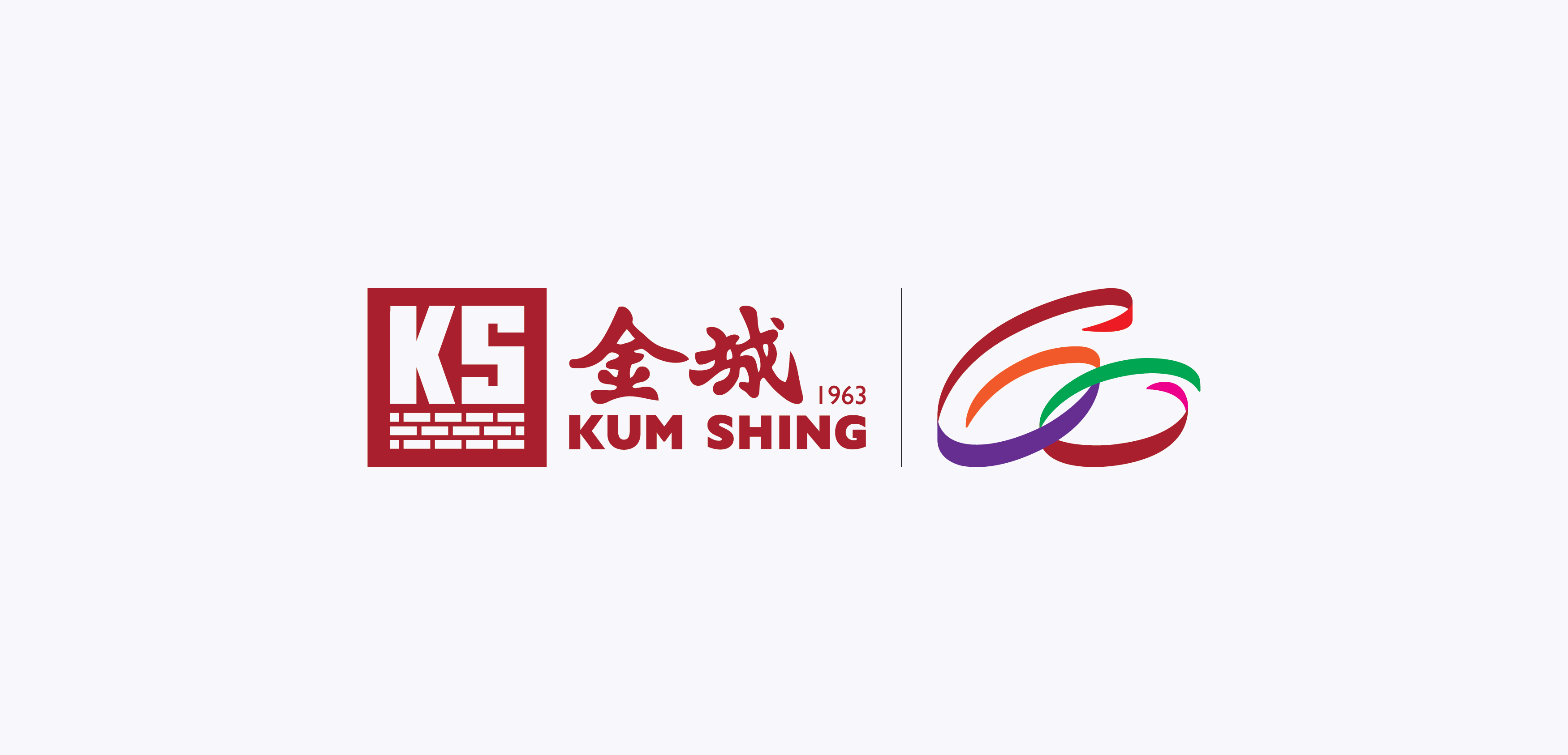
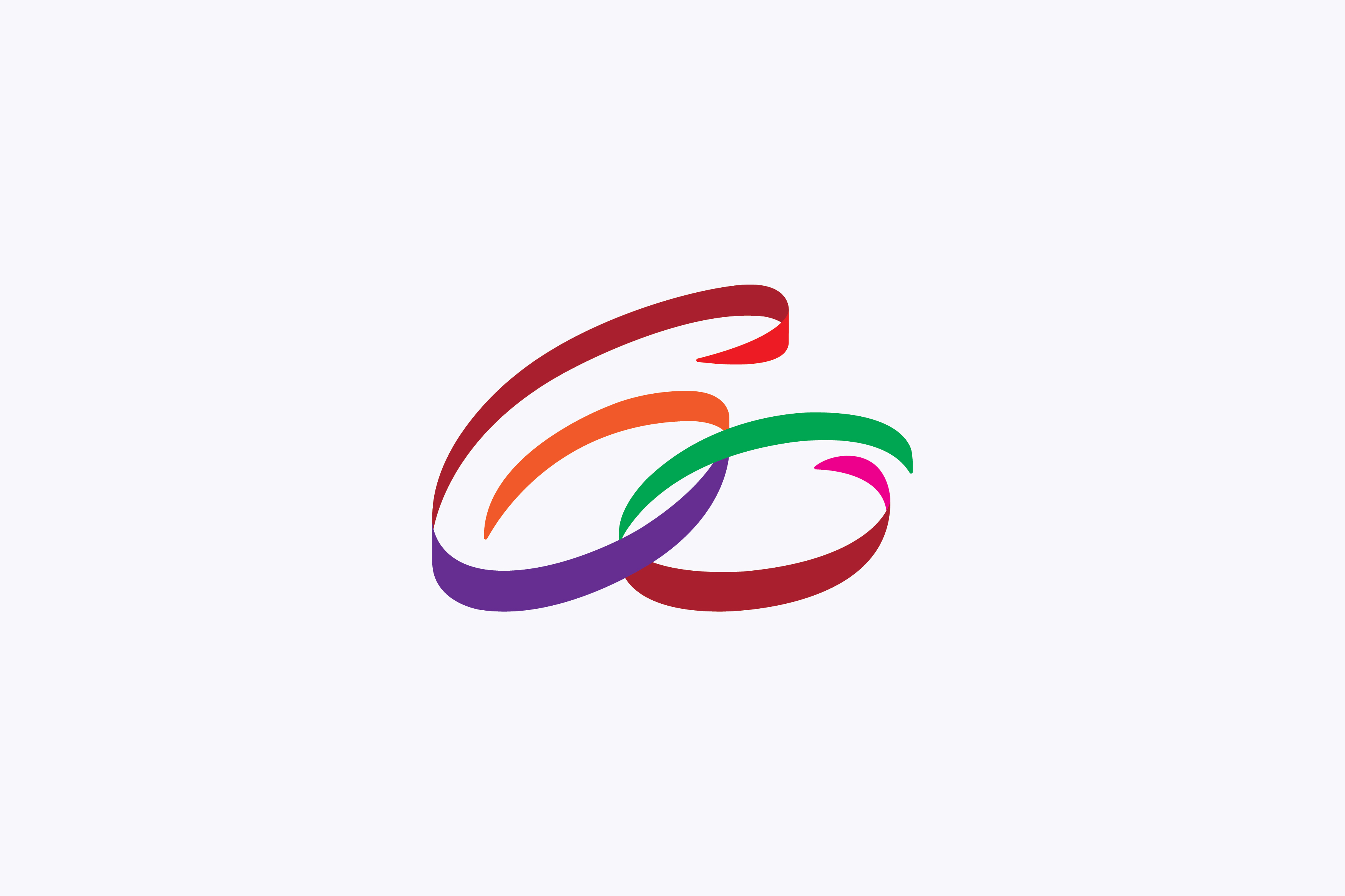
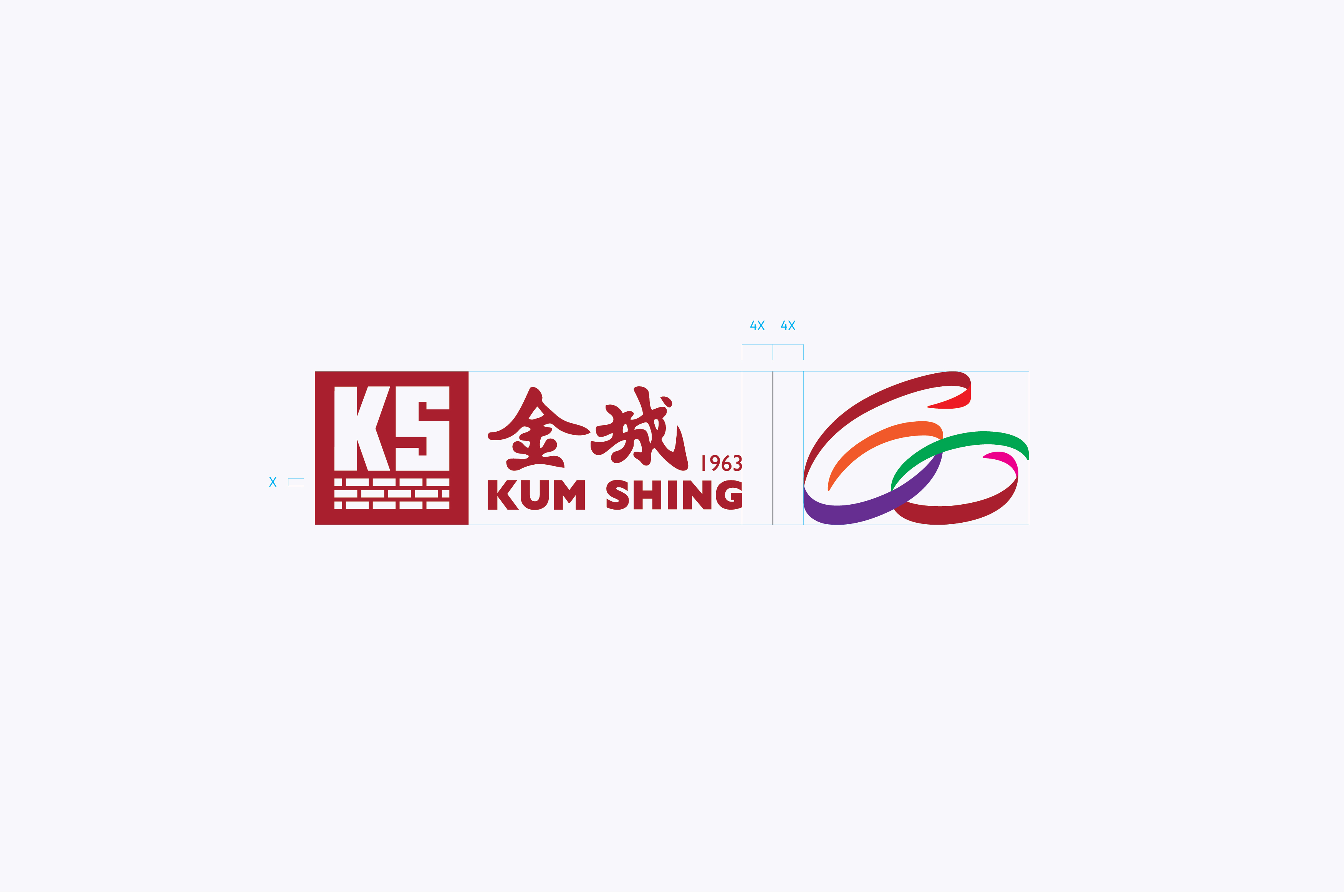
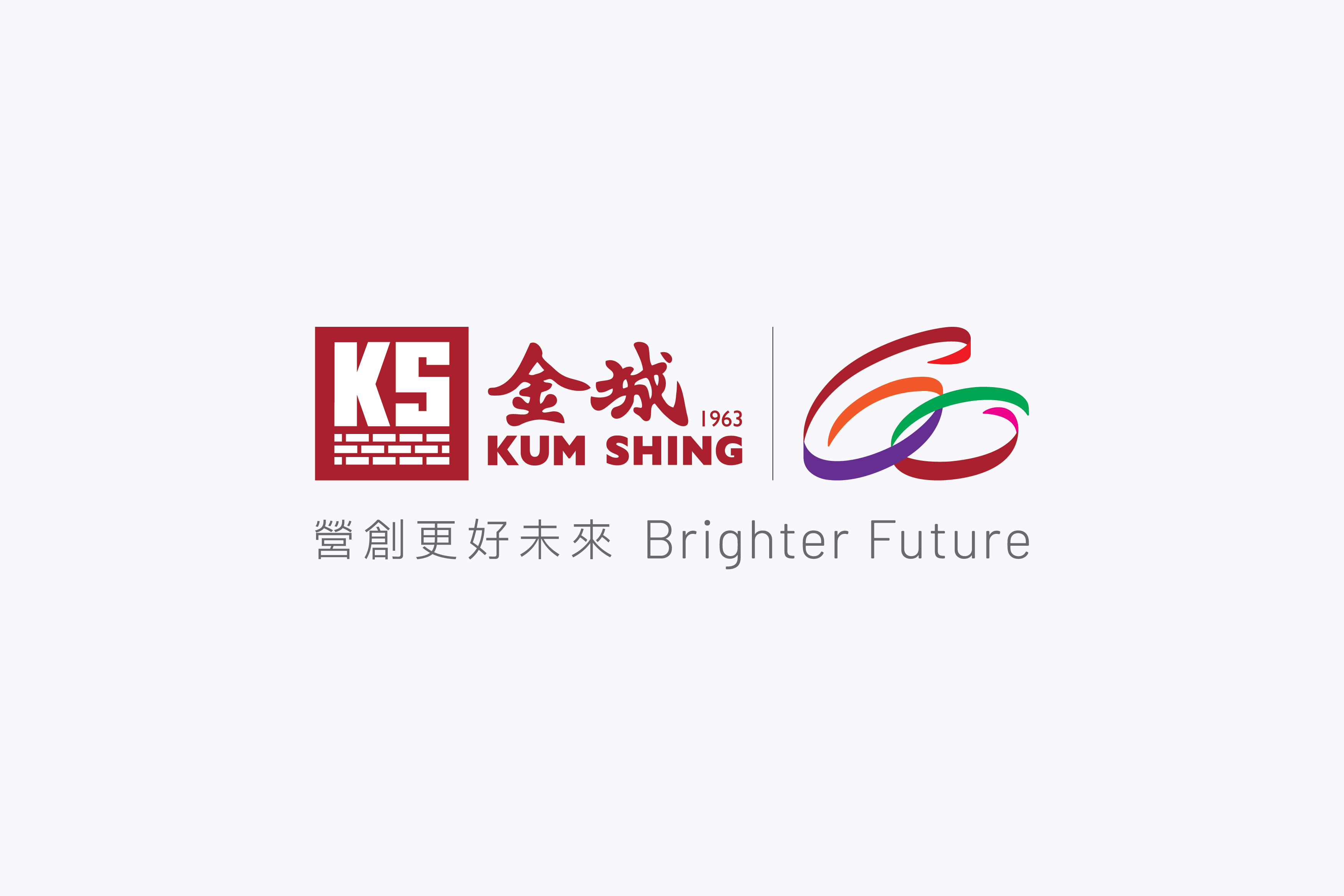
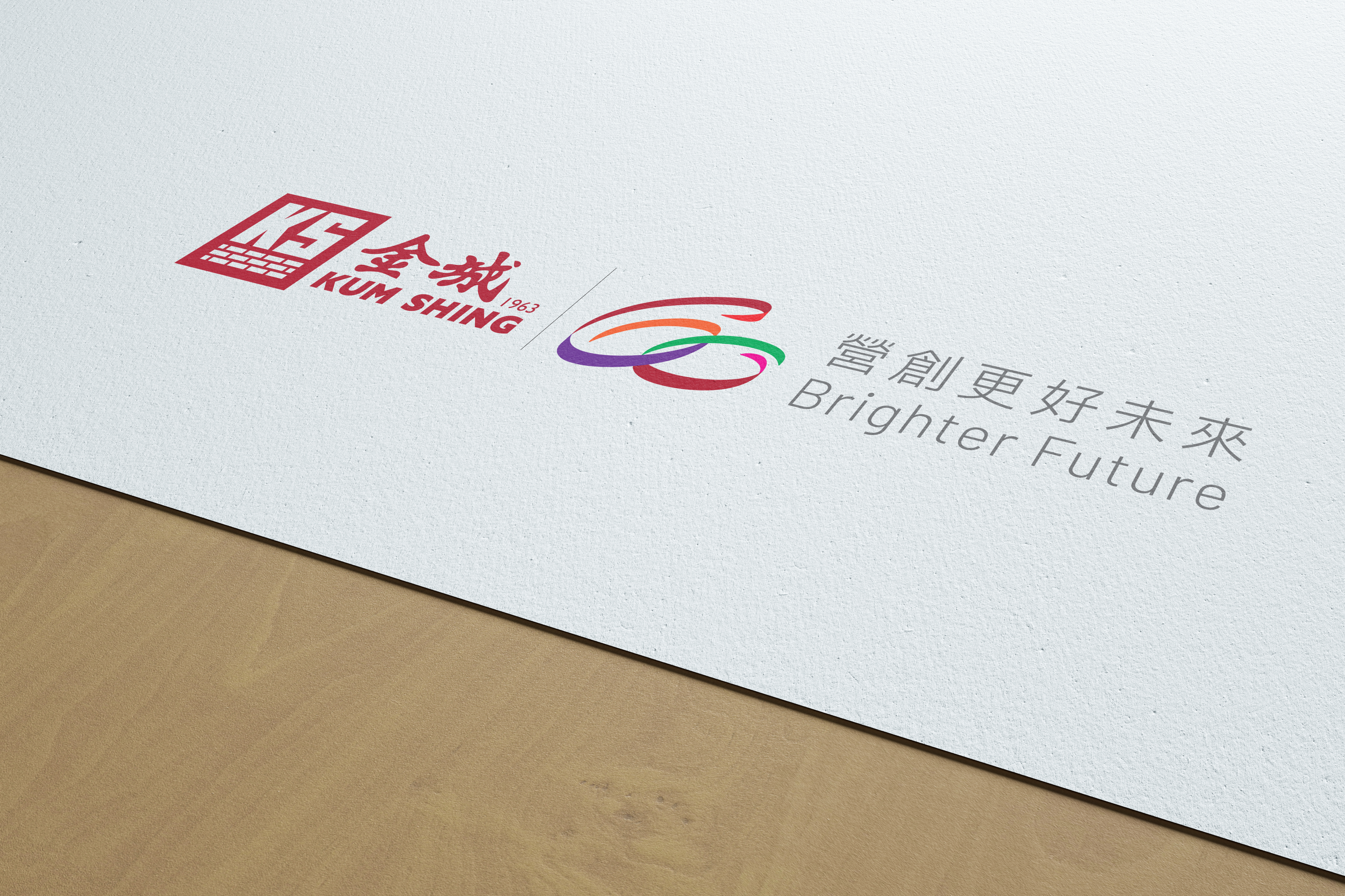
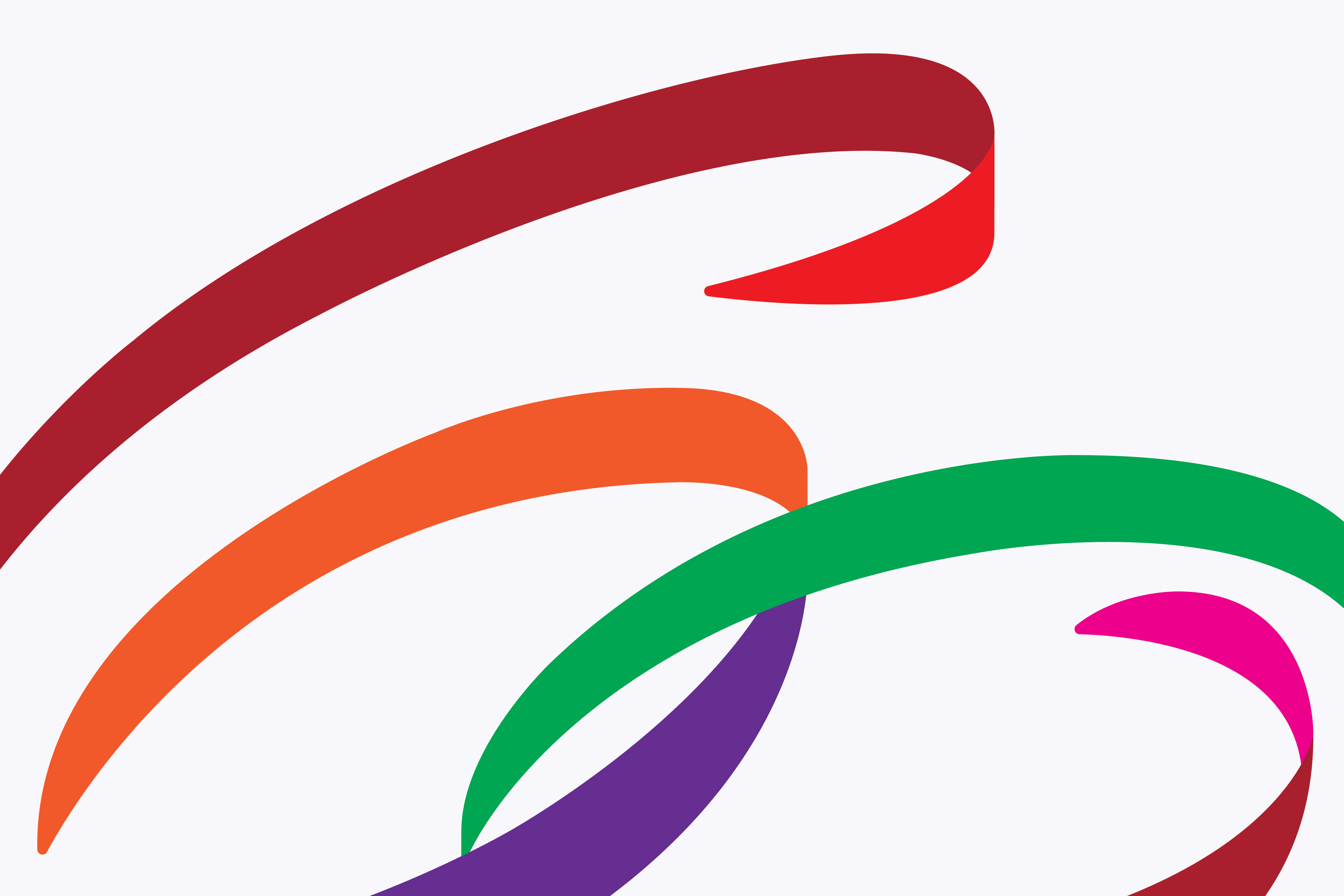
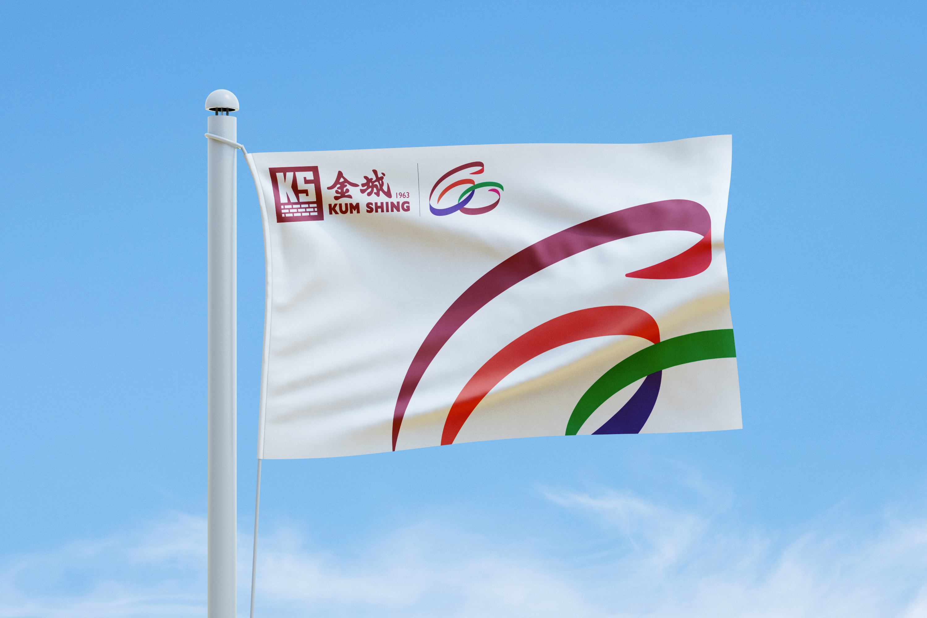
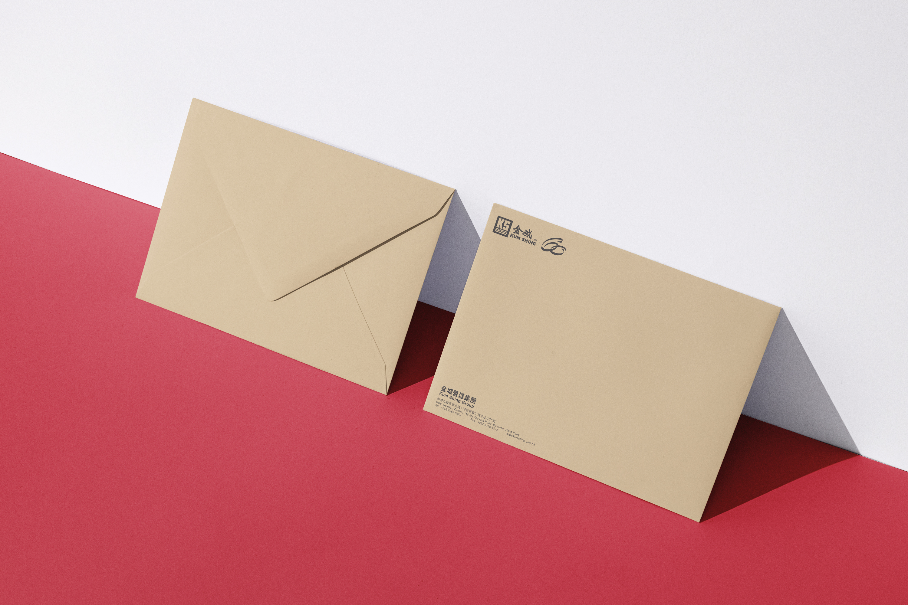
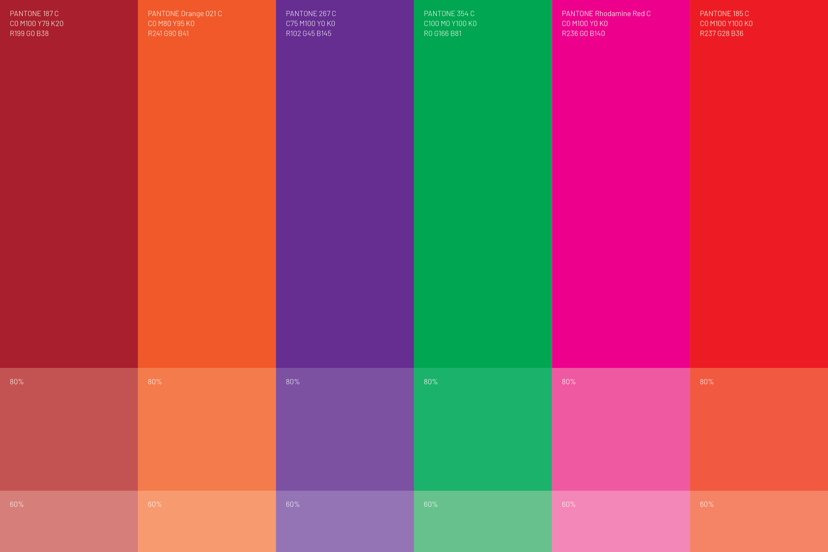
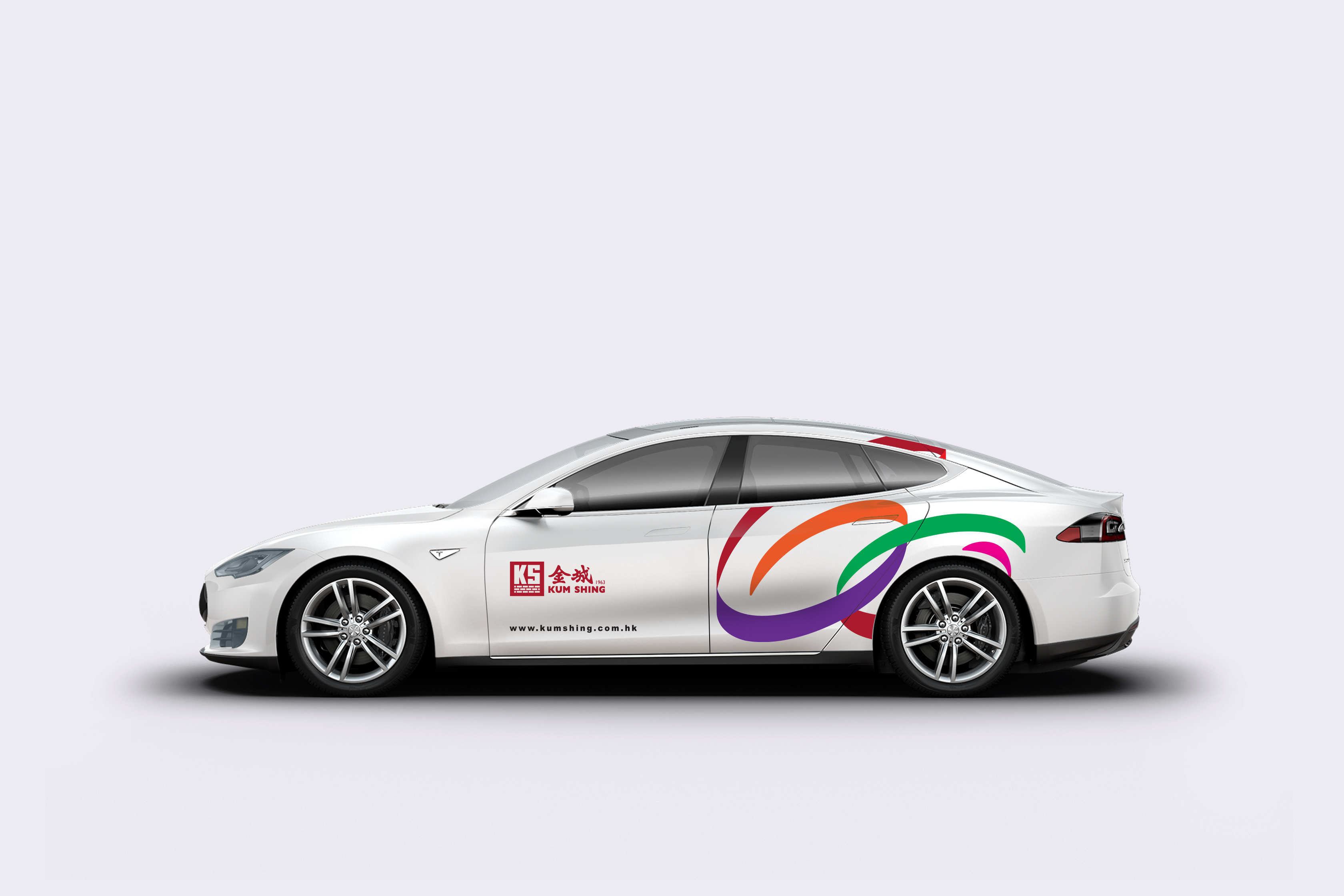
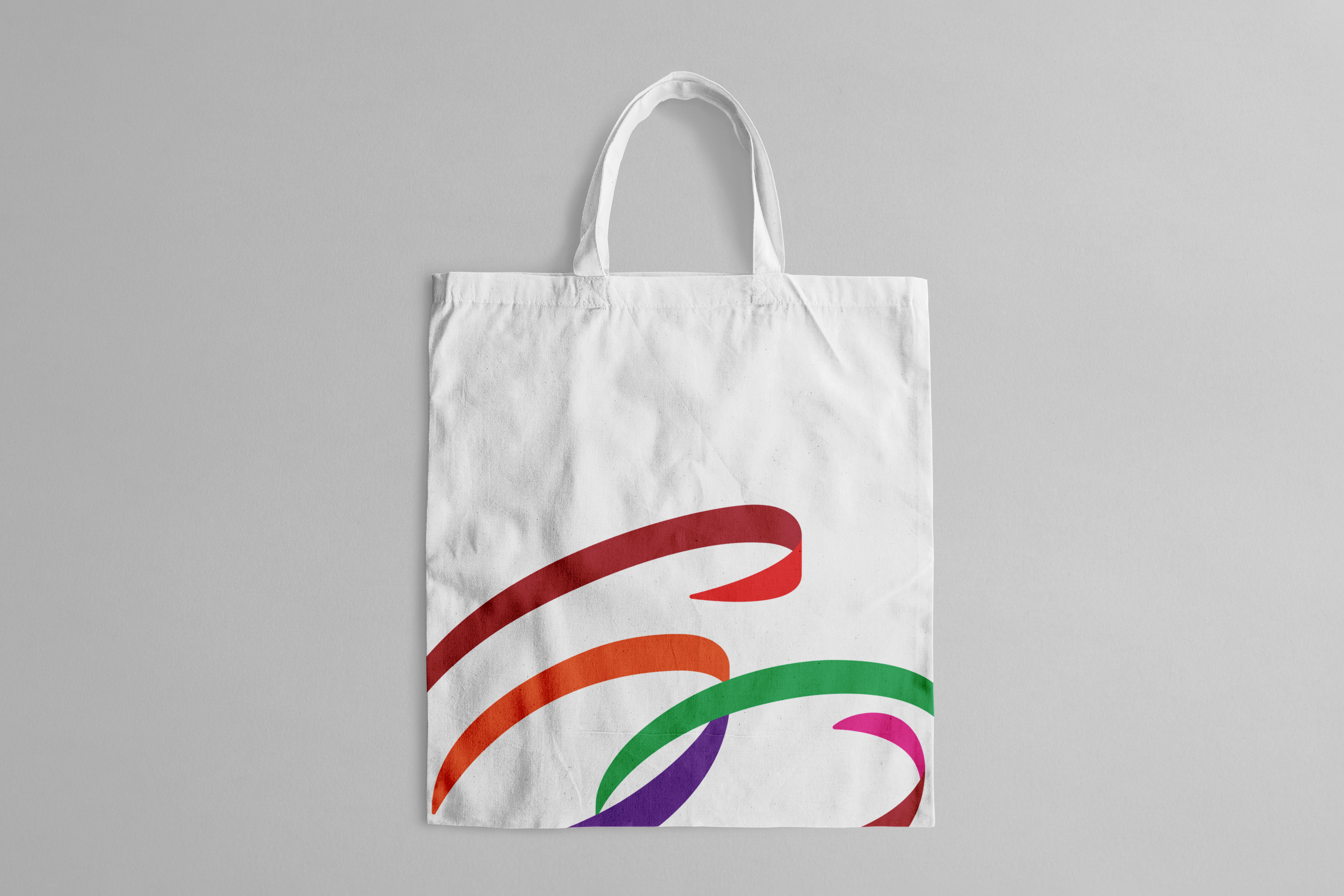
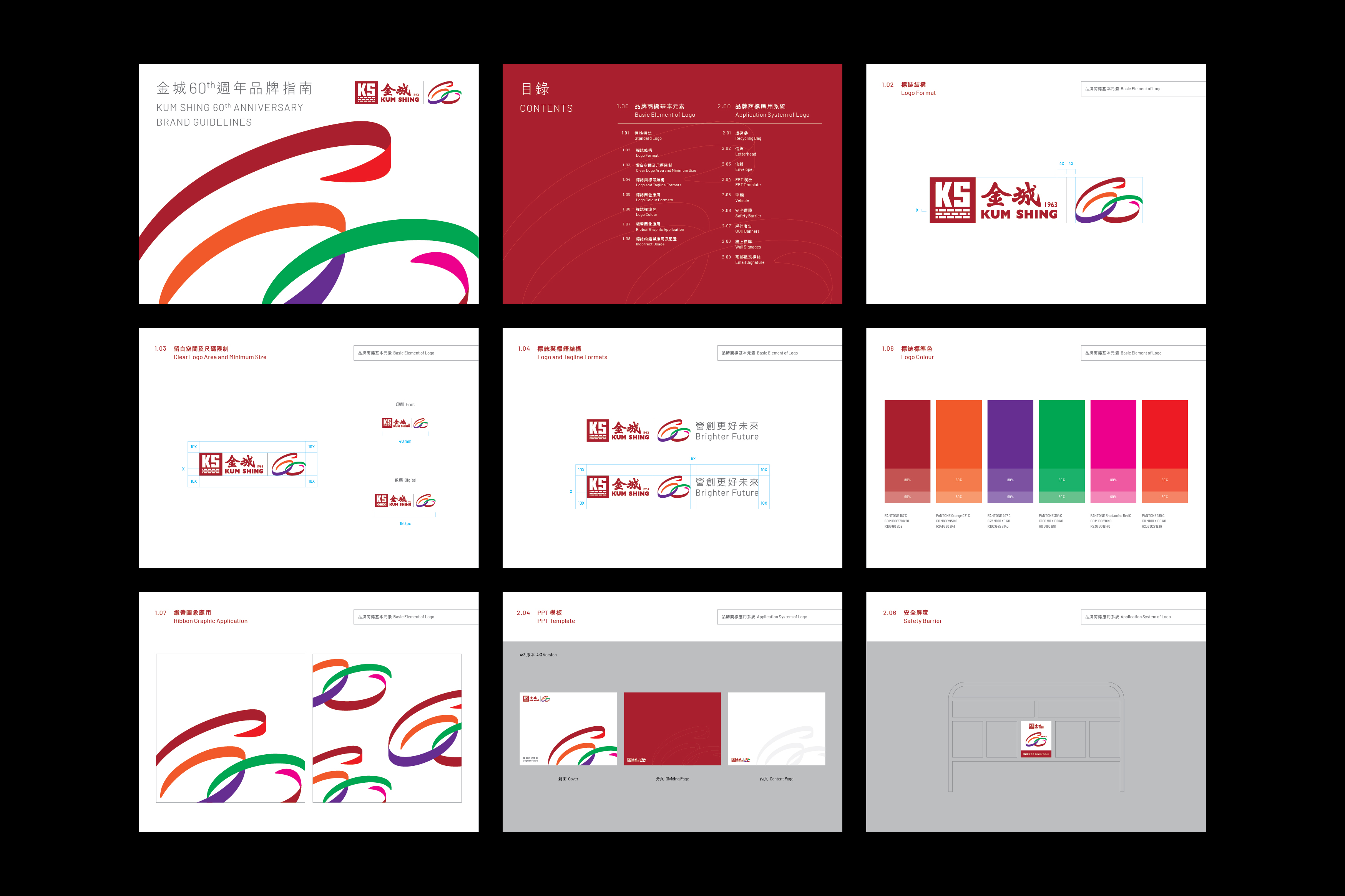
Established in 1963, Kum Shing has been at the forefront of Hong Kong’s energy infrastructure development, operation, and maintenance for several decades. This year, Double Eleven was entrusted with the task of designing a commemorative logo for their 60th anniversary, one that seamlessly integrates with their existing corporate logo. The new logo, created to celebrate Kum Shing’s milestone, presents a fresh interpretation of the numbers “6” and “0” through intricately woven ribbons in five vibrant colors. Two circles symbolize the inception and culmination of a cycle, embodying the company’s unwavering commitment to continuous progress as it enters a new era. The first ribbon, rendered in the company’s signature red hue, signifies the foundational pillars of Kum Shing’s four primary business sectors. Meanwhile, the green ribbon represents their steadfast dedication to fostering positive transformation and sustainable development within both the industry and society. The 60th Anniversary logo, proudly showcased across digital and physical platforms, serves as a joyous celebration shared by the entire Kum Shing family and the wider community.
Service
More case


Creative Tomorrow by West Kowloon
Visual identity and brand guideline design for the brand new performing arts season “Creative Tomorrow” launched by West Kowloon Cultural District Authority exploring the possibilities of technology and art.
Service


More case