tmtp commons. An identity built around connection.
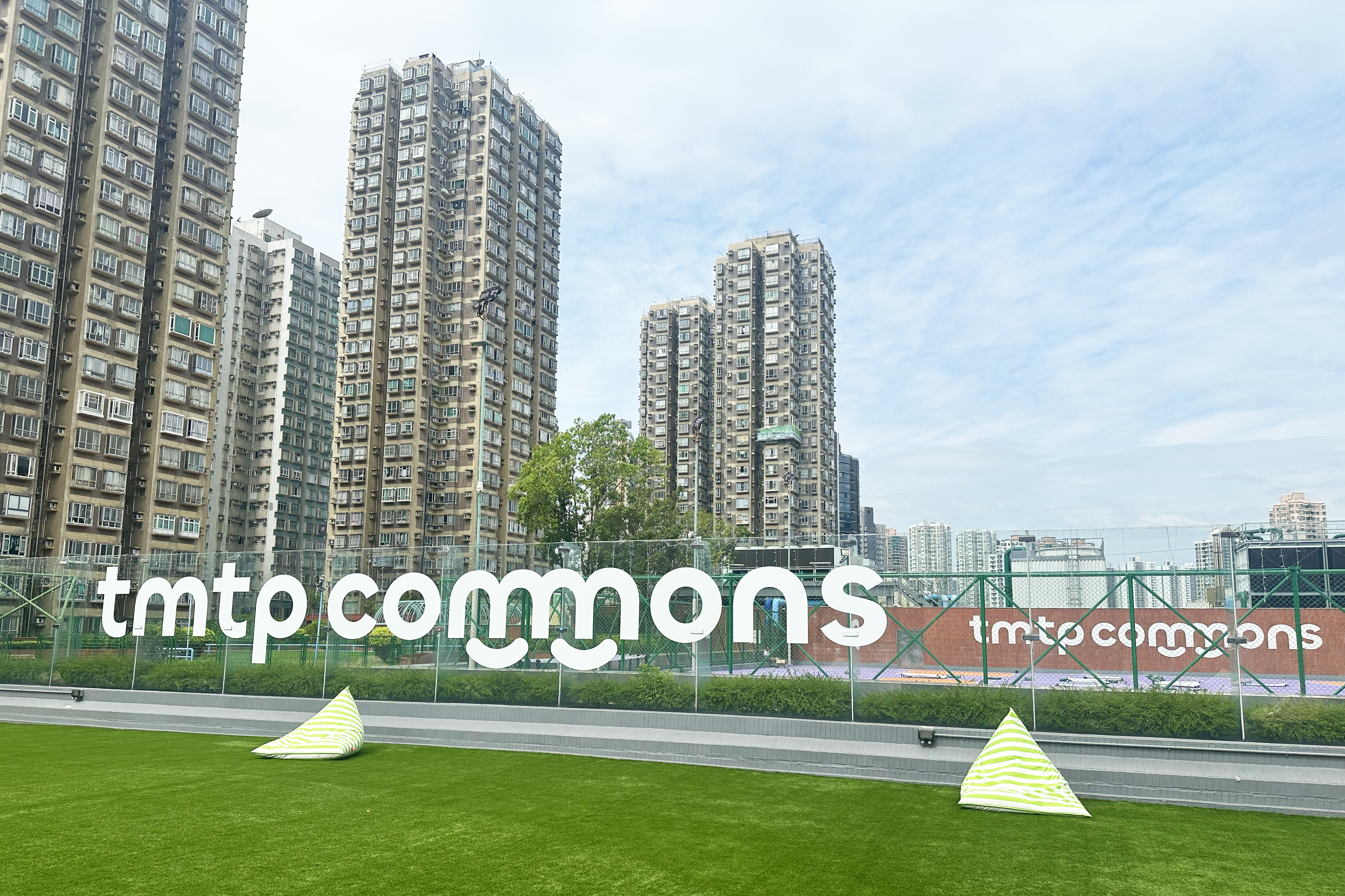
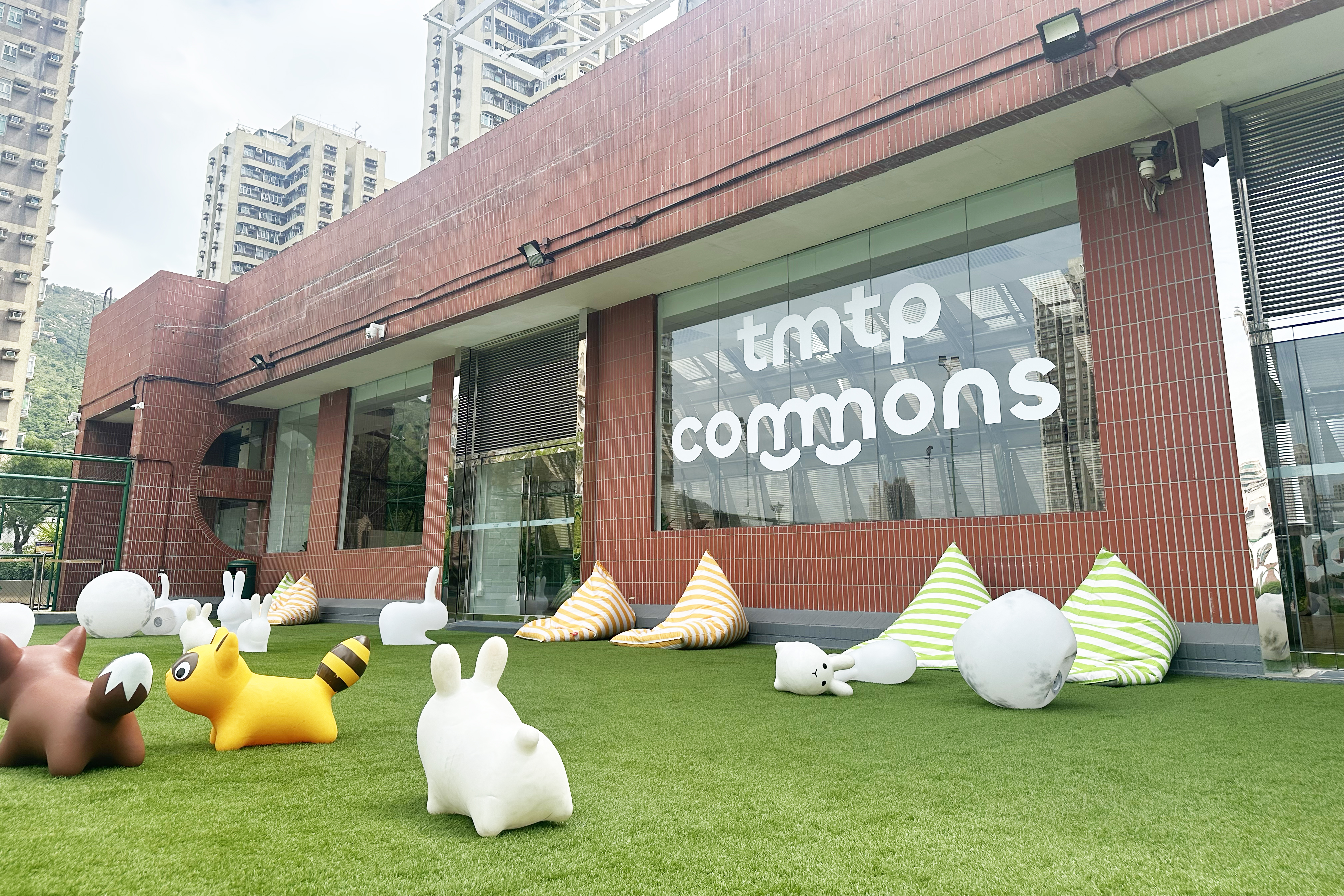
Tuen Mun Town Plaza set out to transform an existing fourth-floor platform into tmtp commons, an open-air shared space for the community. Its programme spans wellness, sustainable living, creative workshops, learning and community services. We were asked to create an identity that could hold this diversity together: one that feels open and welcoming, carries a clear sense of optimism, and actively draws people through the mall to a new destination.
Service
CONCEPT
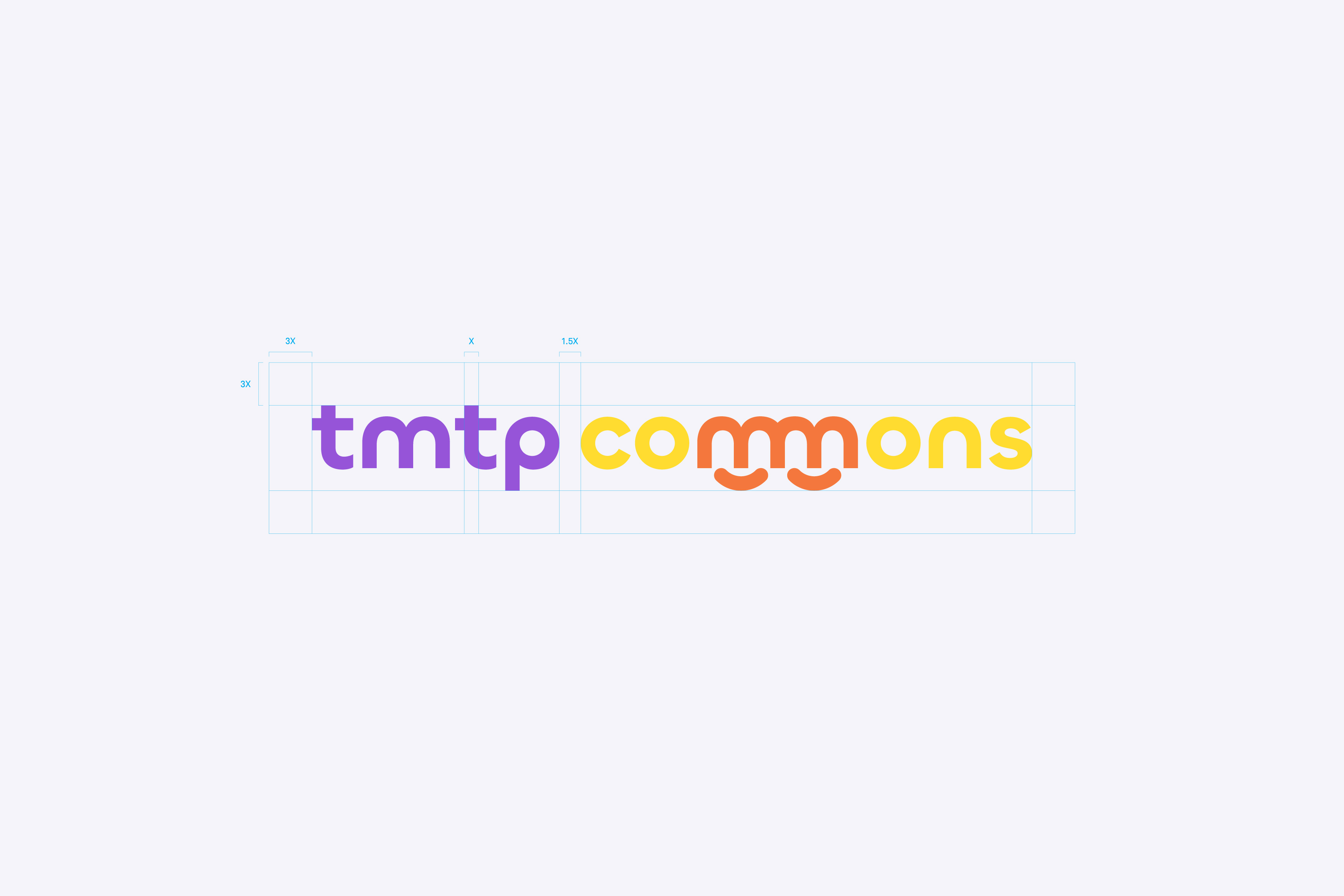
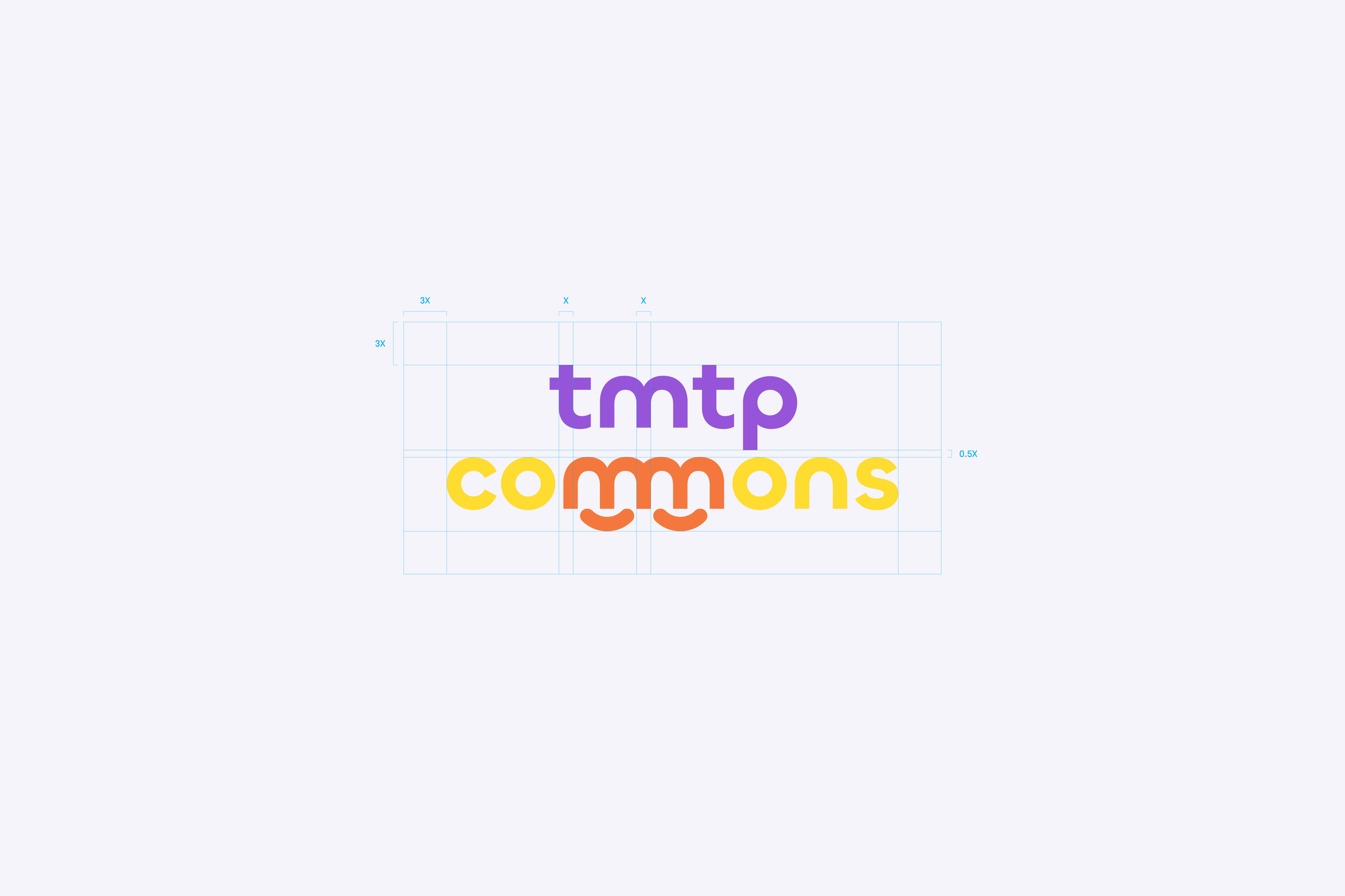
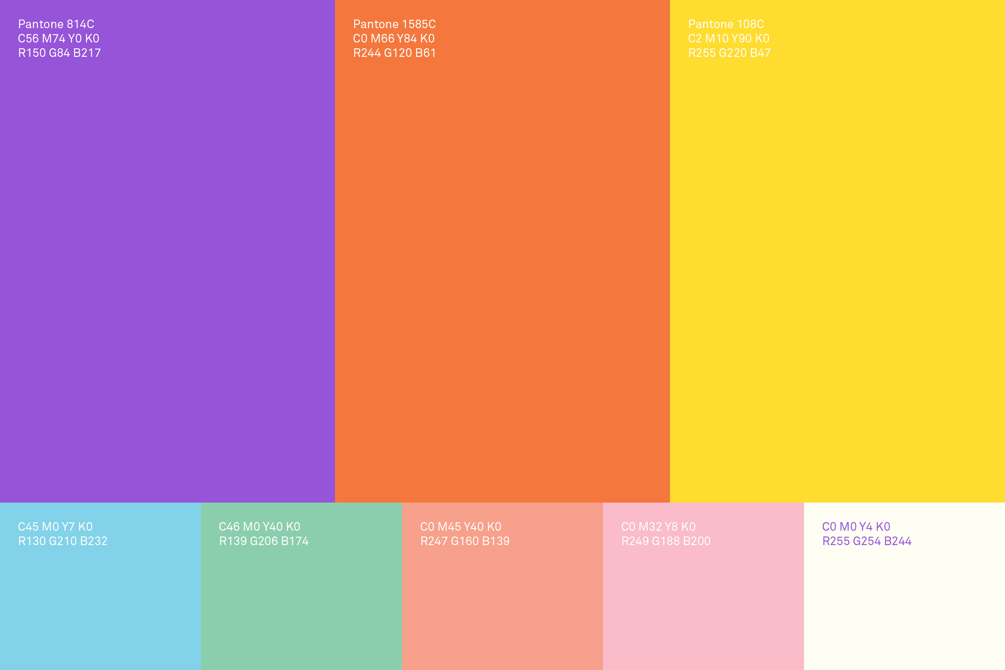
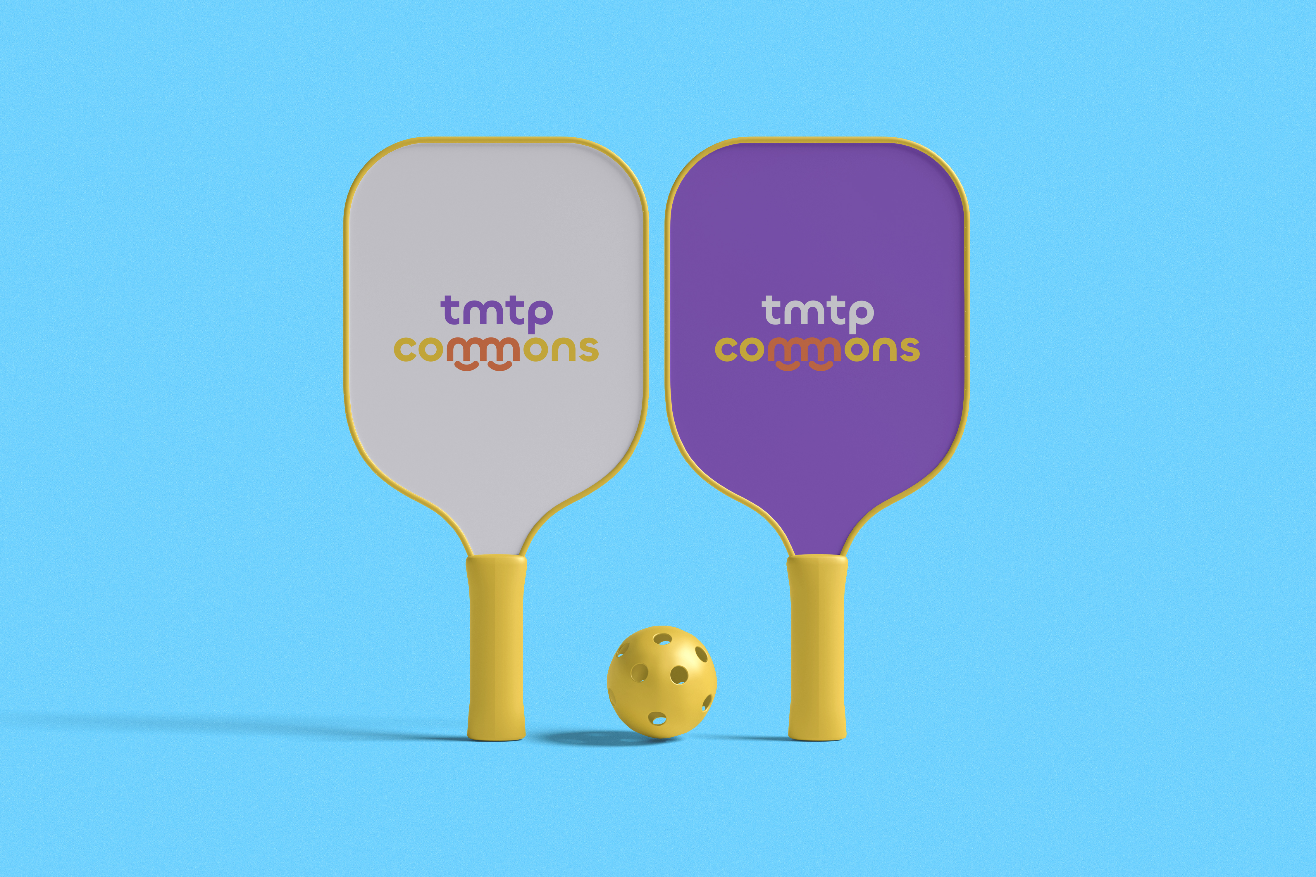
The core concept for the tmtp commons identity is deeply rooted in the principles of connectedness, movement, and emotional warmth, accurately reflecting the space’s role as a nexus for community activity. The logotype itself is the central conceptual pillar, featuring a unique, playful treatment of the double “m” in “commons.” By intentionally linking these letters, we established a powerful symbolic representation of Continuity, suggesting a seamless flow of ideas and collective process; Movement, with the rhythmic, wave-like pattern embodying the energy and dynamic spirit of a lively community hub; and Connectedness, where the interconnected curves symbolize collaboration, support, and the harmony of diverse elements working together. Crucially, this linked “m” formation abstractly forms two smiles. This universally recognized symbol of happiness and positivity establishes an immediate, emotional connection, communicating warmth, care, and a welcoming atmosphere. This is further supported by a bright, high-contrast color palette of vibrant purples, yellows and oranges which was deliberately chosen to express a joyful and energetic vibe that synchronizes with the brand’s holistic value and optimistic tone.
THE MODULAR KEY VISUAL
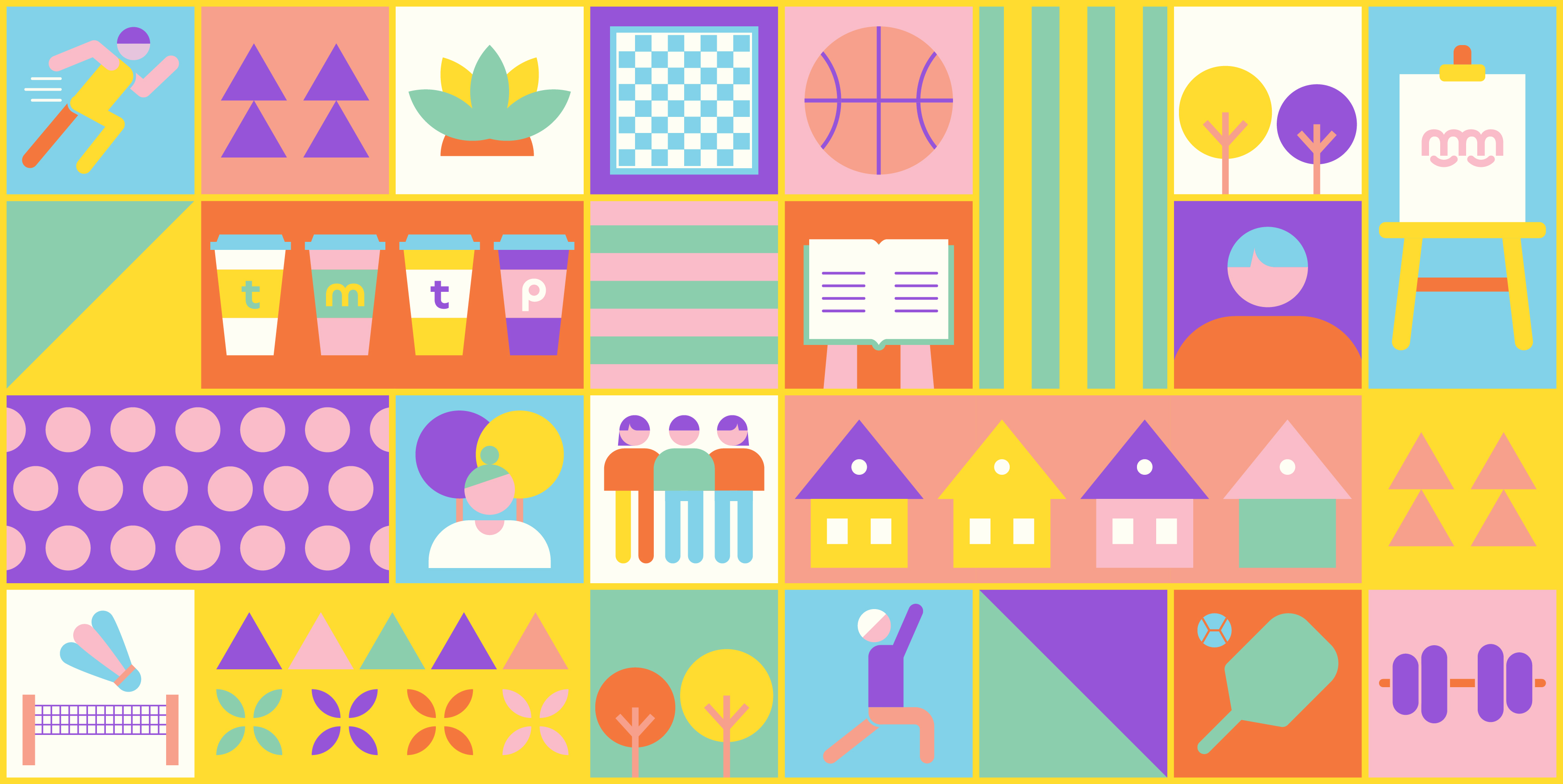
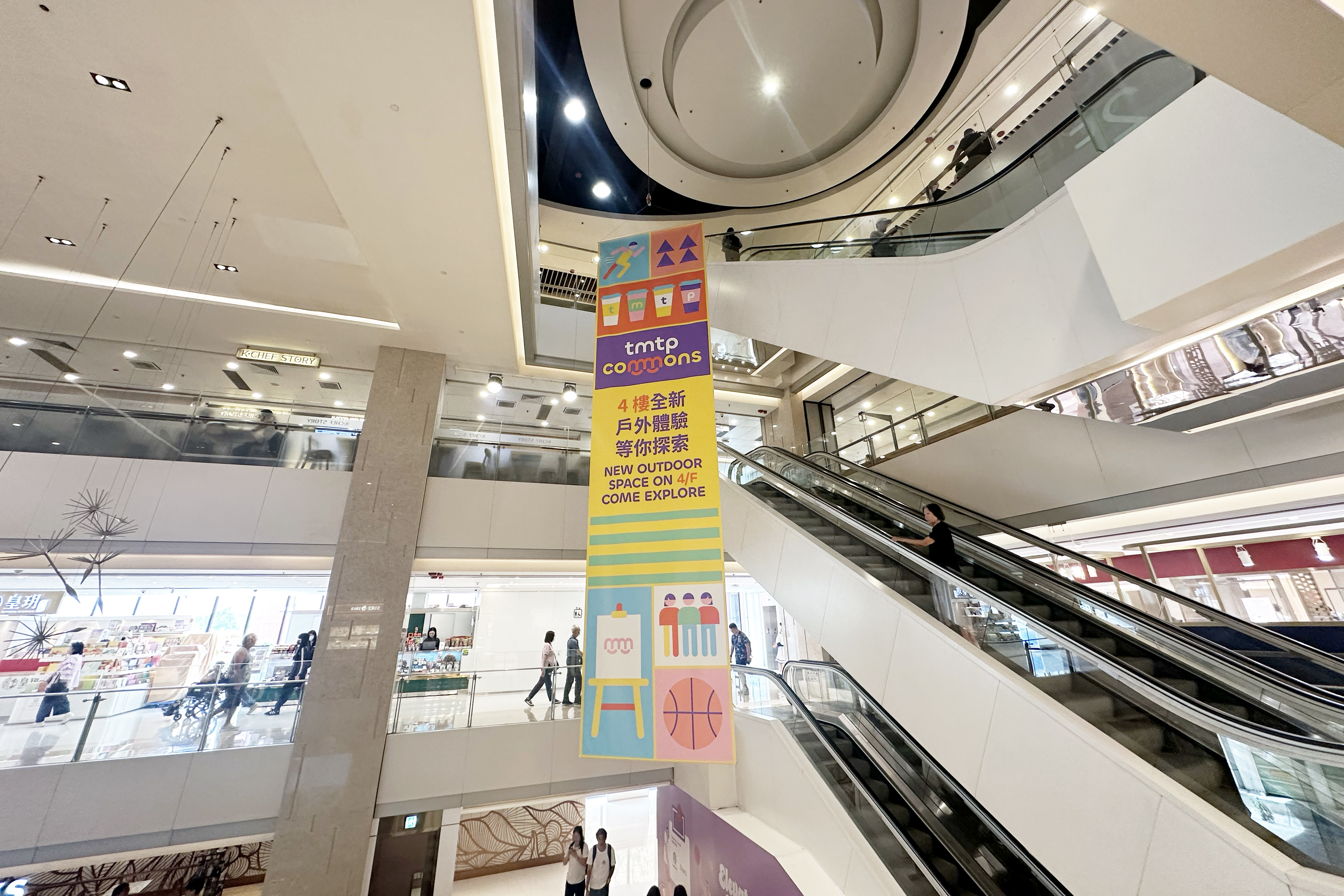
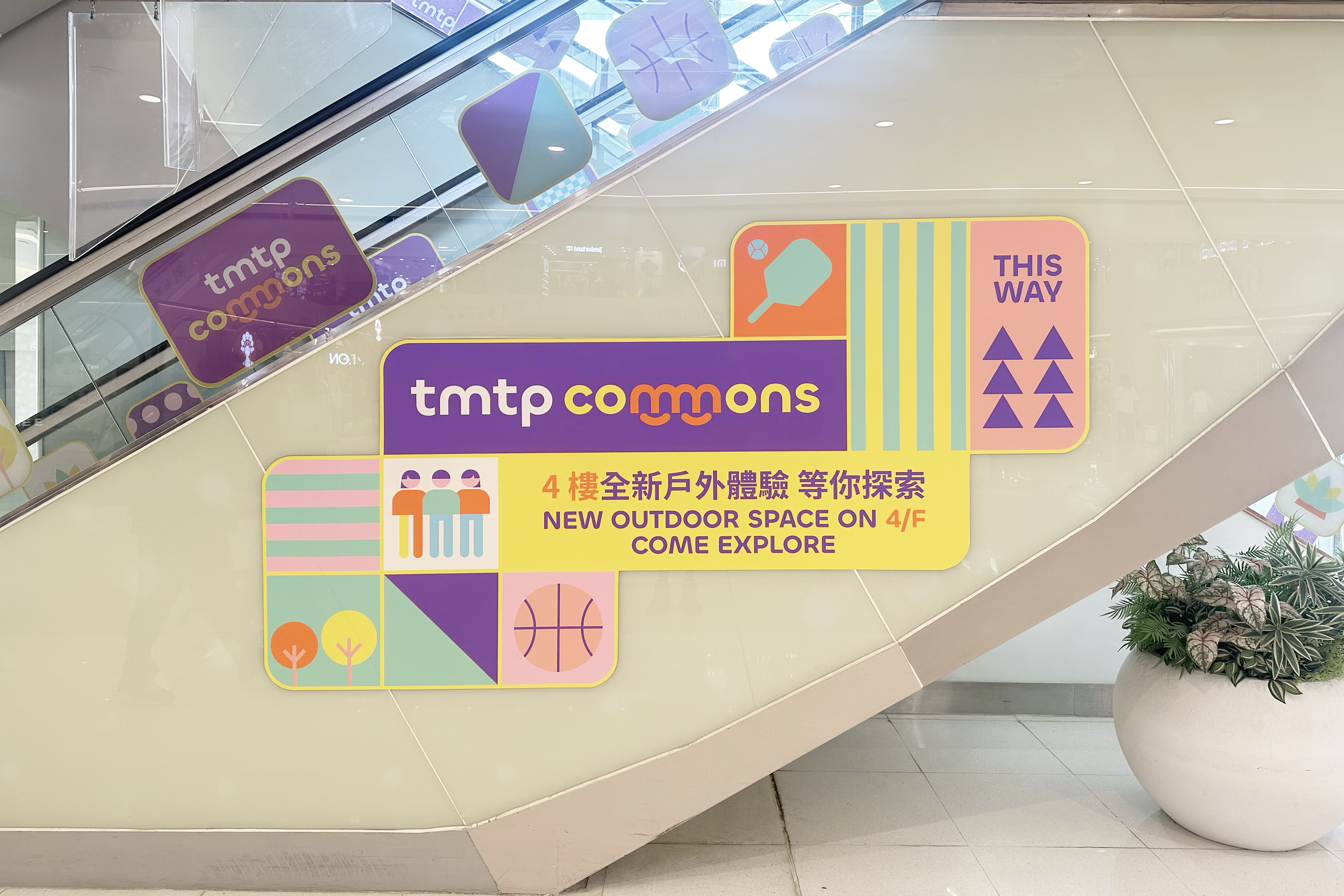
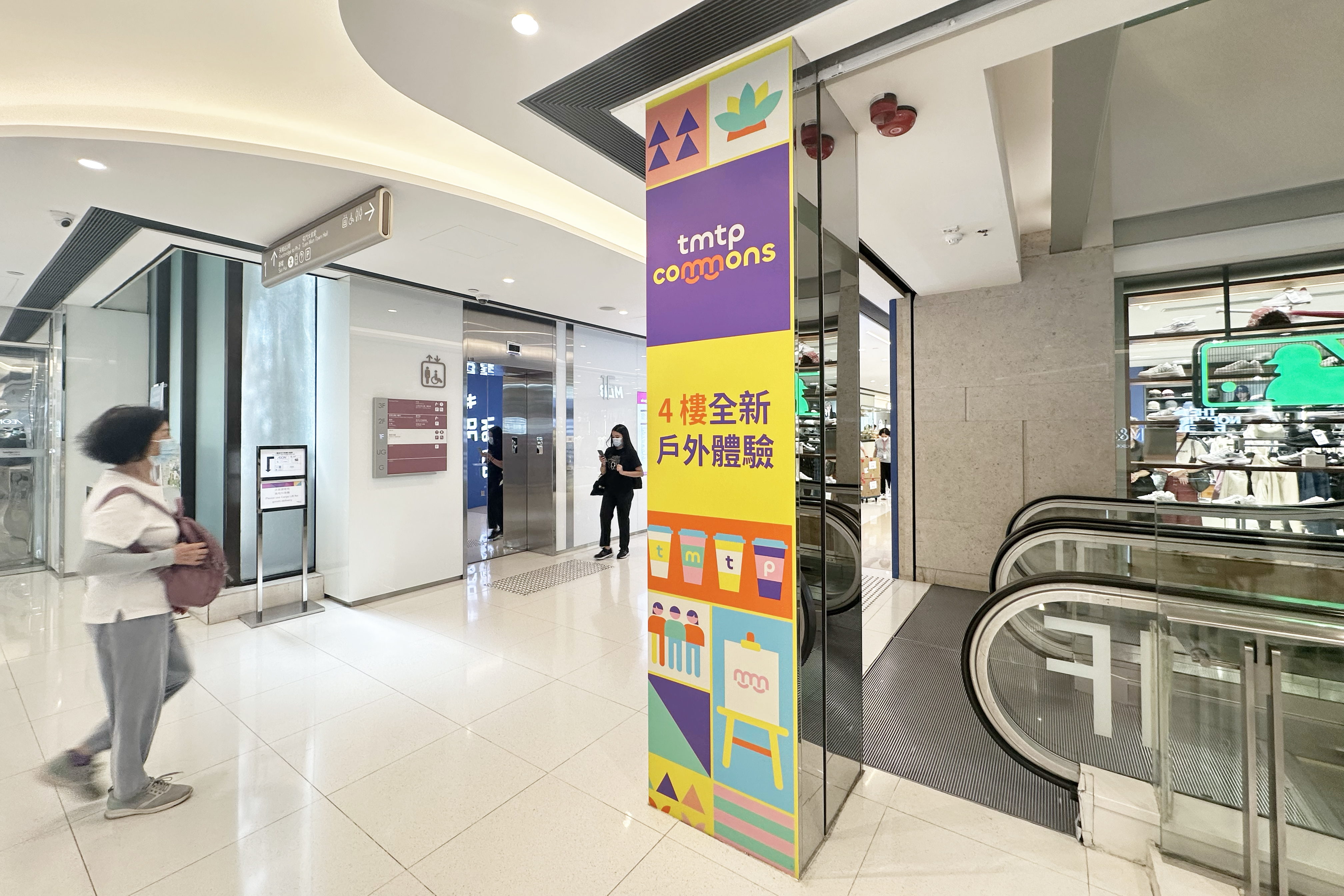
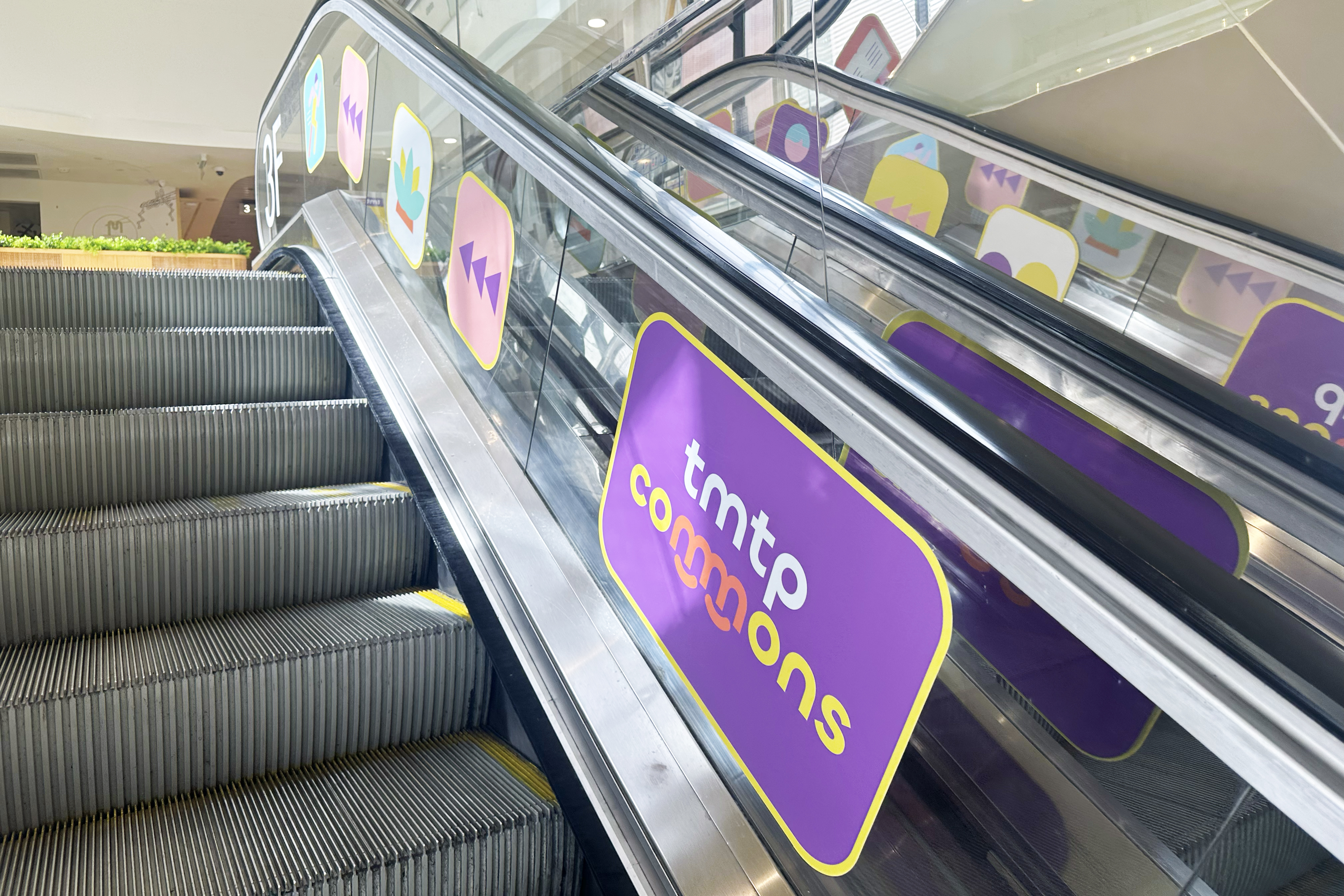
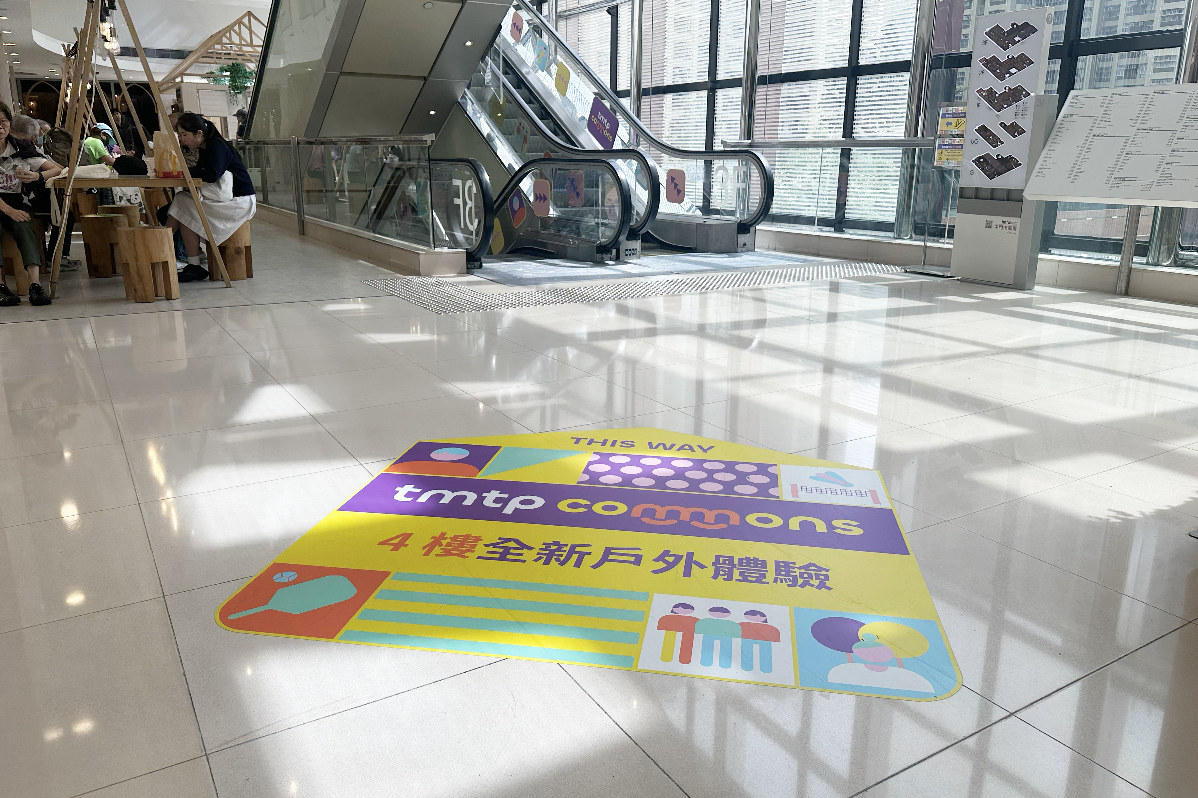
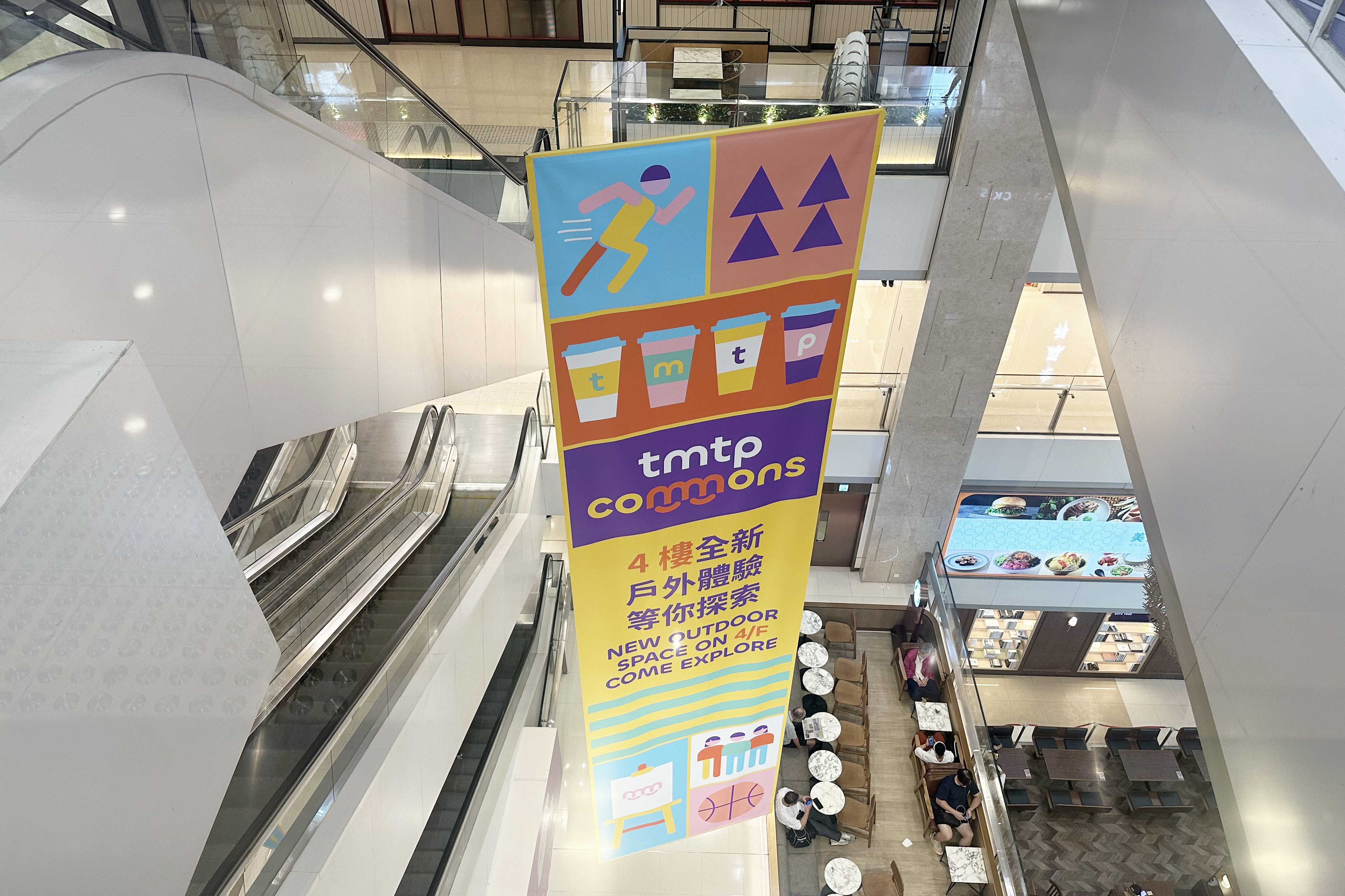
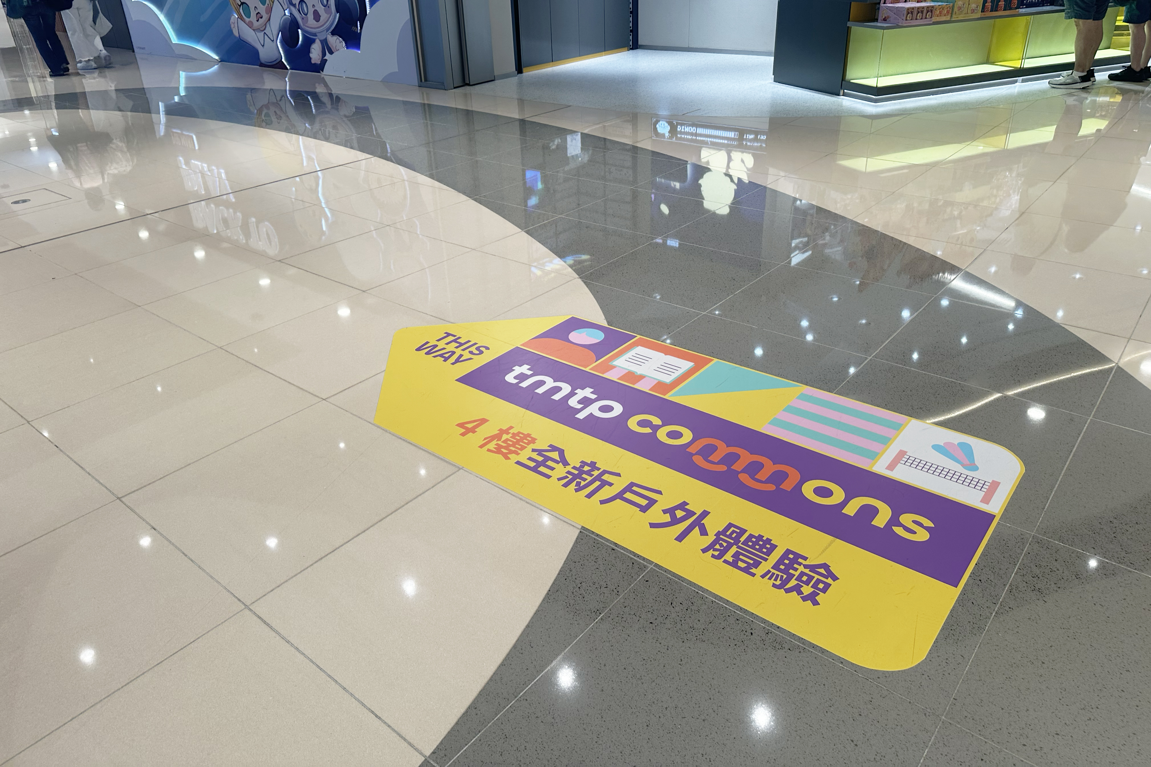
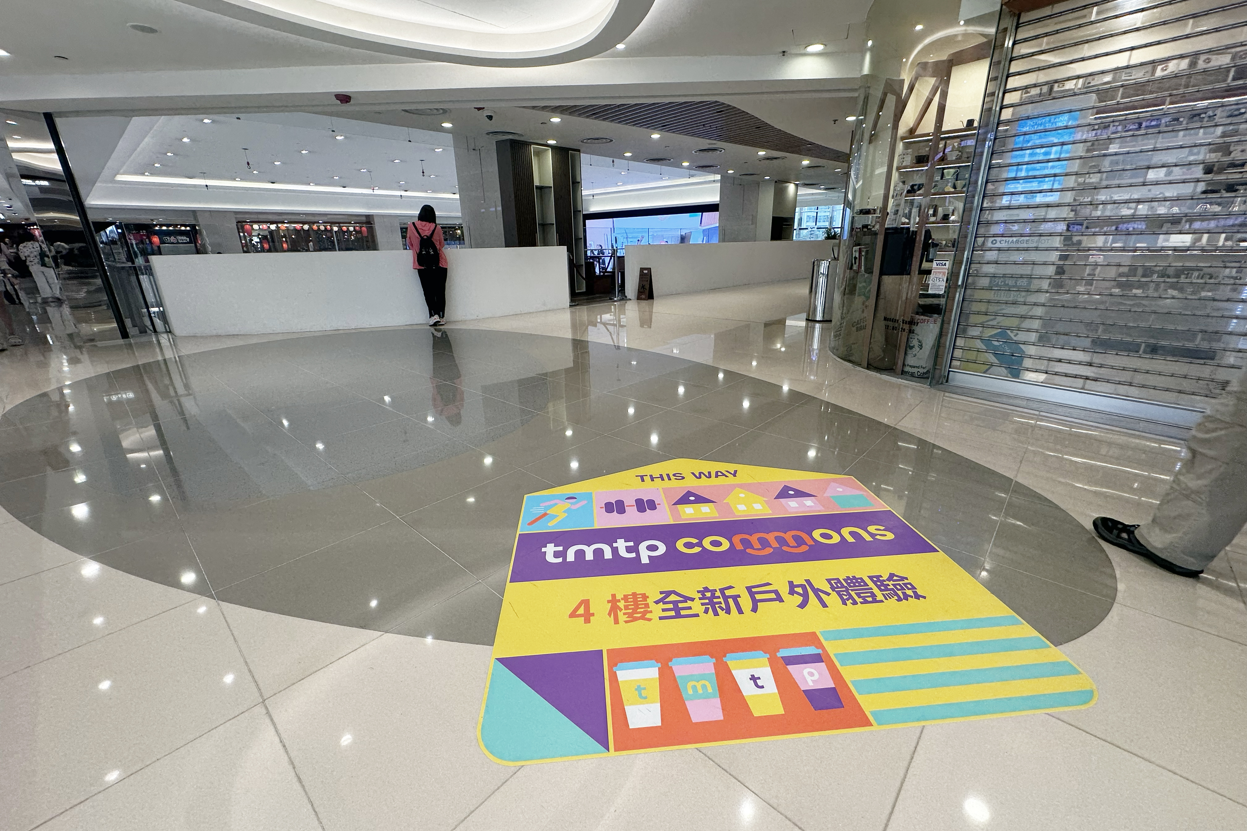
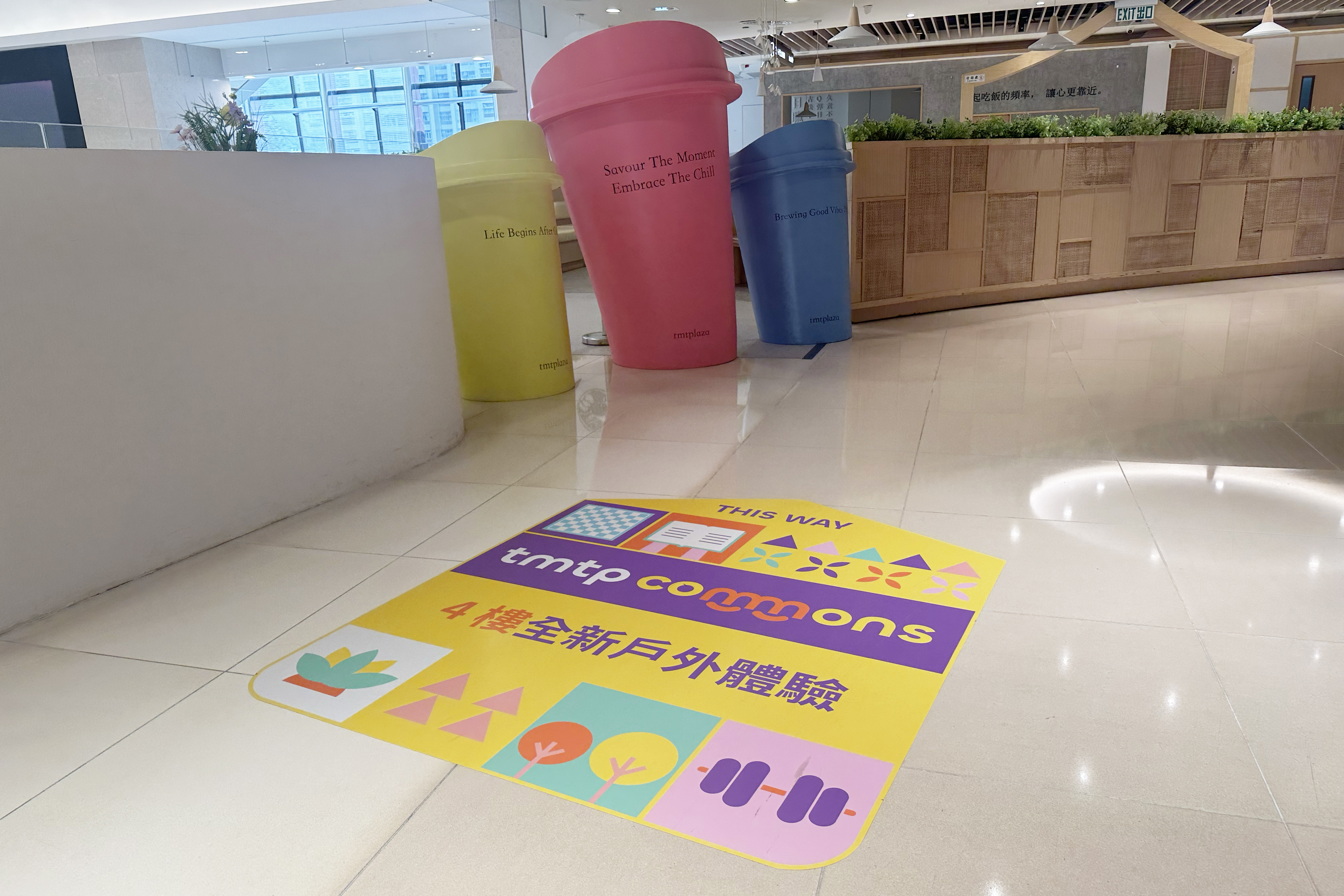
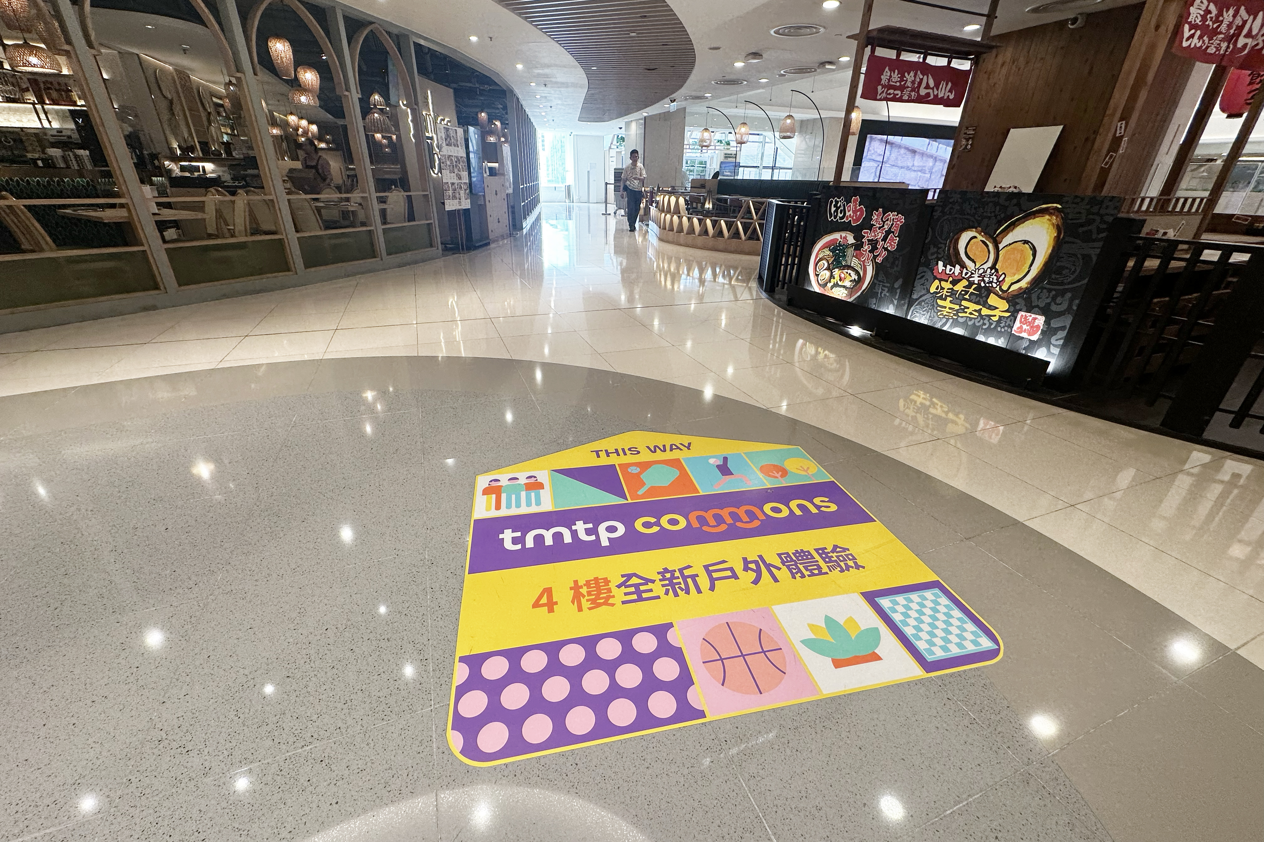
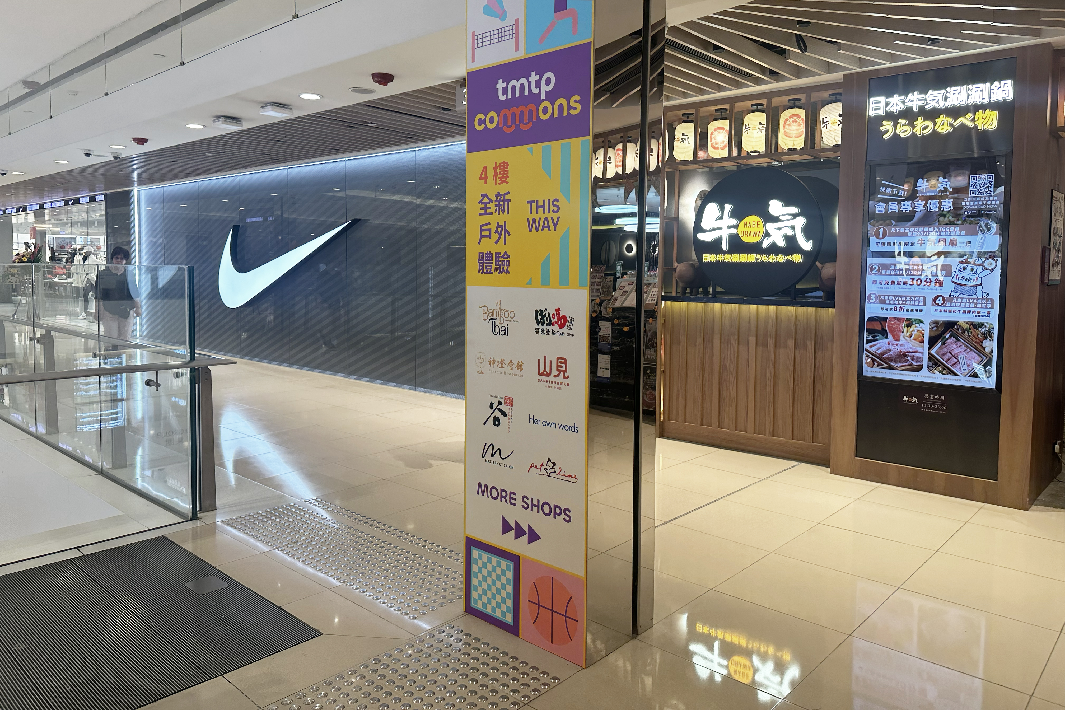
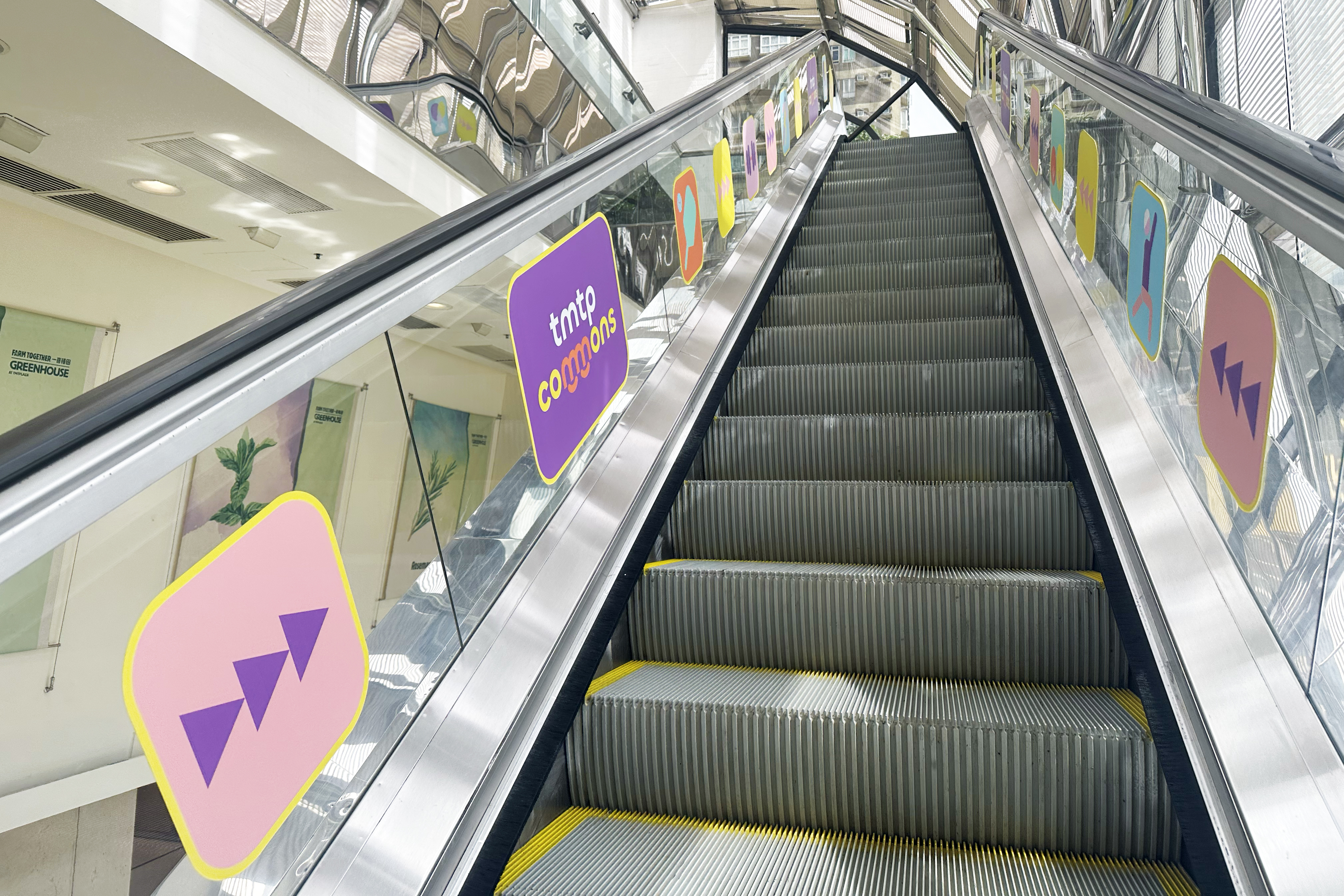
The Key Visual (KV) was executed as a simple, highly graphical, and modular pattern, designed to serve simultaneously as the brand’s primary visual support and a key navigational aid. The KV is structured as a grid-based mosaic of abstract icons, each concisely representing a core activity offered at the tmtp commons, such as wellness, sports, creative arts, and community engagement. This instantly and clearly communicates the variety and inclusivity of the space. The geometric, flat design ensures the visual remains modern, friendly, and highly legible across all applications . The modular nature of the grid is paramount for the identity’s practical use, allowing the pattern to be scaled, cropped, and rearranged seamlessly without losing brand integrity or recognition. This robust system is ideally suited for adaptation across all marketing touchpoints: from full, impactful patterns on large indoor banners to individual elements and smaller segments utilized on floor and escalator stickers. This ensures a visually consistent “bread crumb” trail that effectively guides visitors to the 4th-floor platform while simultaneously reinforcing the unique brand experience.
More case