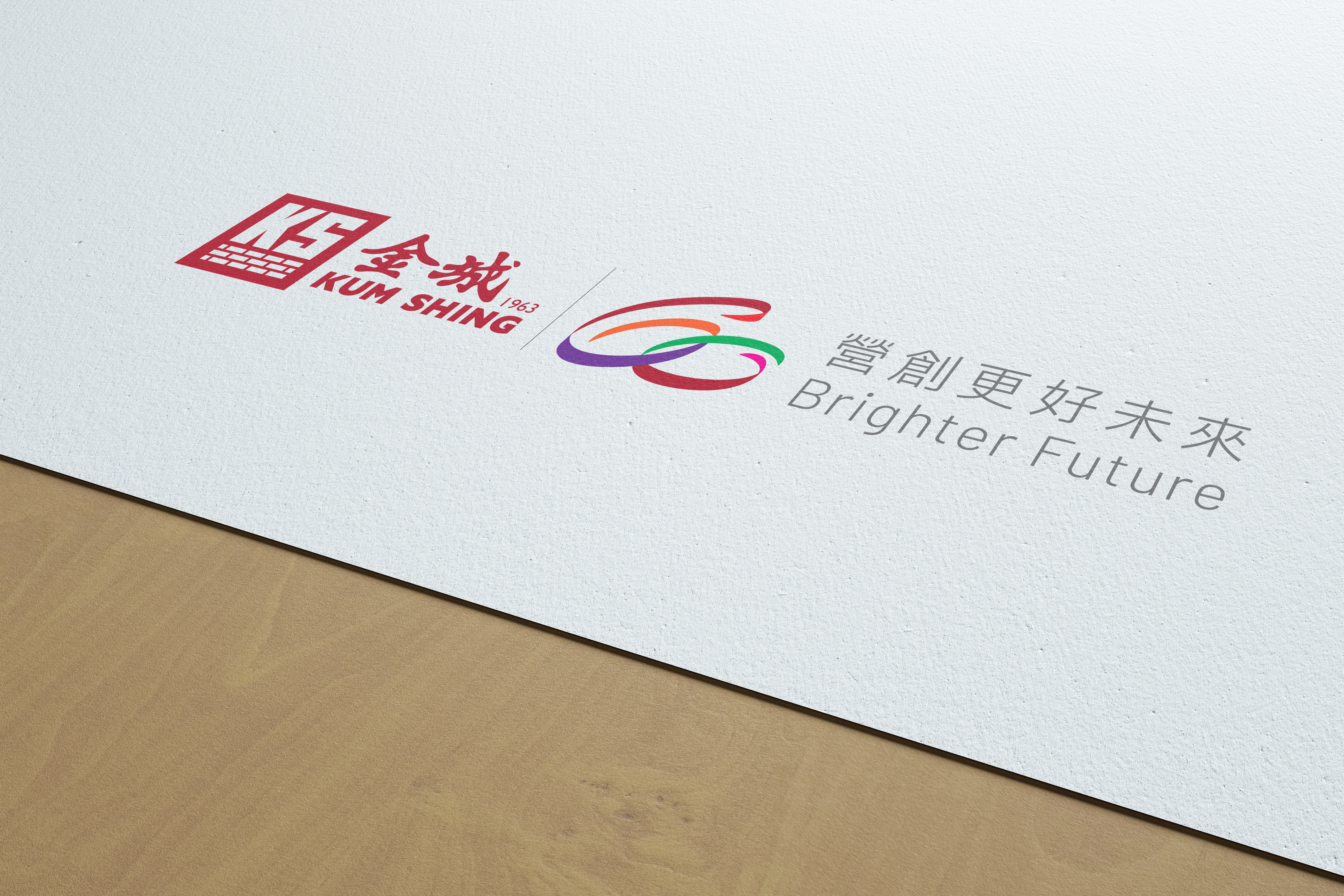
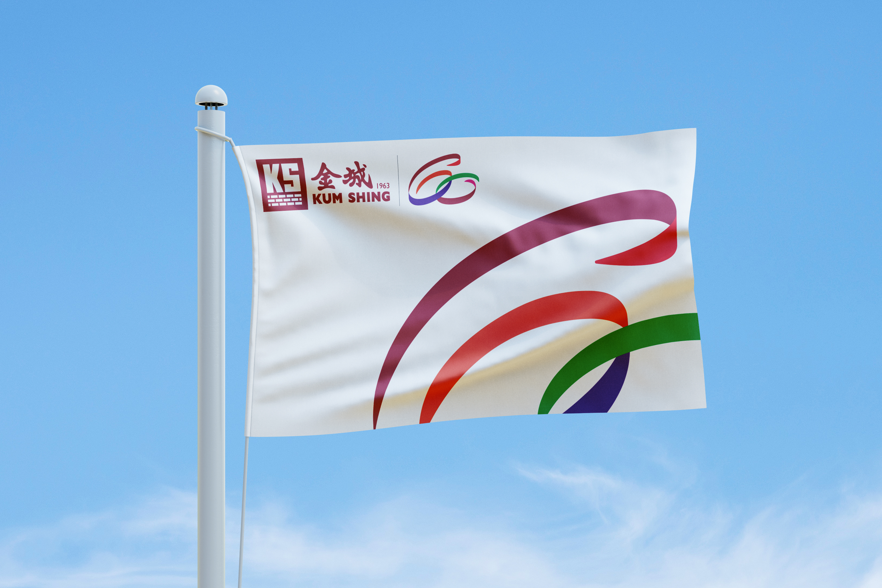
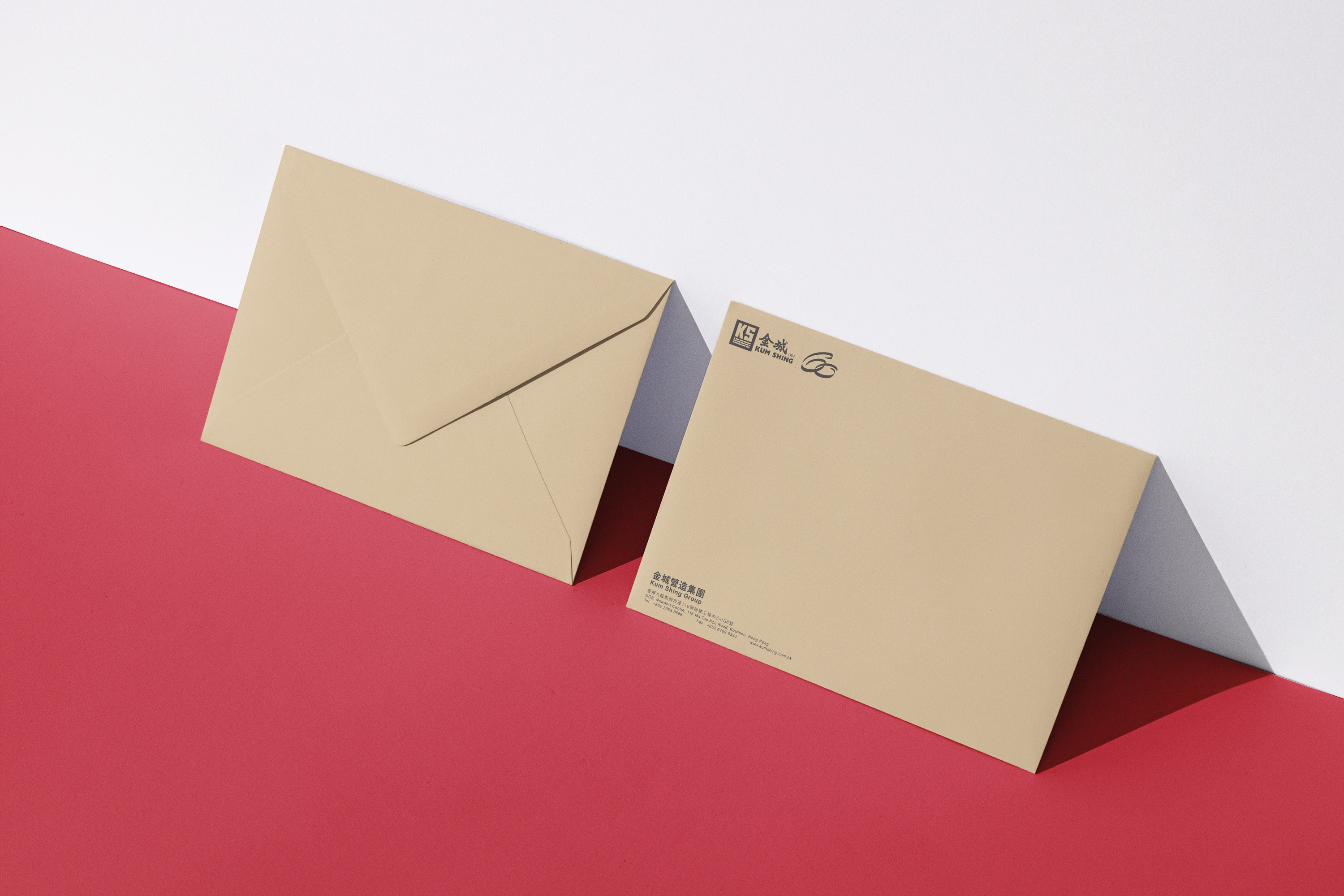
Kum Shing 60th Anniversary Logo
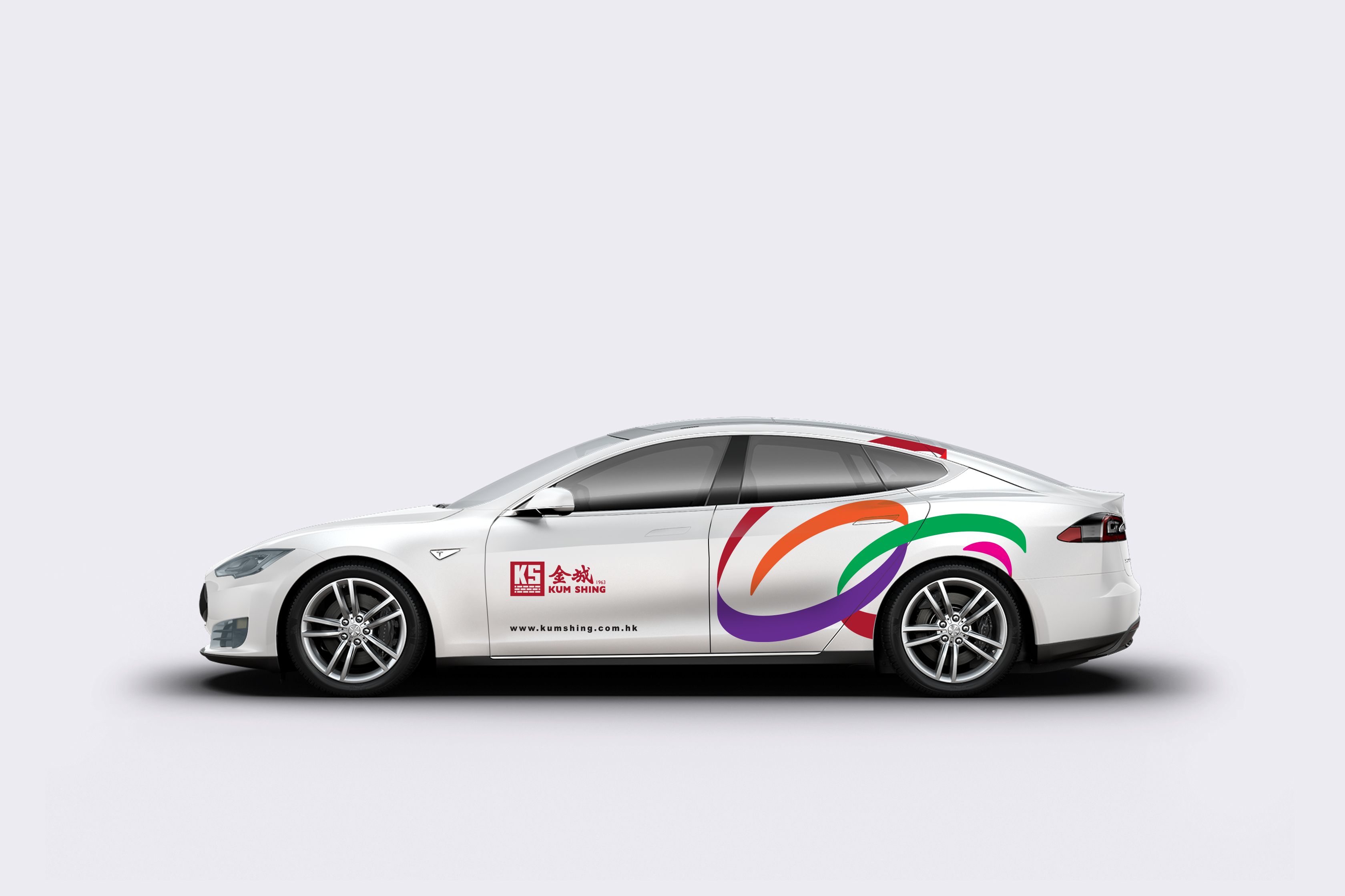
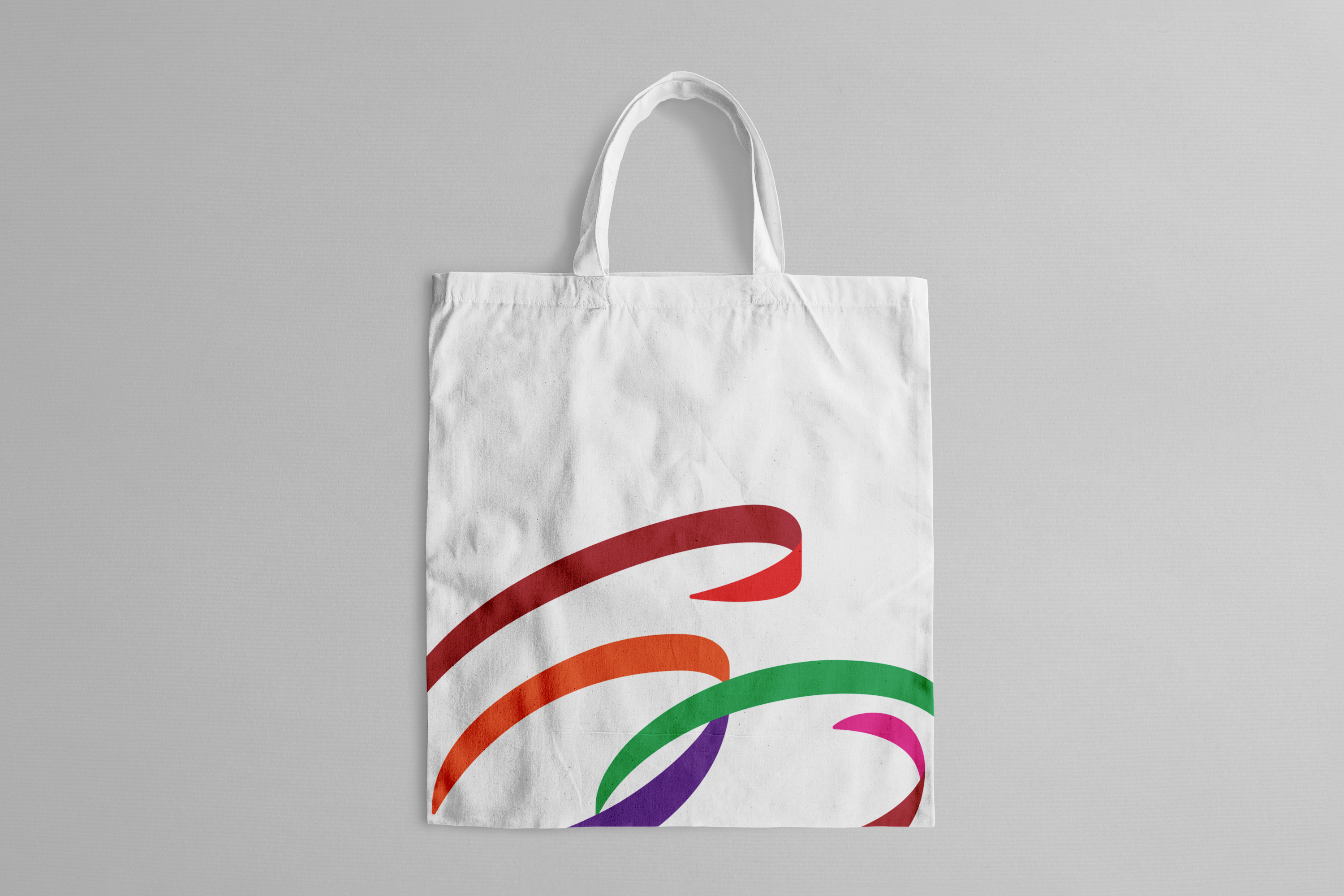
Established in 1963, Kum Shing has been at the forefront of Hong Kong’s energy infrastructure development, operation, and maintenance for several decades. This year, Double Eleven was entrusted with the task of designing a commemorative logo for their 60th anniversary, one that seamlessly integrates with their existing corporate logo. The new logo, created to celebrate Kum Shing’s milestone, presents a fresh interpretation of the numbers “6” and “0” through intricately woven ribbons in five vibrant colors. Two circles symbolize the inception and culmination of a cycle, embodying the company’s unwavering commitment to continuous progress as it enters a new era. The first ribbon, rendered in the company’s signature red hue, signifies the foundational pillars of Kum Shing’s four primary business sectors. Meanwhile, the green ribbon represents their steadfast dedication to fostering positive transformation and sustainable development within both the industry and society. The 60th Anniversary logo, proudly showcased across digital and physical platforms, serves as a joyous celebration shared by the entire Kum Shing family and the wider community.
Service
More case