
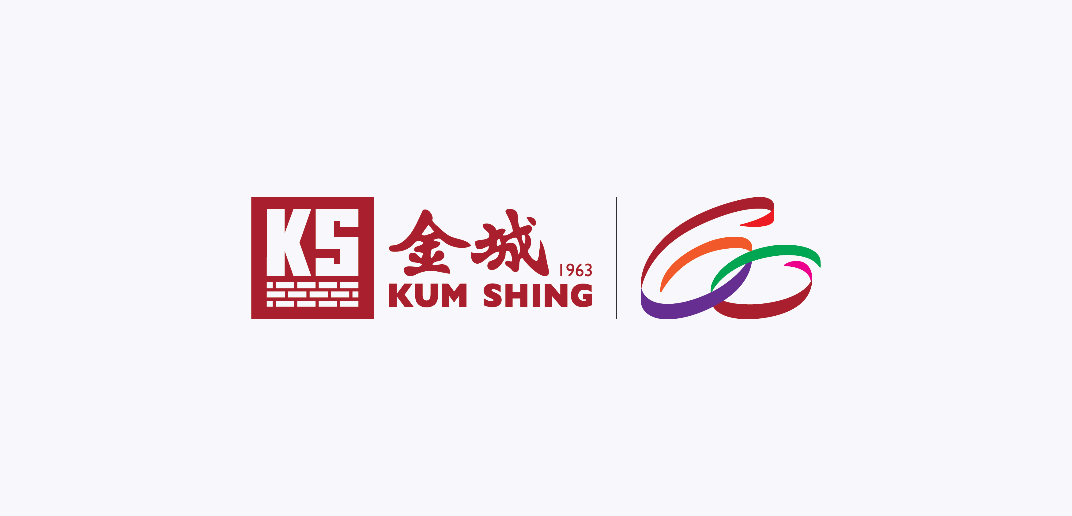
Kum Shing 60th Anniversary Logo
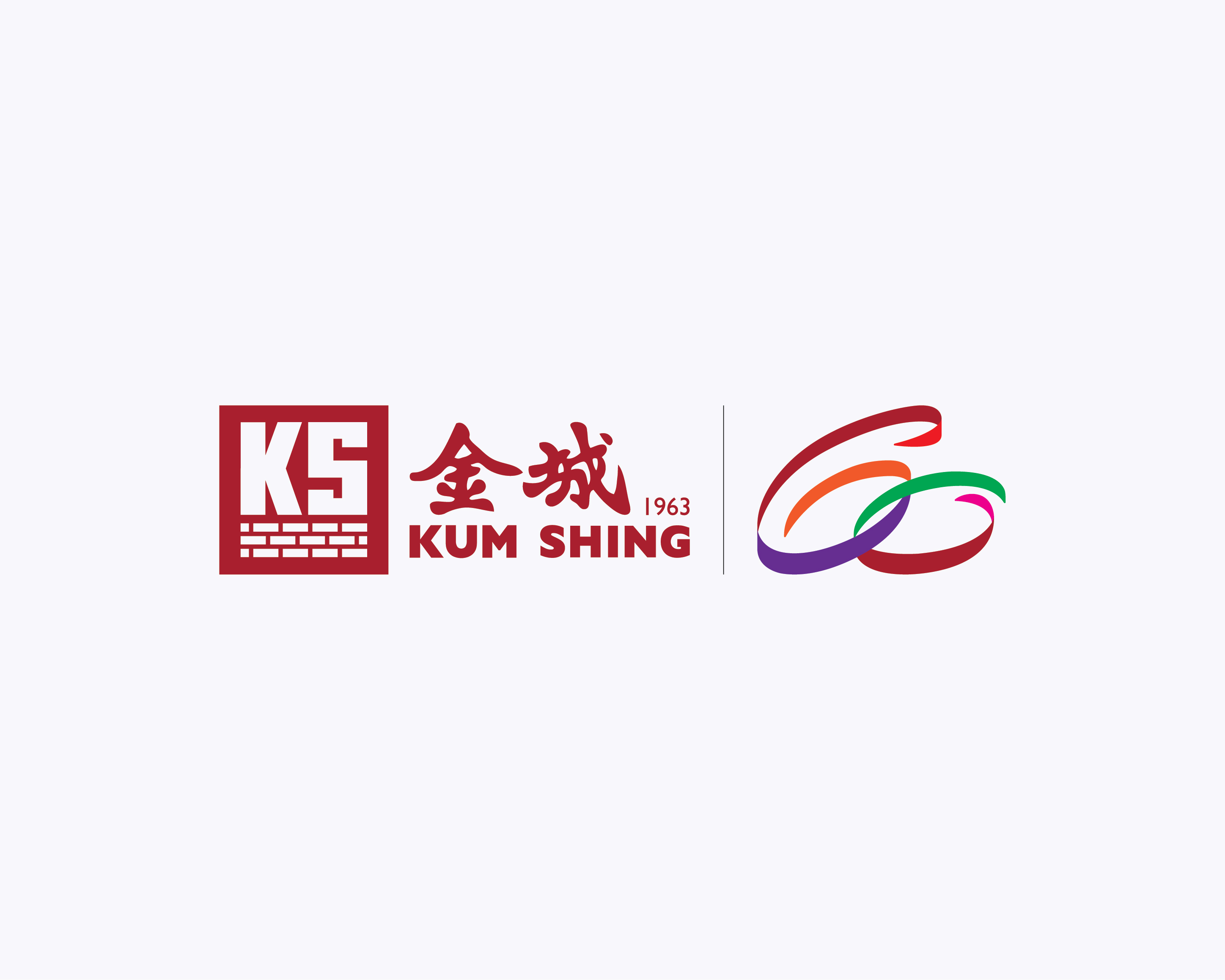
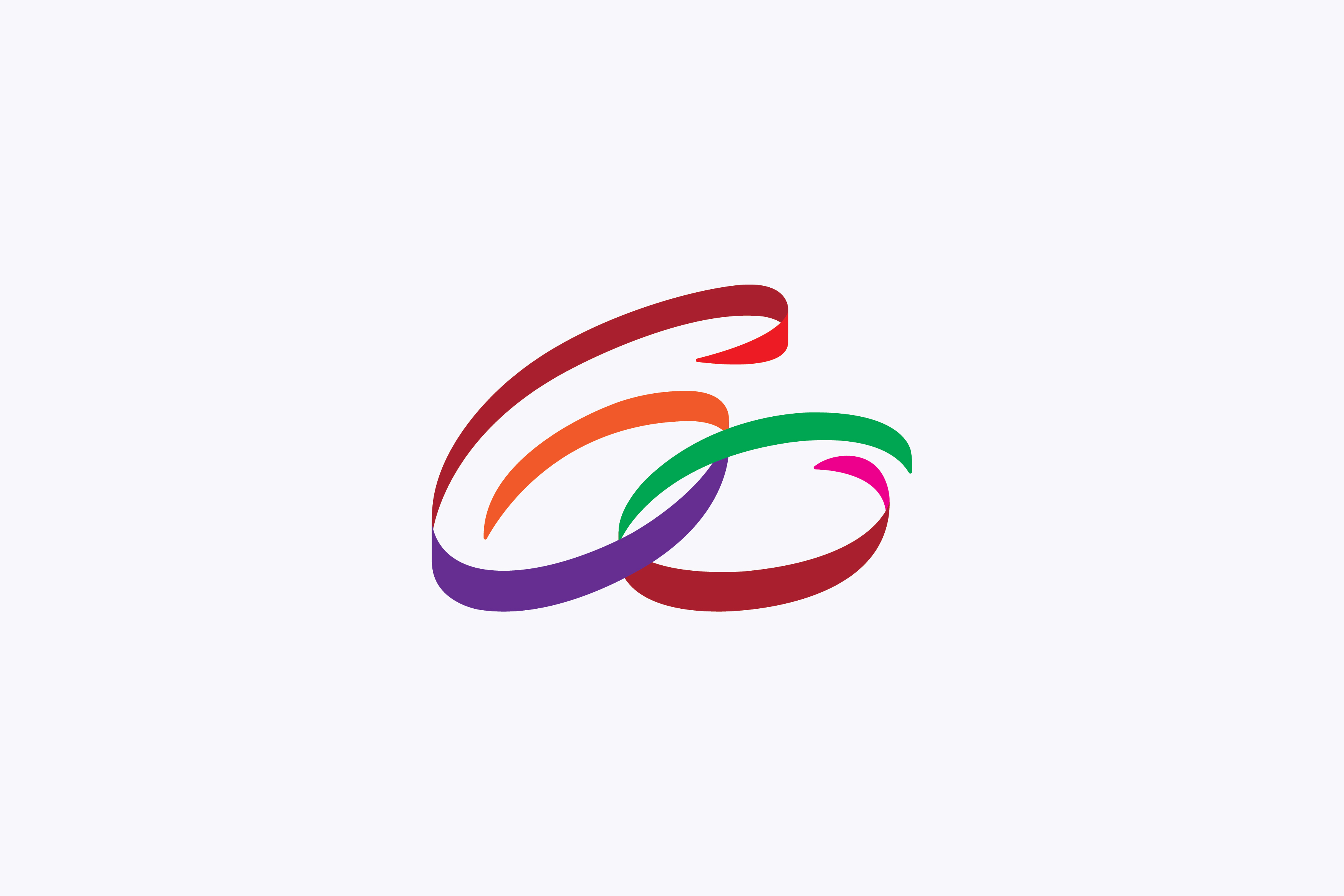
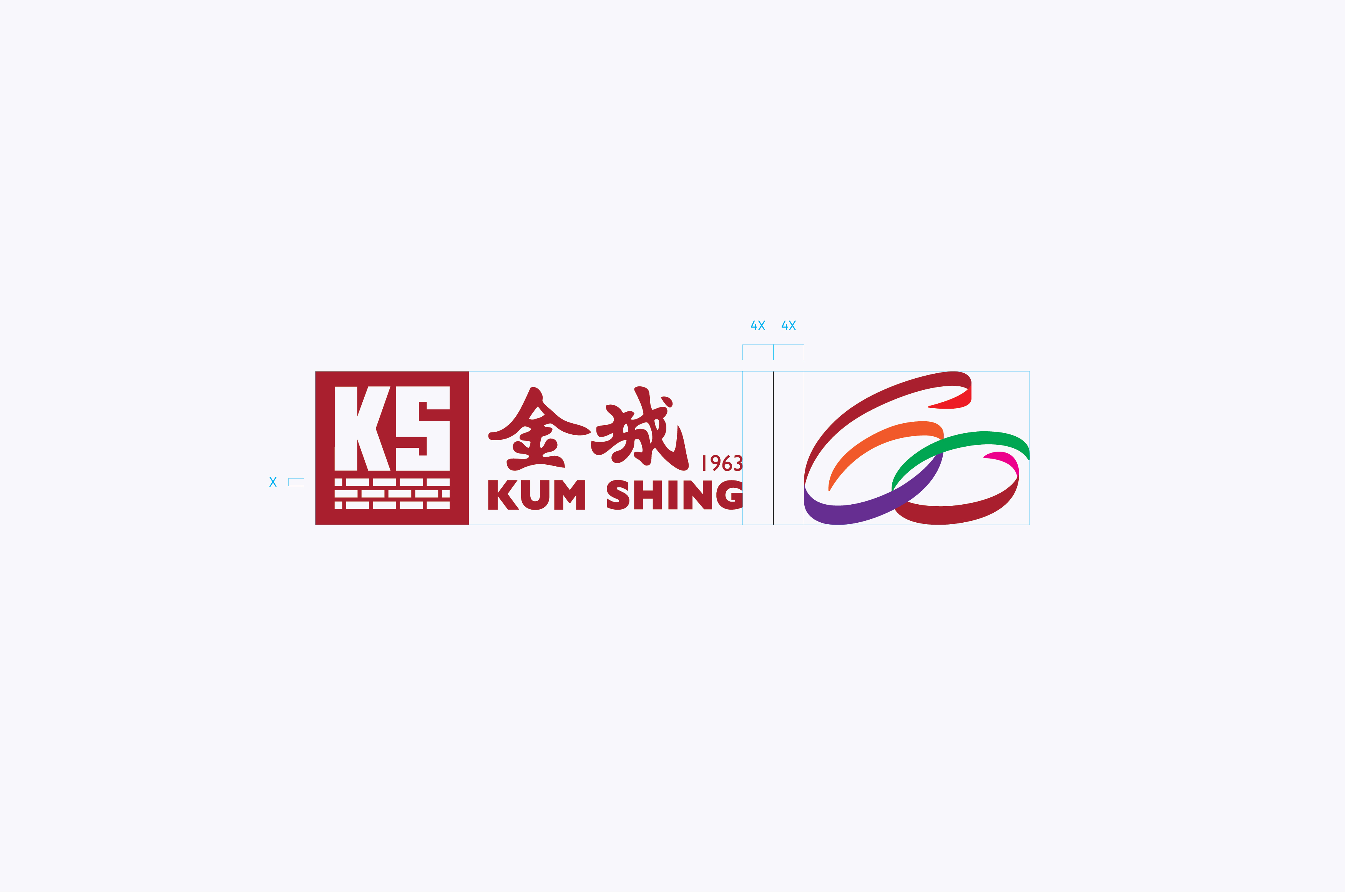
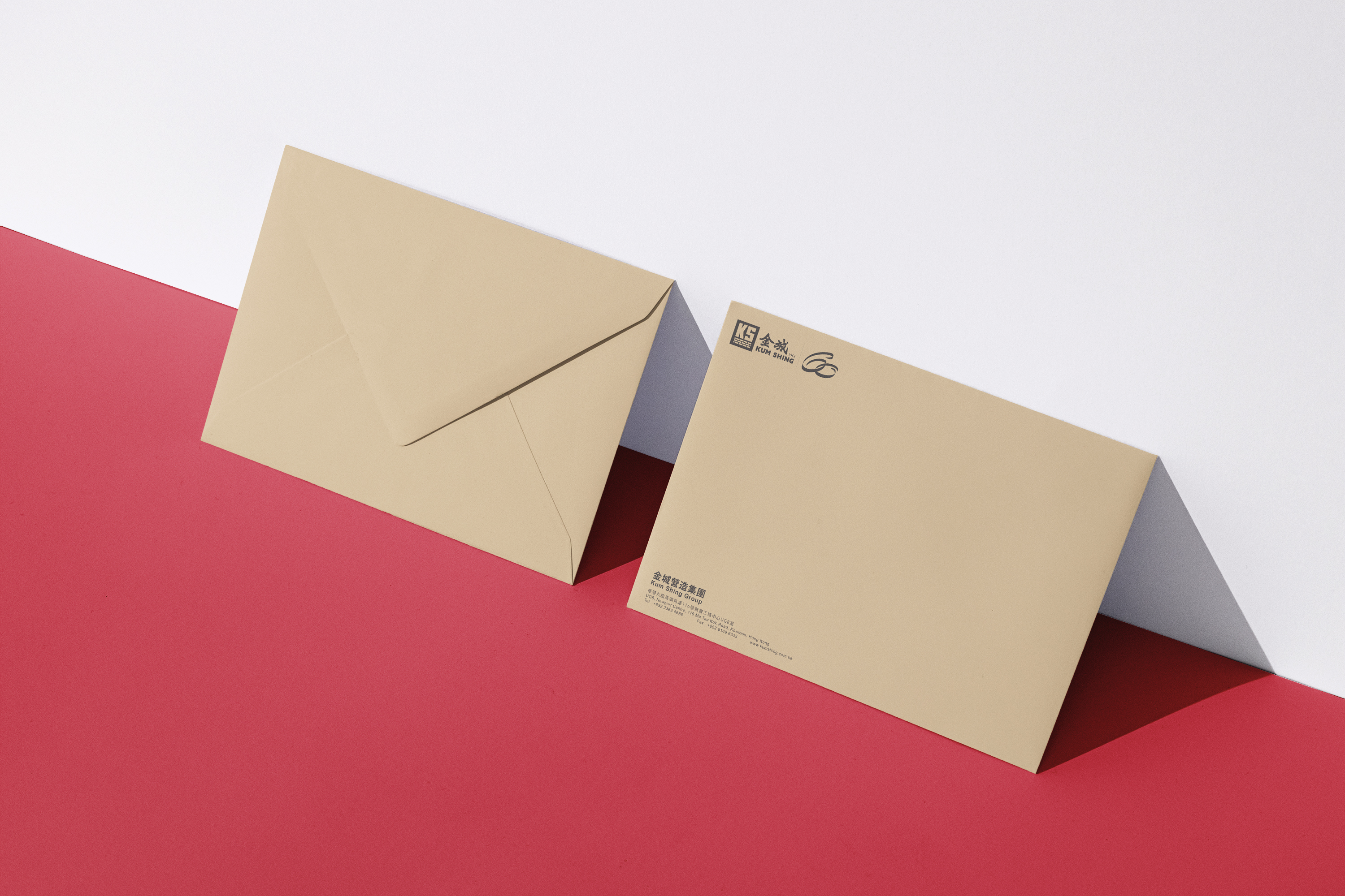
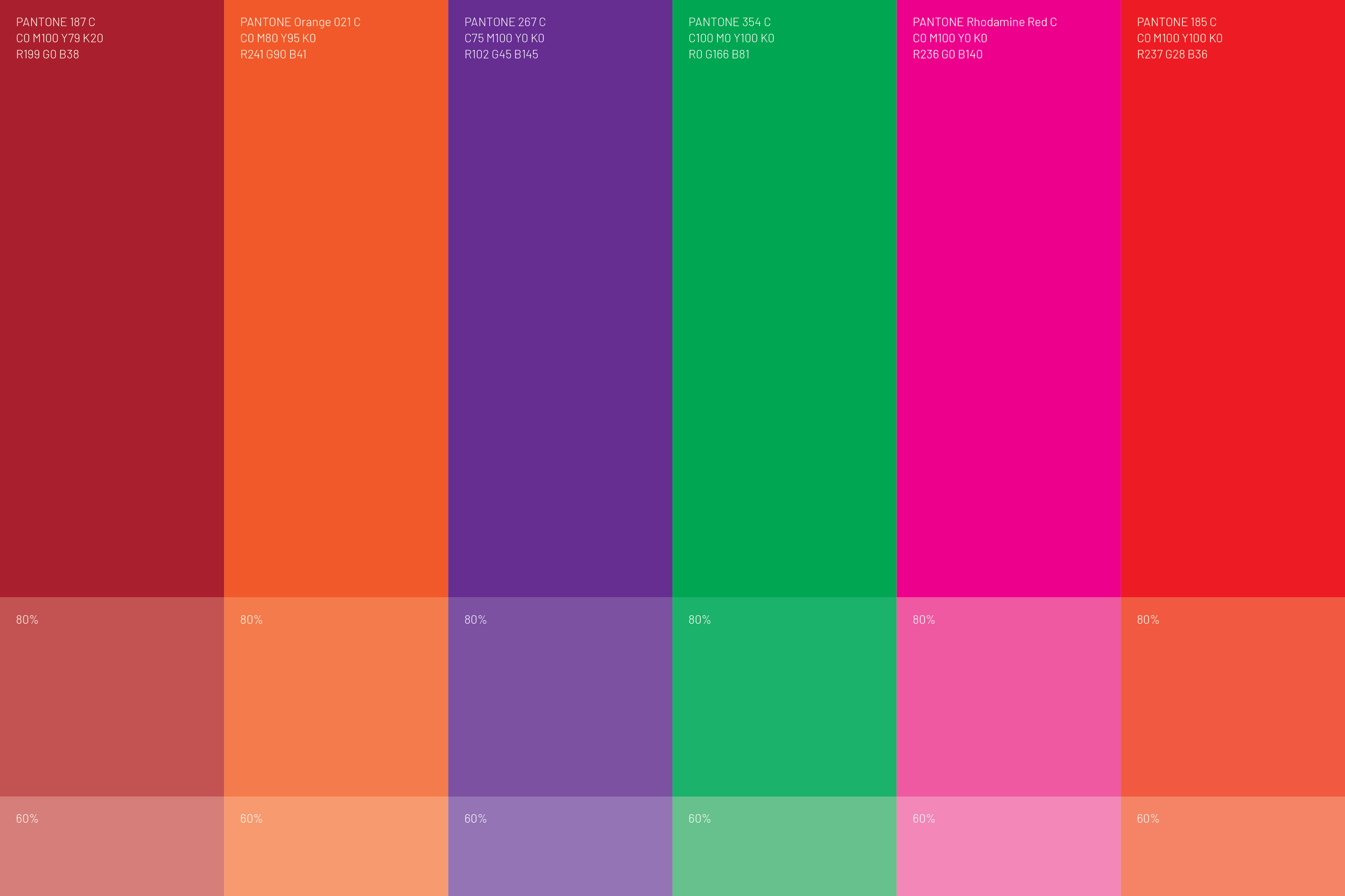
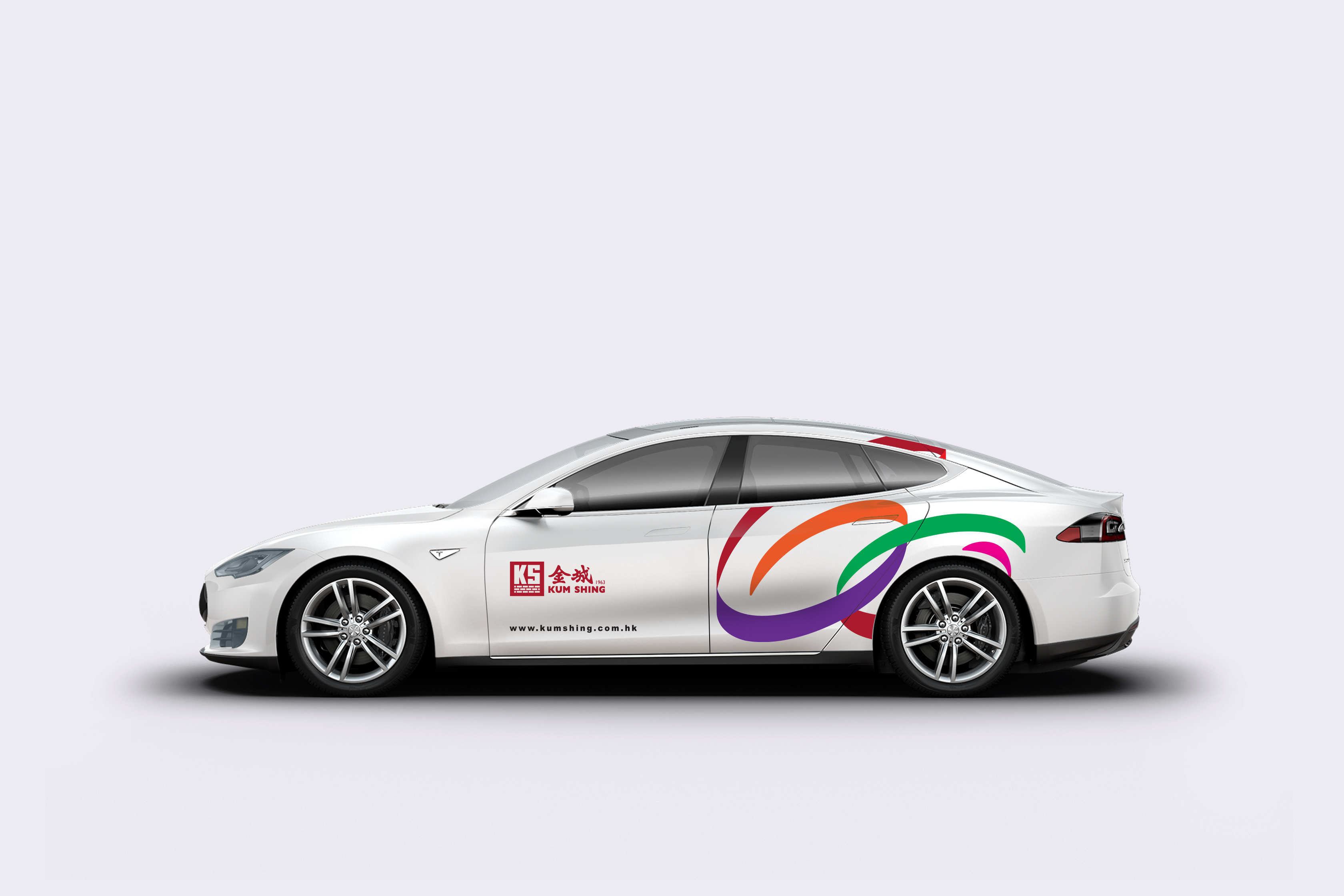
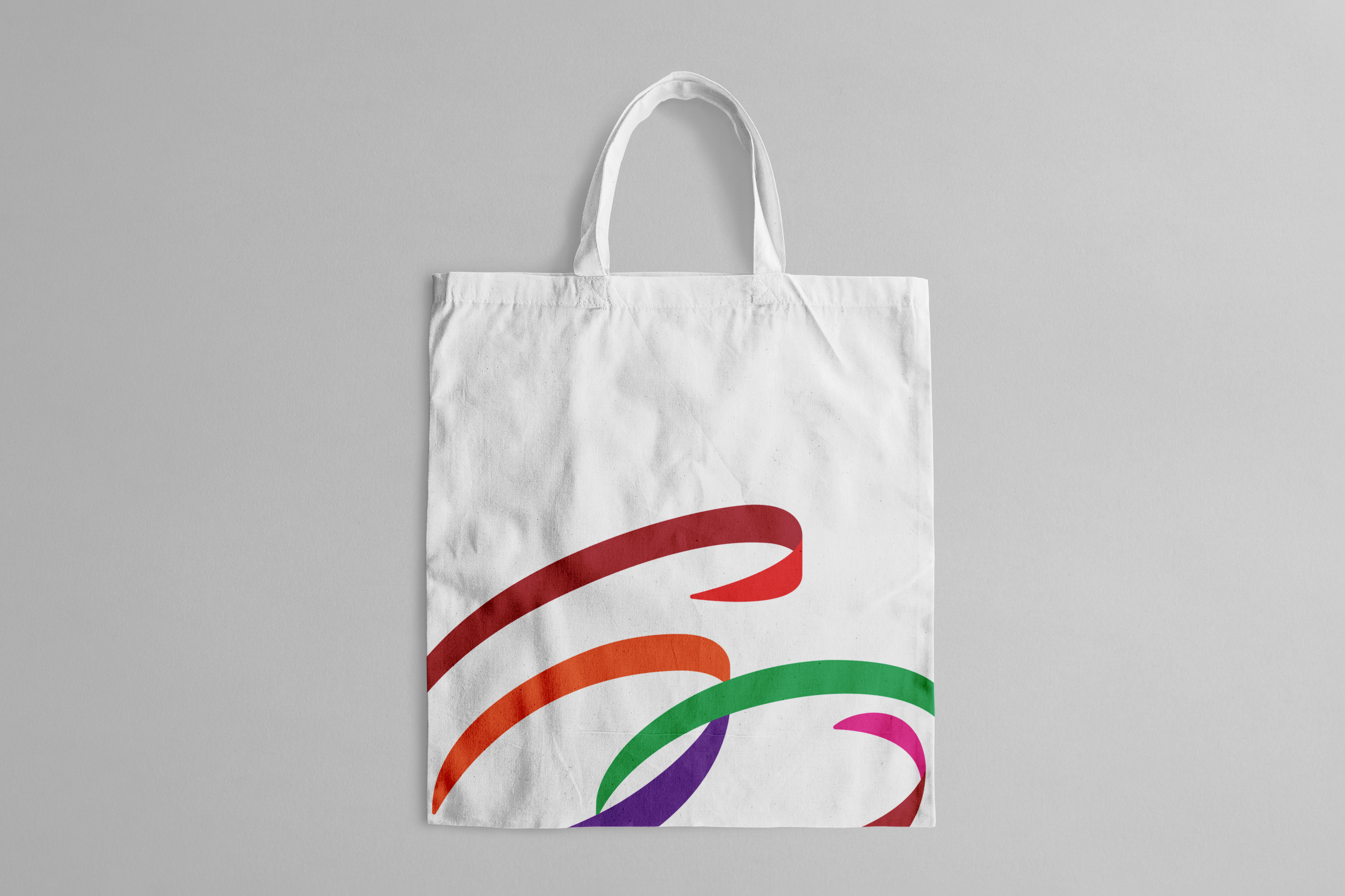
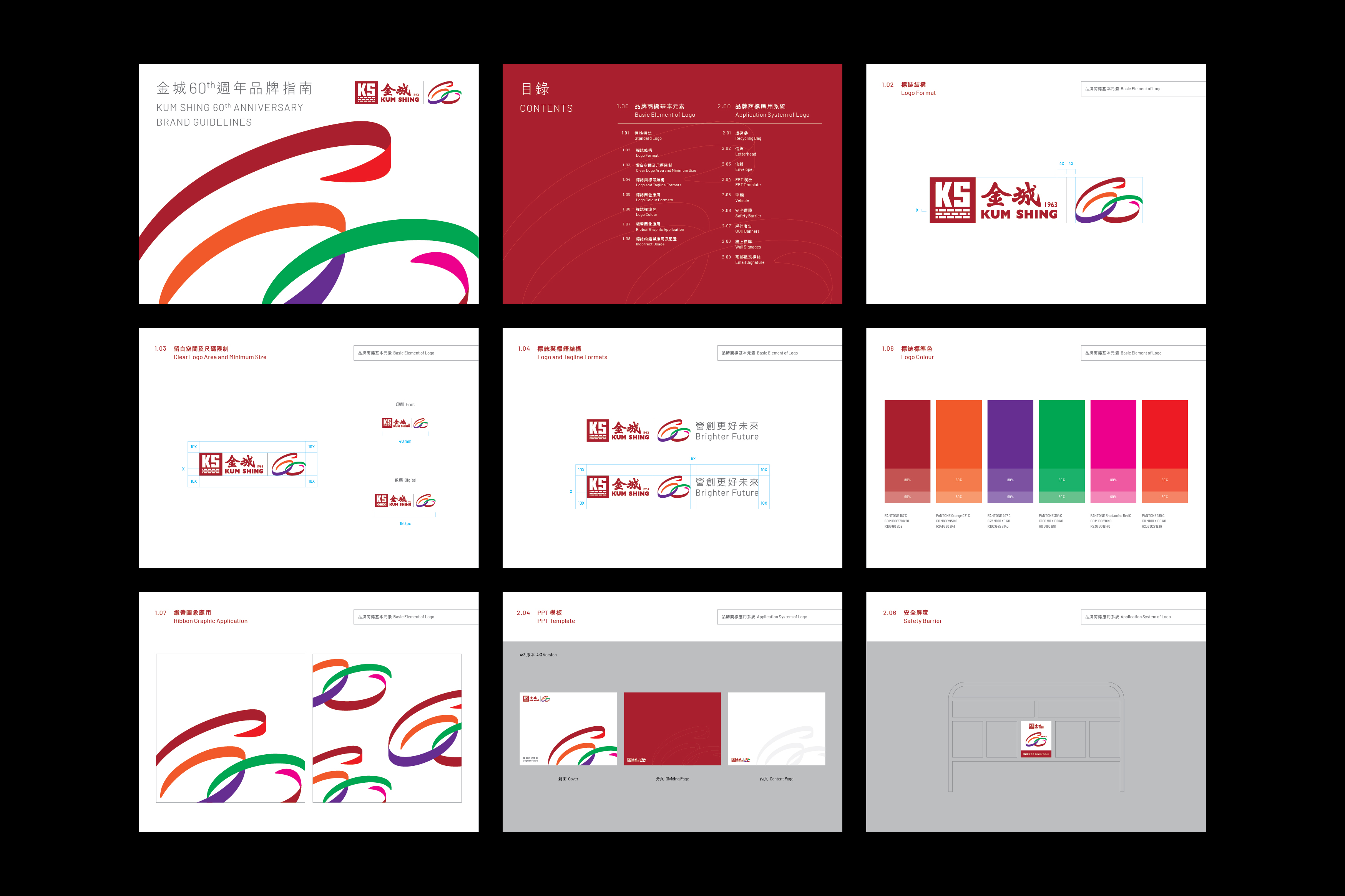
Established in 1963, Kum Shing has been at the forefront of Hong Kong’s energy infrastructure development, operation, and maintenance for several decades. This year, Double Eleven was entrusted with the task of designing a commemorative logo for their 60th anniversary, one that seamlessly integrates with their existing corporate logo. The new logo, created to celebrate Kum Shing’s milestone, presents a fresh interpretation of the numbers “6” and “0” through intricately woven ribbons in five vibrant colors. Two circles symbolize the inception and culmination of a cycle, embodying the company’s unwavering commitment to continuous progress as it enters a new era. The first ribbon, rendered in the company’s signature red hue, signifies the foundational pillars of Kum Shing’s four primary business sectors. Meanwhile, the green ribbon represents their steadfast dedication to fostering positive transformation and sustainable development within both the industry and society. The 60th Anniversary logo, proudly showcased across digital and physical platforms, serves as a joyous celebration shared by the entire Kum Shing family and the wider community.
Service

More case



Diamond Rose E-commerce Platform
We have developed an exceptional e-commerce platform for Diamond Rose, a brand dedicated to providing customers with gift ideas that symbolize eternal love for their cherished female partners, commemorating the timeless moments within their relationships.
Service


More case


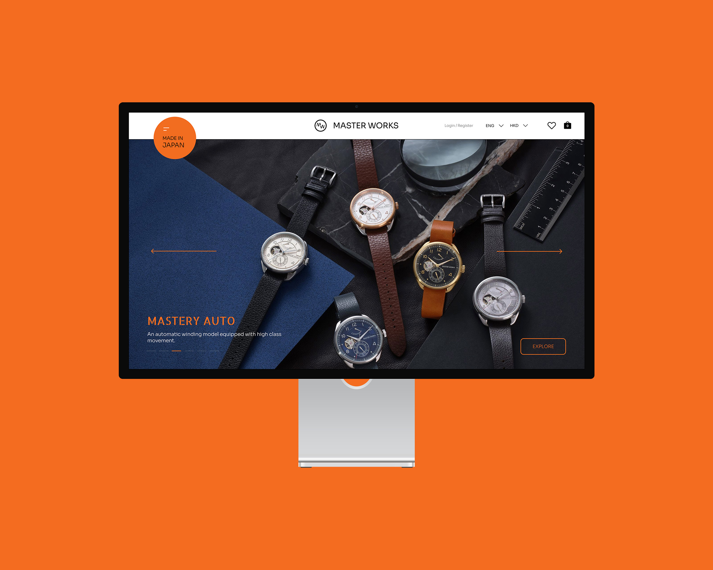
Master Works Online Shop and Brand Refresh
Master Works online shop is an e-commerce platform optimized for both desktop and mobile interface to illuminate its values through its story and to offer an enhanced online shopping experience through an elucidated product catalogue. It enables Master Works to expose their products and services to the world. Through a well-orchestrated commerce flow design, customers may easily accord their preferences with one or more masterpieces that come in a wide spectrum of elegance.
Service

Brand Introduction
Master works is founded in 2017 in Japan to offer masterpiece to the world. The name of the brand comes from “master (匠) ’s work (作品)”. The brand aims to reproduce the exquisite craftsmanship engraved in the Japanese culture, through ateliers and manufacturers from all around the world. The mission is to unleash the potential and synergy in different sets of materials from different parts of the world until the limit on a creative mind is undone.
Project Goals
- Using Hong Kong as an anchor to promote the Japanese brand across the world.
- Construct a unique identity and experience to emphasize the brand’s equity
- Shape Master Works as a provider of fashionable and exquisite products endorsed by genuine craftsmanship
- Redevelop the original identity
- Build an omni online shop
- Create visual content for the online shop


More case


Creative Tomorrow by West Kowloon
Visual identity and brand guideline design for the brand new performing arts season “Creative Tomorrow” launched by West Kowloon Cultural District Authority exploring the possibilities of technology and art.
Service


More case