


A Refreshed Brand Identity for Gratus
A refreshed visual identity for Gratus, a skincare and body care platform dedicated to delivering a seamless, personalized beauty experience. The evolution centers on softening and streamlining the brand’s core wordmark and monogram. By refining the lowercase ‘g’ into a single, fluid stroke and introducing a warm, radiant color palette, the new identity balances clinical precision with human warmth — translating effortlessly across mobile interfaces, AI-driven skin diagnostics, and digital touchpoints.
Service


More case
tmtp commons. An identity built around connection.
Brand Identity + Campaign & Advertising
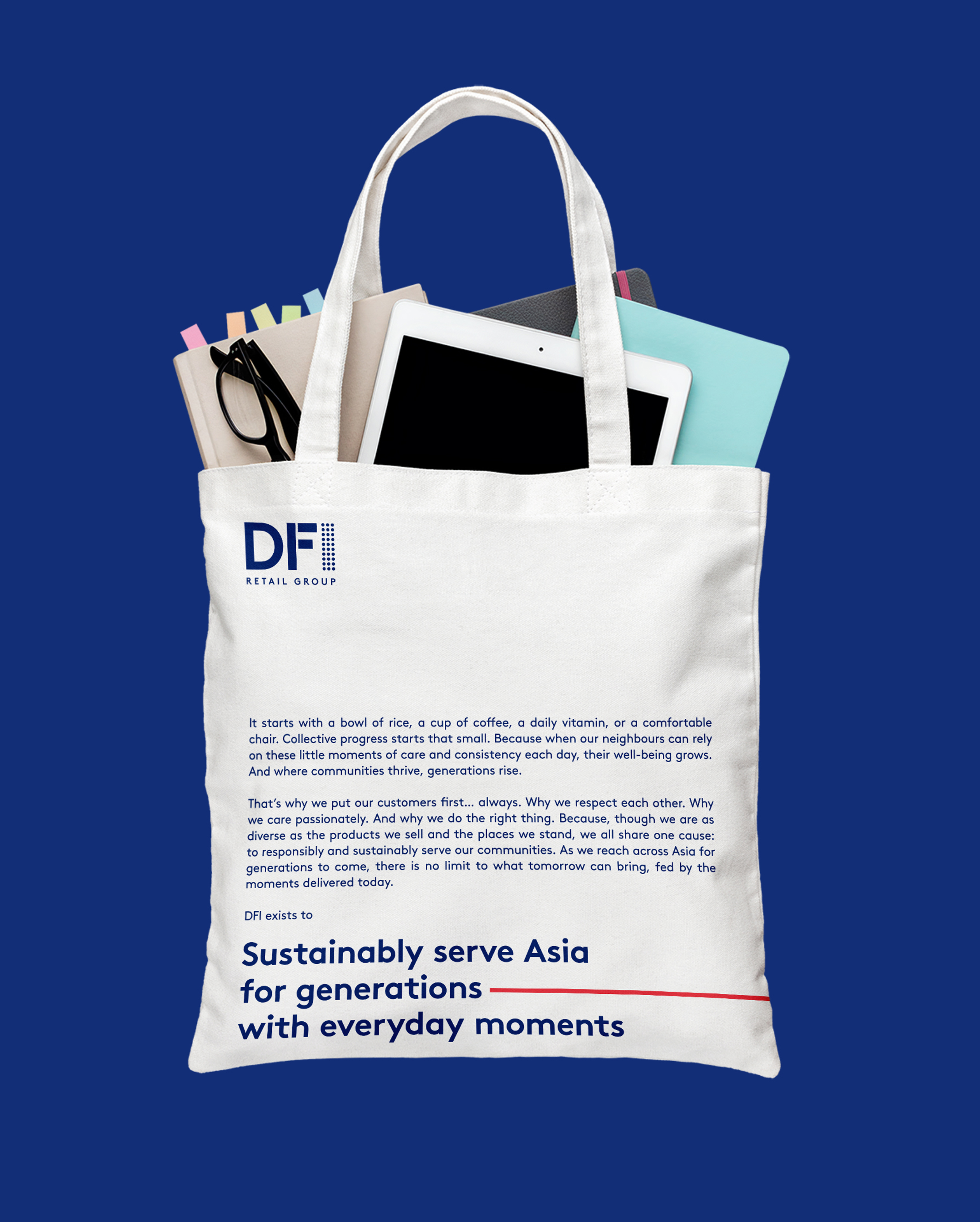
Designing Purposeful Brand Identities for DFI
Brand Identity
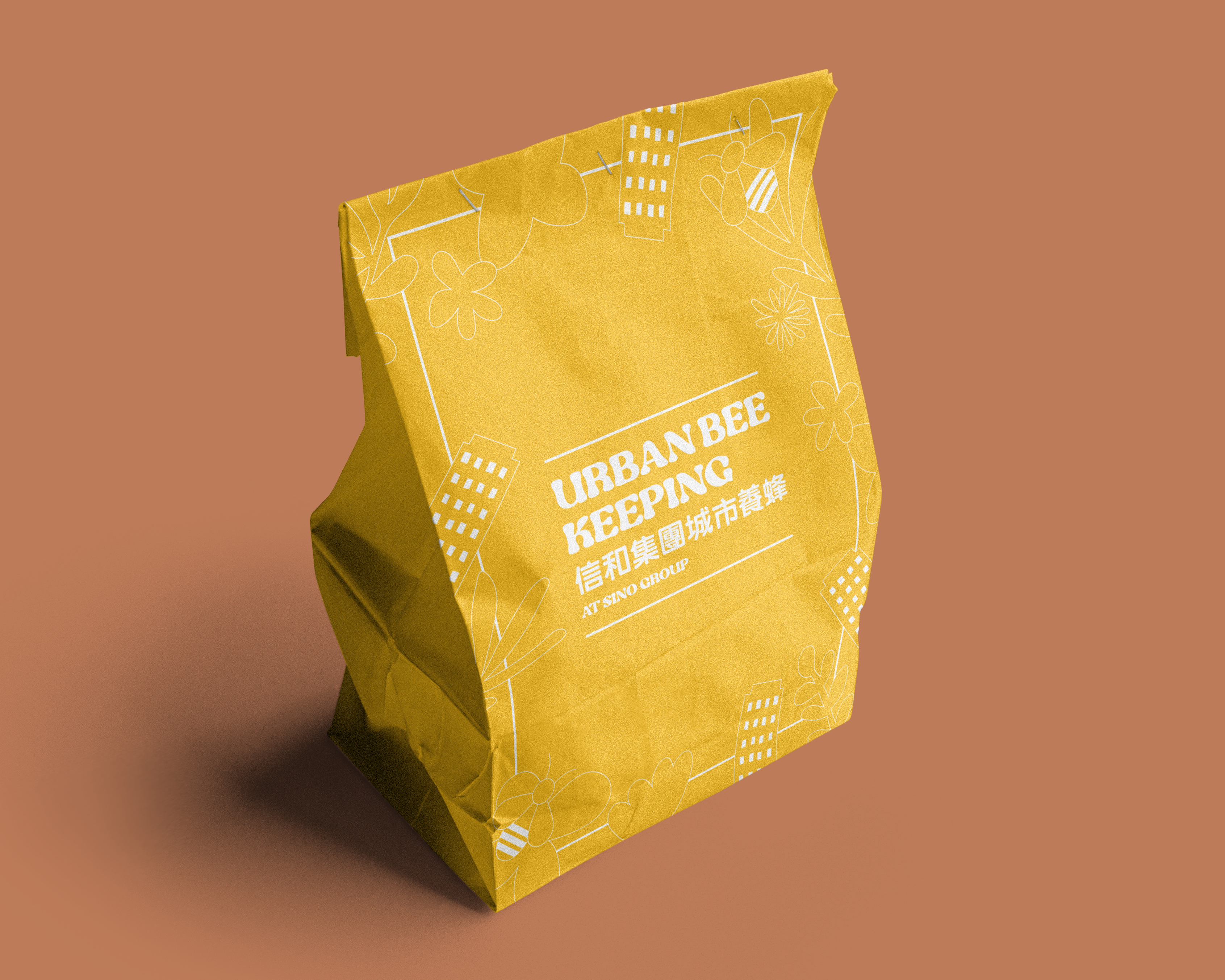
Urban Bee Keeping at Sino Group
Brand Identity + Campaign & Advertising
Kum Shing 60th Anniversary Logo
Brand Identity
tmtp commons. An identity built around connection.
Brand Identity + Campaign & Advertising
Designing Purposeful Brand Identities for DFI
Brand Identity
Urban Bee Keeping at Sino Group
Brand Identity + Campaign & Advertising
Kum Shing 60th Anniversary Logo
Brand Identity